Session 01: Introduction to Tableau
Learning Goals
- Understand the role of Tableau in data analysis and business intelligence
- Connect Tableau to Excel datasets
- Understand Tableau products and file types
- Navigate the Tableau interface
- Understand Tableau data concepts including data types, dimensions, measures, discrete and continuous fields
- Create basic visualizations using the Airbnb dataset
- Add interactivity using filters, groups, sets, and sorting
- Apply basic workbook formatting for readability
- Build and publish a simple Tableau dashboard
Overview
This session introduces the foundations of Tableau, a leading platform for interactive data visualization and business intelligence.
You will learn how Tableau connects to data, how the interface is organized, and how data fields are transformed into visualizations.
Throughout those sessions we will use many tables, and you can download them from here
During this particular session we are going to work with the airbnb excel file
The dataset contains Airbnb listings with fields such as:
- Listing name
- Neighborhood
- Property type
- Room type
- Number of beds
- Price
- Number of reviews
- Host start date
Tableau in Data Analysis
Tableau is a data visualization platform used to explore data and build interactive and dynamic dashboards.
Remember to review Intro to Data Visualization Session
Instead of writing complex queries, analysts interact with data using drag-and-drop fields.
Downloading Tableau Desktop
Tableau Desktop can now be downloaded for free for learning and development purposes.
The desktop application provides the full authoring environment used to build visualizations, dashboards, and data analysis workflows.
Tableau Desktop Download: Click here to download
Installation Steps
- Download the installer from the official Tableau website
- Install Tableau Desktop on your computer
- Launch the application
- Sign in with a Tableau account if prompted
In case of issues checkout the more detailed guide here
Publishing Dashboards
Once visualizations and dashboards are created in Tableau Desktop, they can be published online using Tableau Public.
Tableau Public: Click here to access
Tableau Public is a free platform that allows users to share interactive dashboards on the web.
To publish a dashboard:
- Create a Tableau Public account
- In Tableau Desktop select:
File → Save to Tableau Public - Sign in to your Tableau Public account
- The workbook will be uploaded and made publicly accessible
After publishing, dashboards can be:
- Shared through a public URL
- Embedded in websites
- Viewed and interacted with directly in a browser
Tableau Public is commonly used for:
- Portfolio projects
- Data storytelling
- Public data analysis
- Sharing visualizations with the community
Tableau Products
Tableau includes several products that support different stages of analytics.
| Product | Description |
|---|---|
| Tableau Desktop | Tool for creating dashboards and visualizations |
| Tableau Server | Platform for sharing dashboards within organizations |
| Tableau Cloud | Cloud-hosted version of Tableau Server |
| Tableau Public | Free platform for publishing dashboards publicly |
| Tableau Data Prep | Tool for data cleaning and preparation |
Tableau Desktop is now free, making it easier for analysts and students to learn Tableau.
Tableau Desktop
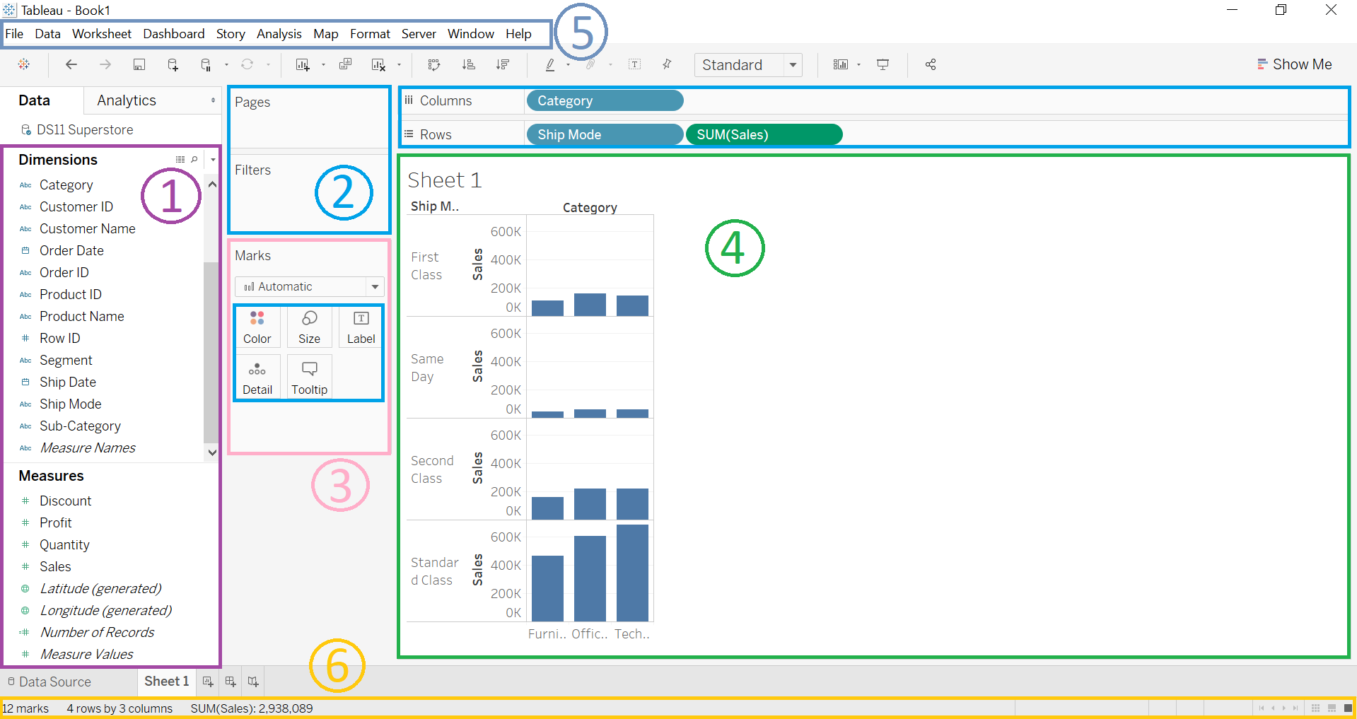
Tableau Server
Tableau Data Prep
Tableau Certifications
Tableau certifications are managed under the Salesforce certification experience through Trailhead Academy. Tableau’s official certification page lists five active Tableau-related credentials.
For more information check out official Tableau Website
| Certification | Level | Best For | Main Focus |
|---|---|---|---|
| Salesforce Certified Tableau Desktop Foundations | Foundational | Beginners, junior analysts, students, business users | Core Tableau Desktop skills and basic product knowledge |
| Salesforce Certified Tableau Data Analyst | Advanced | Data analysts, BI analysts, dashboard developers | Data analysis, visualization, dashboard building, stakeholder decision support |
| Salesforce Certified Tableau Server Administrator | Advanced | Tableau admins, BI platform admins, IT/data platform teams | Tableau Server administration, platform management, configuration, and governance |
| Salesforce Certified Tableau Consultant | Advanced | BI consultants, analytics consultants, implementation specialists | Tableau implementation, visual best practices, analytics solution design |
| Salesforce Certified Tableau Architect | Advanced | Tableau architects, senior admins, enterprise analytics platform owners | Tableau platform architecture, enterprise deployment, best practices, and maintenance |
Tableau Desktop Foundations
This is the entry-level Tableau certification. It validates core Tableau Desktop knowledge for users who need to work with Tableau Desktop.
Recommended for:
- Beginners in Tableau
- Data analytics students
- Business analysts starting with dashboarding
- Users who need to prove basic Tableau Desktop knowledge
Typical skills covered:
- Connecting to data
- Understanding Tableau interface
- Creating basic charts
- Creating basic dashboards
- Using filters, marks, and simple calculations
After our program, you do not need to obtain this certifcation
Salesforce Certified Tableau Data Analyst
This is the main professional certification for analysts. Tableau describes the credential as validating core Tableau knowledge and development skills for people working with Tableau products. :contentReferenceoaicite:2
Recommended for:
- Data analysts
- BI analysts
- Dashboard developers
- Analytics professionals who work with stakeholders
Typical skills covered:
- Preparing and exploring data
- Building visualizations
- Creating dashboards
- Applying calculations
- Understanding business problems
- Sharing insights with stakeholders
After completing those sessions you will have all the prerequisites to successfully obtain the certification
Salesforce Certified Tableau Server Administrator
This certification is focused on Tableau Server administration. Certified Tableau Server Administrators as people with comprehensive understanding of Tableau Server functionality in a single-machine environment.
Recommended for:
- Tableau Server administrators
- BI platform administrators
- IT support teams managing Tableau
- Data platform teams responsible for governance and access
Typical skills covered:
- Tableau Server configuration
- User and group management
- Permissions and projects
- Extracts, schedules, and subscriptions
- Monitoring and maintenance
- Security and governance
Salesforce Certified Tableau Consultant
This is an advanced certification for professionals who design and implement Tableau solutions for organizations. It is validating Tableau knowledge and development skills for users who work with Tableau products.
Recommended for:
- Tableau consultants
- BI consultants
- Analytics solution designers
- Professionals working with multiple business stakeholders
Typical skills covered:
- Requirement gathering
- Dashboard and workbook design
- Visual analytics best practices
- Data source planning
- Performance-aware dashboard design
- Deployment and user adoption considerations
Salesforce Certified Tableau Architect
This is the most infrastructure-oriented Tableau certification. It is for implementing complex Tableau Server deployments in enterprise-level environments.
Recommended for:
- Tableau architects
- Senior Tableau administrators
- Enterprise BI platform owners
- Data platform architects
Typical skills covered:
- Tableau infrastructure design
- Enterprise deployment planning
- Tableau Server architecture
- Monitoring and maintenance
- Scalability, reliability, and governance
- Platform best practices
Suggested Certification Path
For a learner or analyst, the most logical path is:
- Tableau Desktop Foundations: Start here if the person is new to Tableau.
- Tableau Data Analyst: Best target for data analysts, BI analysts, and dashboard developers.
- Tableau Consultant: Useful if the person designs Tableau solutions for business units or clients. For platform/admin roles, the path is different:
- Tableau Server Administrator: For managing Tableau Server environments.
- Tableau Architect: For enterprise-level Tableau infrastructure and architecture.
Tableau Menu Bar
The Menu Bar is located at the top of the Tableau interface and provides access to the main commands used for managing data, creating visualizations, formatting dashboards, and controlling the application environment.

Each menu contains a group of related tools that support different stages of the data analysis workflow.
| Menu | Purpose |
|---|---|
| Tableau | Provides application-level options such as preferences, product activation, settings, and quitting Tableau. |
| File | Used to create, open, save, export, and publish Tableau workbooks and data sources. |
| Data | Contains tools for managing data connections, refreshing data, creating extracts, and editing data sources. |
| Worksheet | Provides commands related to worksheet management such as creating new sheets, duplicating sheets, clearing views, and exporting worksheet data. |
| Dashboard | Contains tools used to create and design dashboards, including adding objects, arranging layouts, and controlling dashboard behavior. |
| Story | Provides functionality for building data stories, which present dashboards and worksheets in a sequential narrative format. |
| Analysis | Includes analytical tools such as reference lines, trend lines, forecasting, clustering, and aggregation settings. |
| Map | Provides geographic visualization tools such as map layers, background maps, geocoding, and spatial settings. |
| Format | Controls formatting options including fonts, colors, shading, borders, alignment, and number formatting. |
| Server | Used to publish dashboards and data sources to Tableau Server or Tableau Cloud, manage permissions, and update published content. |
| Window | Allows users to manage Tableau windows, switch between views, and control layout settings. |
| Help | Provides access to Tableau documentation, tutorials, product help, and support resources. |
Tableau Interface Overview
The Tableau workspace contains several key components that help analysts explore data, build visualizations, and organize dashboards.
Each labeled section in the interface represents a group of tools used during the visualization process.
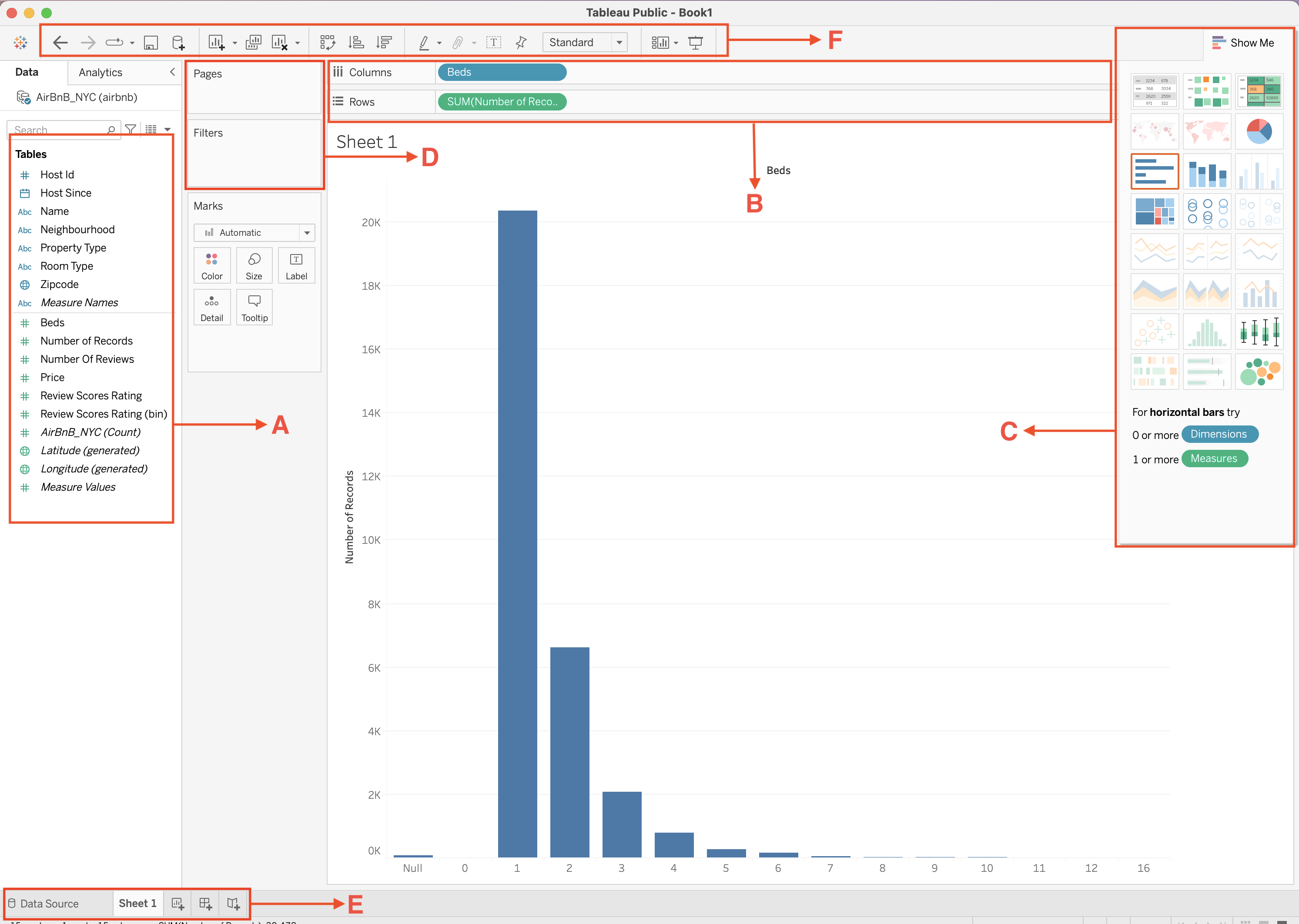
| Label | Section | Description |
|---|---|---|
| A | Data Pane | Displays all available fields from the connected dataset. |
| B | Columns and Rows Shelves | Control how fields are arranged to build the visualization. |
| C | Show Me Panel | Suggests visualization types based on selected fields. |
| D | Pages and Filters Area | Controls navigation through data and restricts which data appears in the view. |
| E | Worksheet Tabs | Allows creation and navigation between worksheets, dashboards, and stories. |
| F | Toolbar | Provides quick access to commonly used commands and formatting tools. |
A | Data Pane
The Data Pane contains all fields from the connected data source.
Fields are organized into several sections:
- Dimensions:categorical fields used to group data
- Measures: numerical fields used for calculations
- Measure Names / Measure Values: system fields used for multi-measure visualizations
- Generated fields: automatically created fields such as latitude and longitude
Additional tools within the Data Pane include:
- Search bar: quickly locate fields in large datasets
- Sort fields button: organize fields alphabetically or by type
- Group and hierarchy options: create logical relationships between fields
The Data Pane is the starting point for building visualizations, since fields are dragged from this area into shelves and cards.
B | Columns and Rows Shelves
The Columns and Rows shelves control the structure of the visualization.
Tools within this section include:
- Columns shelf: creates the horizontal axis of a chart
- Rows shelf: creates the vertical axis of a chart
- Field pills: represent the fields used in the visualization
- Aggregation indicators: show functions such as SUM, AVG, or COUNT applied to measures
- Drop zones: allow users to place additional fields to expand the visualization
These shelves define how data is arranged and determine the basic layout of the chart.
C | Show Me Panel
The Show Me panel provides a collection of visualization templates that Tableau can generate automatically.
Tools within this panel include icons for chart types.
When fields are selected in the Data Pane, compatible chart types become highlighted in the Show Me panel.
Selecting one of these icons automatically generates the corresponding visualization.
D | Pages, Filters, and Marks Area
This section contains tools used to control how data appears in the visualization.
Pages Shelf
- Allows the visualization to be broken into multiple views
- Enables step-by-step navigation through data categories
- Often used for time-based exploration
Filters Shelf
- Restricts which records are included in the visualization
- Supports filtering by dimension values, measures, or date ranges
- Filters can also be displayed as interactive controls on dashboards
Marks Card
The Marks card controls the visual appearance of data points.
Tools available in the Marks card include:
- Color: changes color encoding of marks
- Size: adjusts size of marks
- Label: displays values as text on marks
- Detail: adds additional granularity to the visualization
- Tooltip: customizes information shown when hovering over marks
Tooltips
Tooltips are interactive labels that appear when a user hovers over a data point in a visualization.
They provide additional context without cluttering the chart.
Key characteristics of tooltips:
- Display detailed information about a specific mark
- Automatically include fields used in the visualization
- Can be fully customized using text and dynamic fields
- Support formatting and conditional logic
Typical uses of tooltips:
- Showing exact values behind aggregated metrics
- Providing additional dimensions not visible in the chart
- Displaying calculated metrics or comparisons
- Improving user understanding without adding visual complexity
To edit tooltips:
- Open the Marks card
- Click Tooltip
- Customize the content using inserted fields and text
Tooltips are essential for making dashboards more informative and interactive while keeping visuals clean.
E | Worksheet Tabs
The bottom section of the interface contains navigation tabs used to organize analytical work.
Tools within this section include:
- Data Source tab:view and manage the connected dataset
- Worksheet tabs: individual visualizations
- New Worksheet button: create additional charts
- New Dashboard button: combine multiple worksheets into a dashboard
- New Story button: create sequential presentations of dashboards
These tabs help organize the analytical workflow inside a Tableau workbook.
F | Toolbar
The Toolbar provides quick-access buttons for common commands used while building visualizations.
Tools commonly available in the toolbar include:
- Undo / Redo – reverse or repeat previous actions
- Save – save the workbook
- Sort Ascending / Descending – reorder values in a visualization
- Swap Rows and Columns – quickly switch axes
- Text tool – add annotations or titles
- Format options – adjust visual formatting
- Presentation mode – display the visualization in full-screen format
- Pause automatic updates – temporarily stop queries while editing
These controls help analysts work more efficiently by providing shortcuts for frequent actions.
Connecting to Data Sources
Tableau supports connections to many types of data sources including:
Excel
csv
Databases
Cloud platforms
For this session we connect to an Excel dataset.
Steps:
- Open Tableau Desktop
- Click Connect → Microsoft Excel
- Select
airbnb.xlsx
- Drag the sheet into the workspace
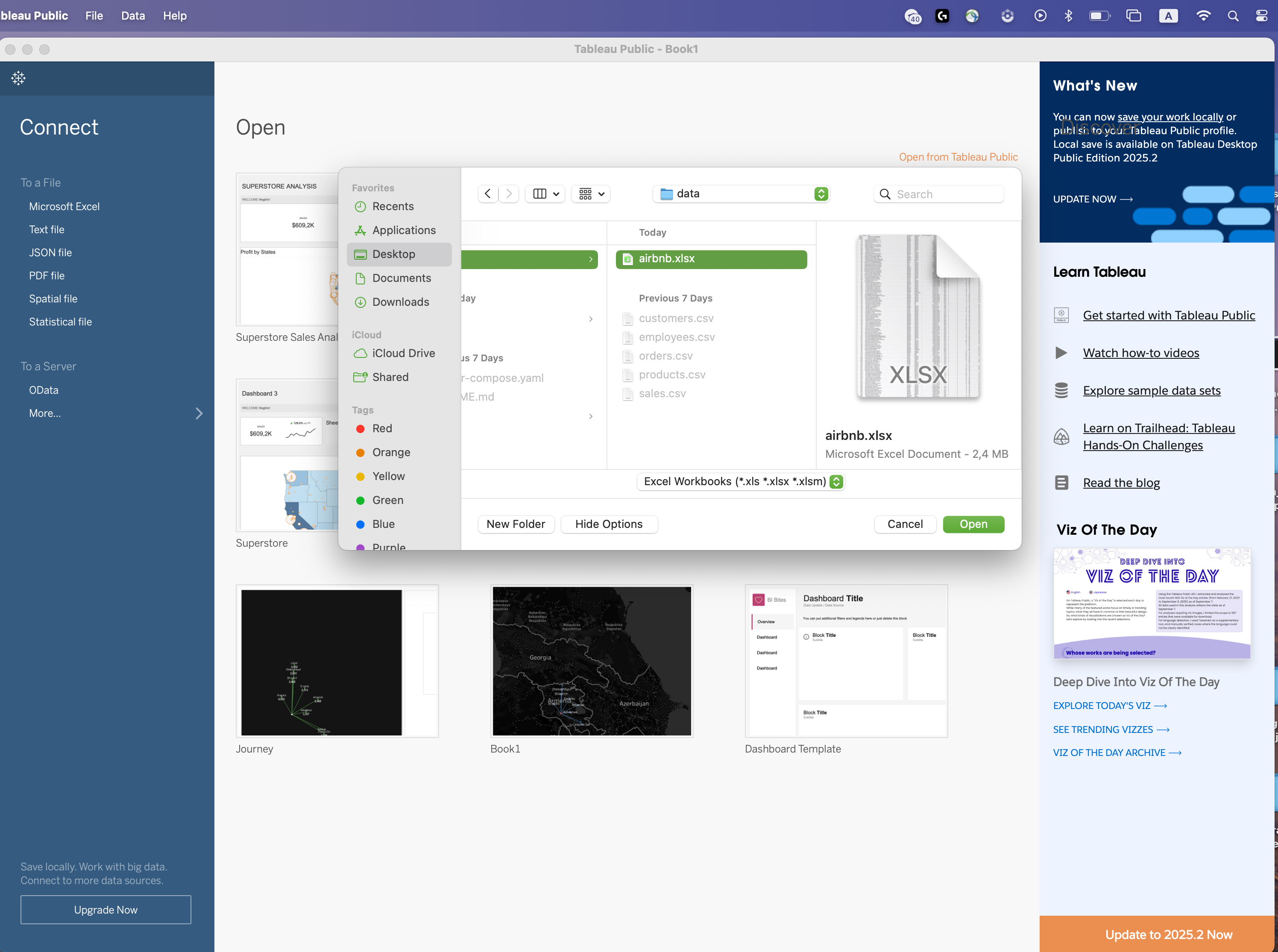
Tableau Data Model Concepts
Understanding how Tableau interprets fields is essential for building correct visualizations.
Data Types
Tableau automatically assigns data types such as:
- String (text)
- Number (whole or decimal)
- Date
- Date & Time
- Boolean
- Geographic
Example fields from the Airbnb dataset:
| Field | Data Type |
|---|---|
| Name | String |
| Neighbourhood | String |
| Price | Number |
| Beds | Number |
| Host Since | Date |
Dimensions vs Measures
When Tableau loads a dataset, it automatically divides fields into Dimensions and Measures.
Understanding this distinction is critical because it determines how data is visualized.
- Dimensions: define categories
- Measures define numeric values
- Dimensions answer
"by what category?" - Measures answer
"how much?" or "how many?"
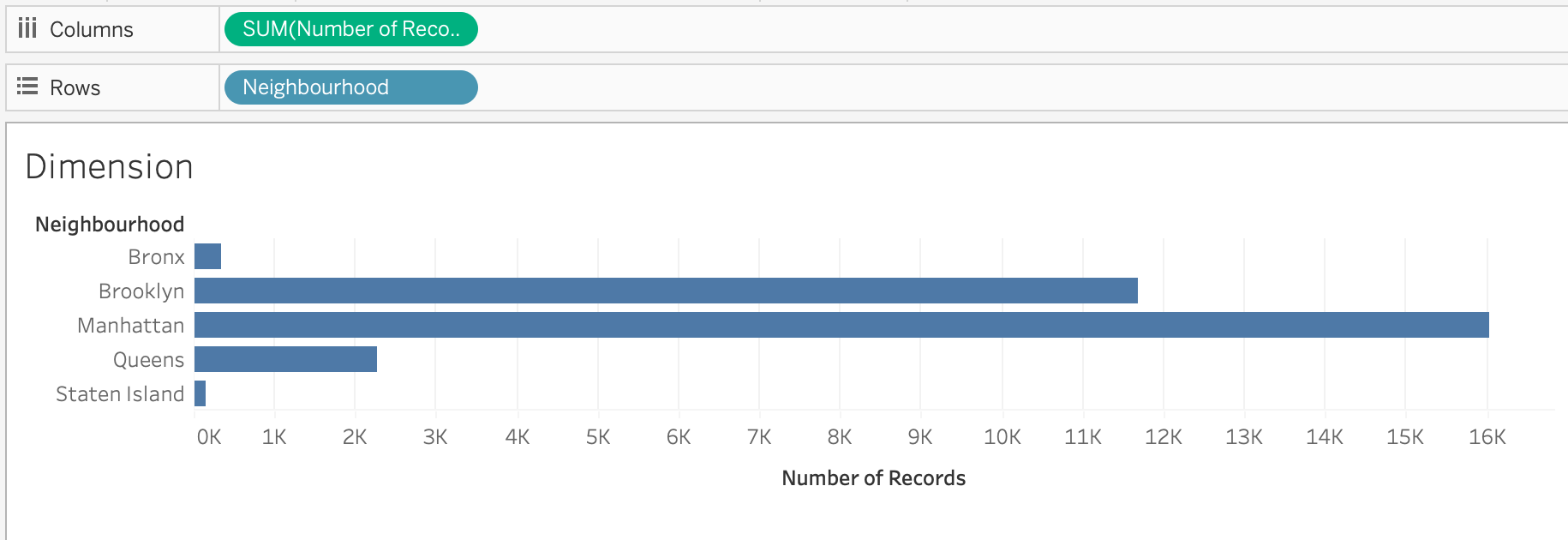
Dimensions
Dimensions are fields that describe qualitative attributes of the data.
They are used to segment, group, or categorize records.
Typical characteristics of dimensions:
- Often text or date fields
- Used to organize the data into categories
- Displayed as blue pills in Tableau
- Often placed on Rows, Columns, Filters, or Color
Examples from the Airbnb dataset:
| Field | Description |
|---|---|
| Name | Listing name |
| Neighbourhood | Area of the listing |
| Property Type | Apartment, house, loft |
| Room Type | Entire home, private room |
| Zipcode | Postal code |
Example visualization: Listings by Neighborhood
Steps:
- Drag Neighbourhood → Rows
- Drag Number of Records → Columns
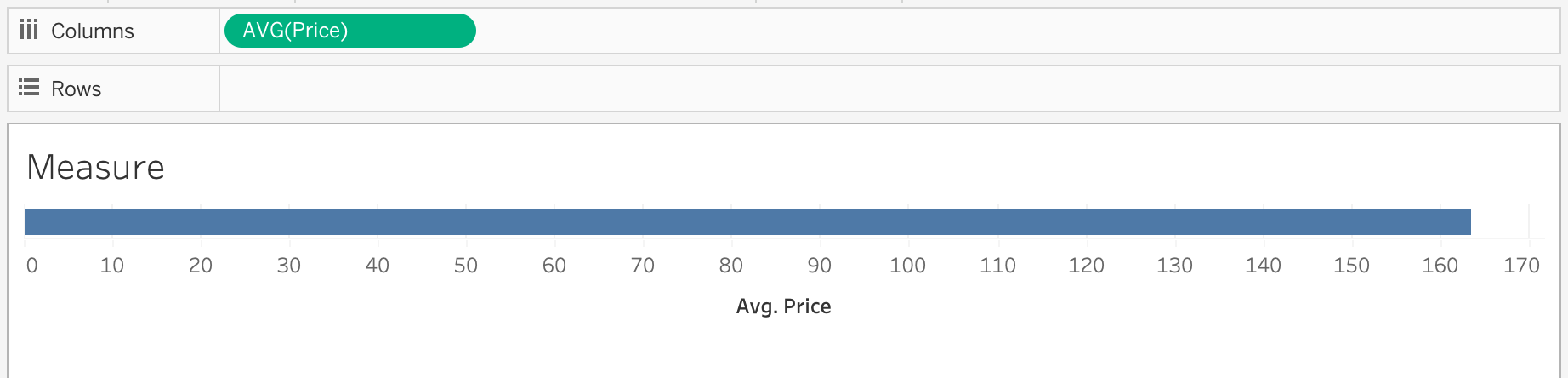
Measures
Measures represent quantitative values that can be calculated or aggregated.
Typical characteristics of measures:
- Usually numeric fields
- Aggregated automatically
- Displayed as green pills
- Create axes in charts
Examples from the Airbnb dataset:
| Field | Description |
|---|---|
| Price | Nightly listing price |
| Beds | Number of beds |
| Number Of Reviews | Total reviews |
| Review Scores Rating | Review score |
Example visualization: Average Price of Listings
Steps:
- Drag Price → Columns
- Right click and choose Measure → Average
Tableau automatically calculates: AVG(Price)
Aggregation of Measures
Measures are aggregated when used in visualizations.
Common aggregation functions include:
| Function | Purpose |
|---|---|
SUM() |
Total value |
AVG() |
Average value |
COUNT() |
Number of records |
COUNTD() |
Distinct values |
MIN() |
Minimum value |
MAX() |
Maximum value |
Using Dimensions and Measures Together
Most visualizations combine dimensions and measures.
General rule:
Dimension → organizes the data
Measure → calculates numeric values
Example: Average Price by Property Type
| Property Type | Avg Price |
|---|---|
| Apartment | 150 |
| House | 180 |
| Loft | 210 |
Discrete vs Continuous Fields
Fields in Tableau can behave as discrete or continuous.
| Type | Appearance | Behavior |
|---|---|---|
| Discrete | Blue pill | Creates categories |
| Continuous | Green pill | Creates an axis |
\[\downarrow\]
| Field | Behavior |
|---|---|
| Property Type | Discrete |
| Price | Continuous |
 |
 |
|---|---|
| Continuous | Discrete |
Workbook Formatting
Workbook formatting controls the visual appearance and consistency of worksheets and dashboards.
Proper formatting improves readability, usability, and professional presentation.
Key formatting areas include:
- Fonts: control text size, style, and hierarchy
- Colors: define color palettes and highlight important data
- Shading: adjust background colors of panes and headers
- Borders: add separation between elements
- Alignment: control positioning of text and labels
- Number formatting define how values are displayed (
currency,percentages,decimals)
Formatting can be applied at multiple levels:
- Worksheet level: affects a single visualization
- Dashboard level: ensures consistency across multiple charts
- Workbook level: applies global styling rules
Common best practices:
- Use consistent fonts across all sheets
- Apply a limited and meaningful color palette
- Align elements for a clean layout
- Avoid excessive gridlines and borders
- Format numbers clearly (e.g., 1K, 1M, percentages)
Formatting tools can be accessed through:
- Format menu in the Menu Bar
- Right-click options within the visualization
- Formatting pane inside Tableau
Proper workbook formatting ensures that dashboards are not only functional but also clear, consistent, and visually appealing.
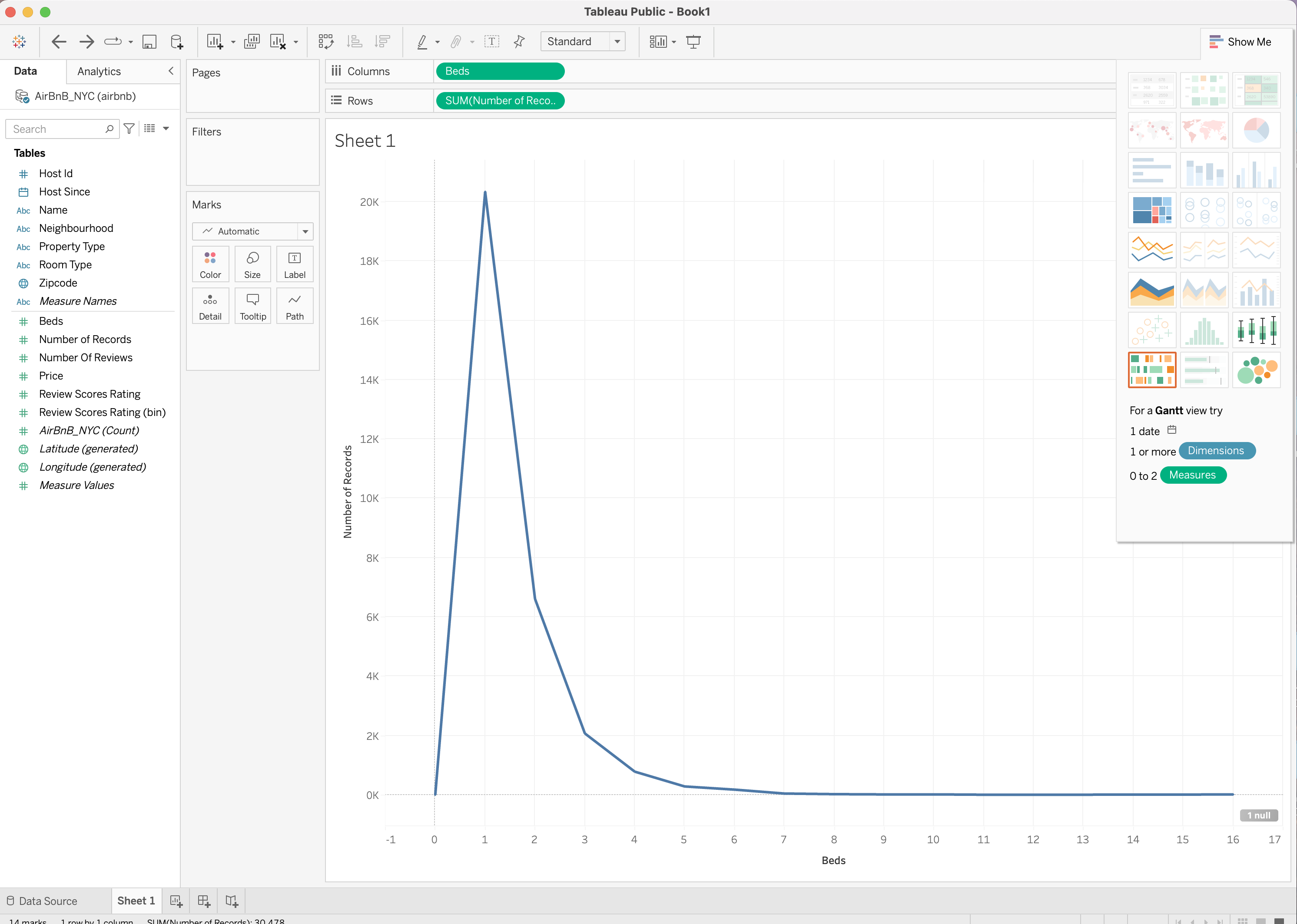
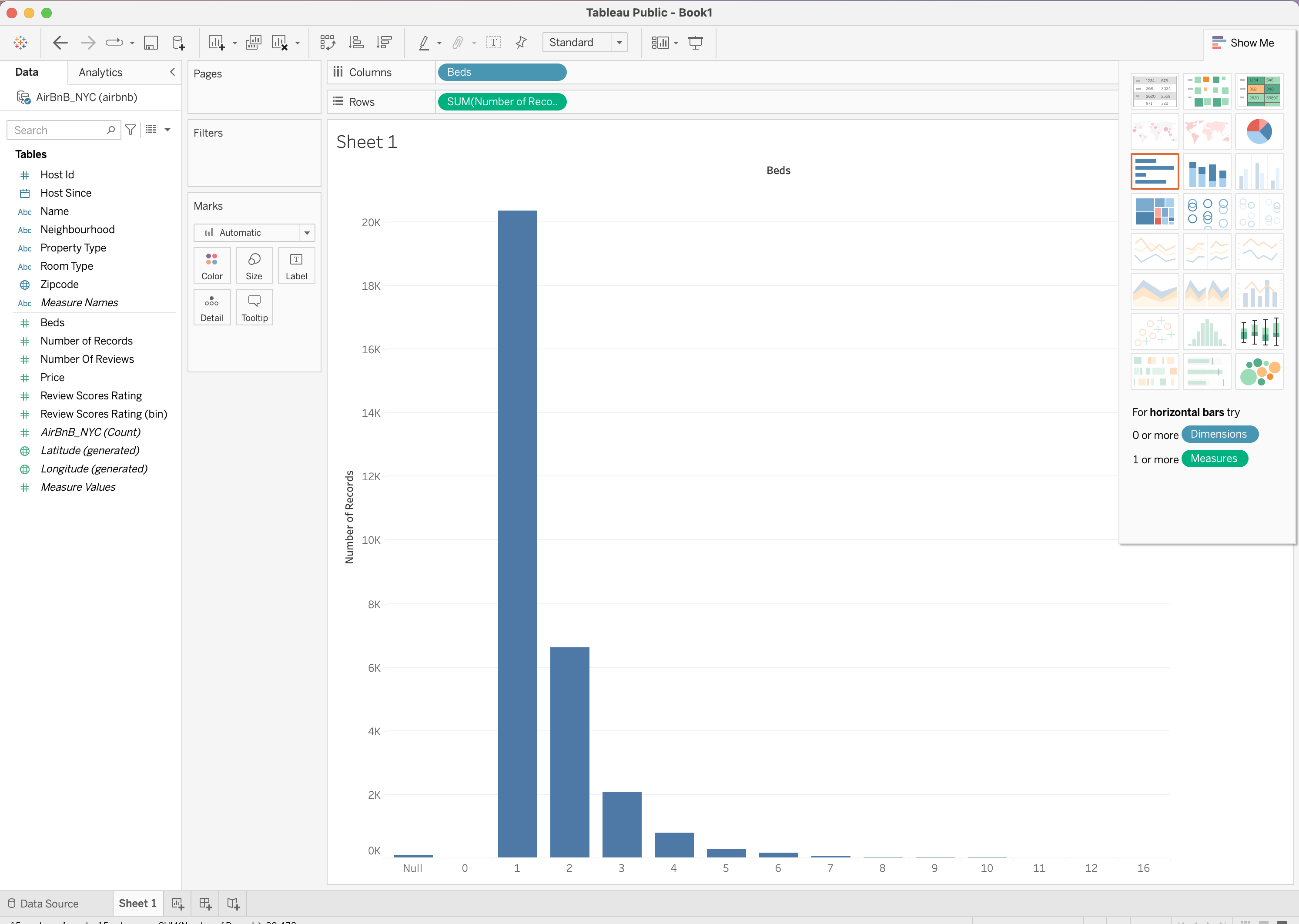
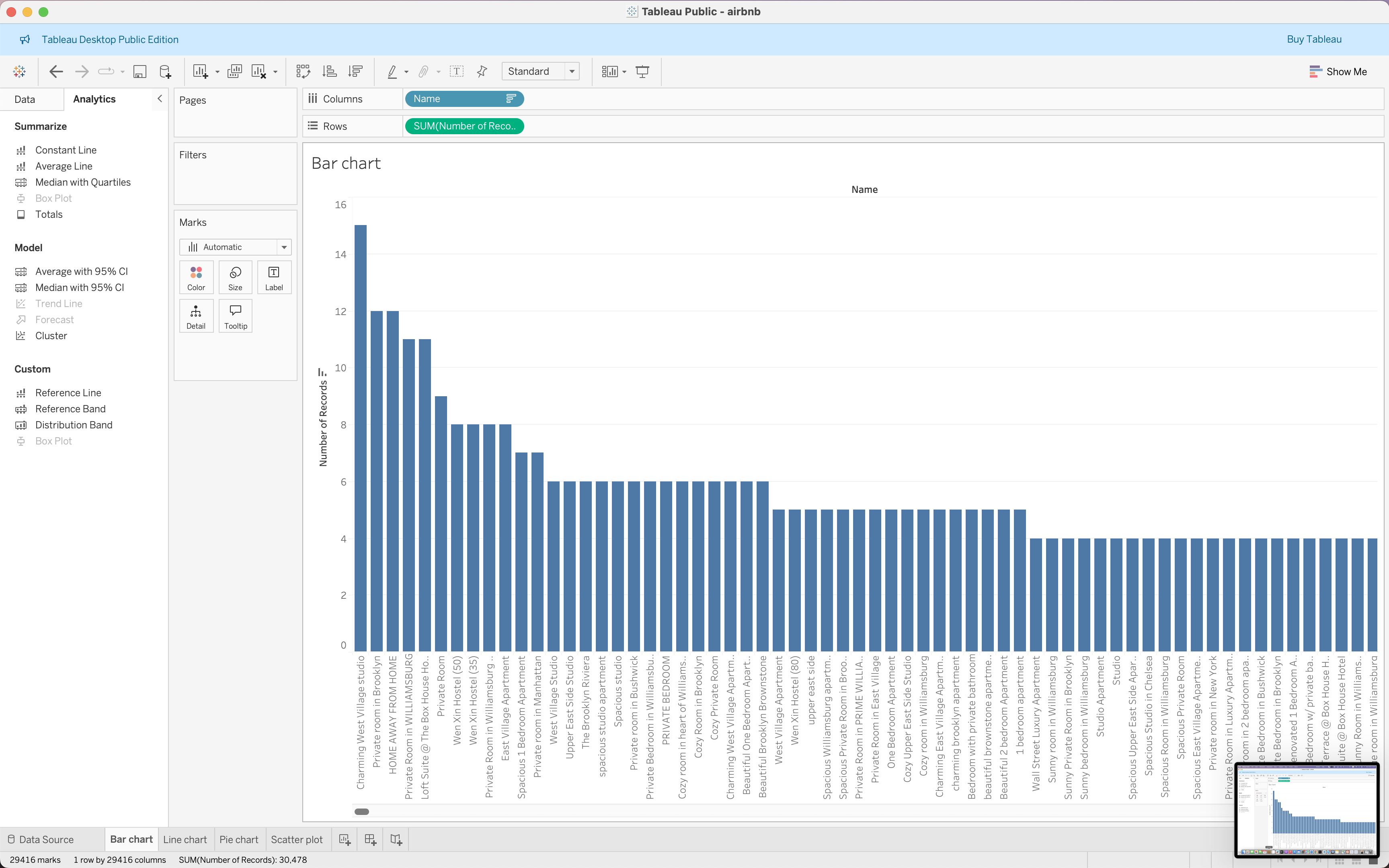
Creating Basic Visualizations
Using the Airbnb dataset we can build several types of charts.
Bar Chart | Listings by Property Type
Question: Which property is most common?
Steps:
- Drag Name → Columns
- Drag Number of Records → Rows
- Sort descending
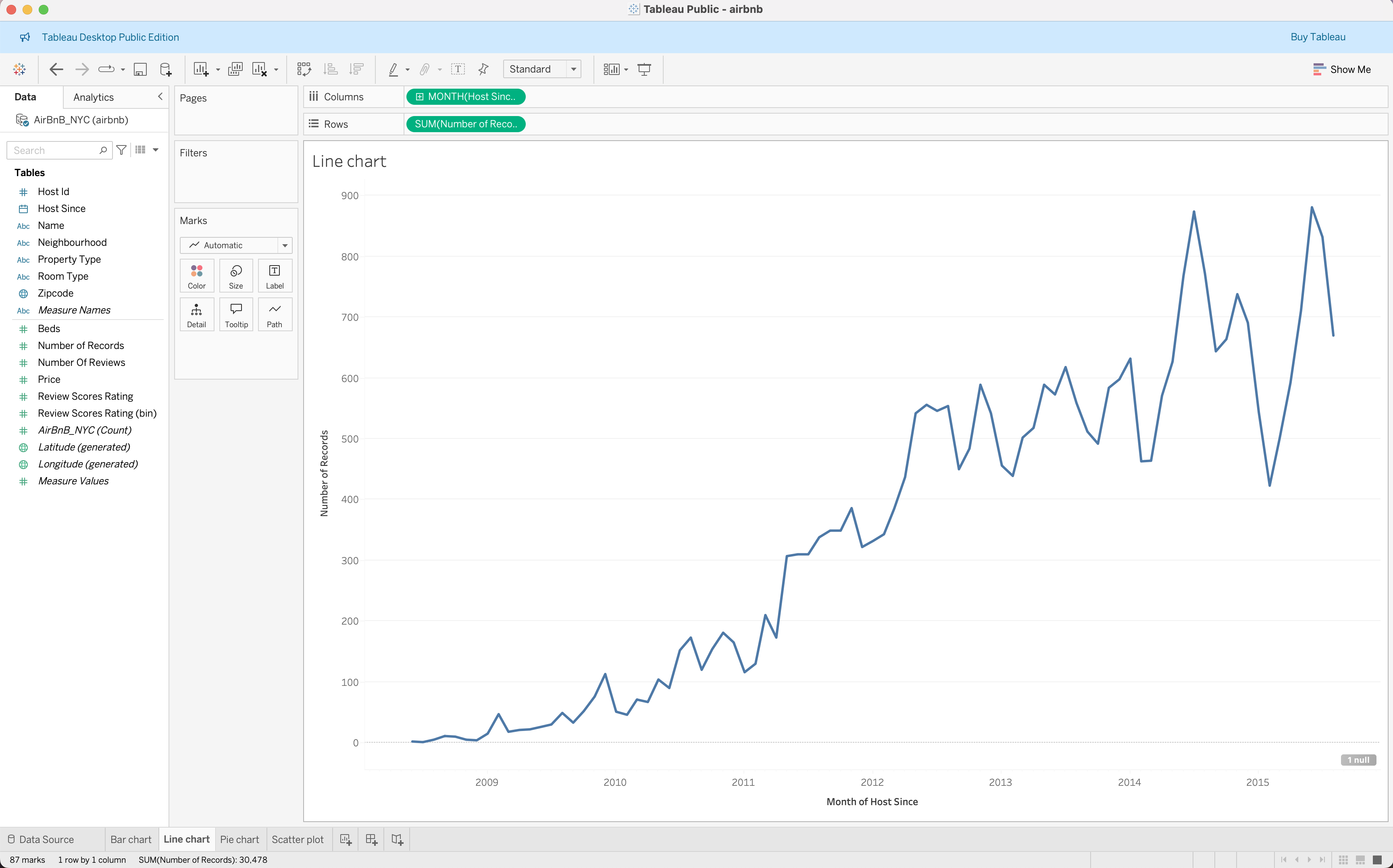
Line Chart | Listings Over Time
Question: How did the number of hosts grow over time?
Steps:
- Drag Host Since → Columns
- Change to Month(Host Since)
- Drag Number of Records → Rows
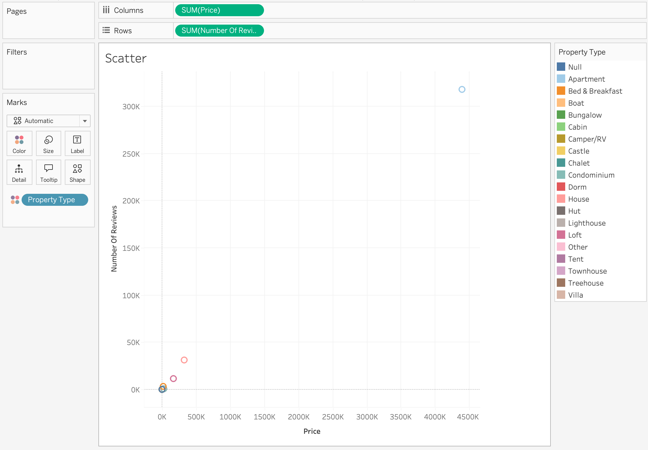
Scatter Plot | Price vs Reviews
Question: Do more expensive listings receive more reviews?
Steps:
- Drag Price → Columns
- Drag Number Of Reviews → Rows
- Drag Property Type → Color
Interactive Visualizations
In data visualization, the terms interactive and dynamic are often used together, but they are not the same.
An interactive visualization allows the user to actively explore the data by changing what they see.
The visualization itself reacts to user actions such as:
- Filtering
- Clicking
- Hovering
- Selecting marks
- Drilling down
- Changing parameters
- Highlighting categories
The user controls the view.
Instead of presenting a single fixed view, interactive dashboards allow users to:
- Focus on specific categories or time periods
- Drill into subsets of the data
- Highlight important segments
- Reorder and reorganize information
This makes dashboards much more useful for data exploration and decision-making.
Several Tableau features enable this interactivity.
| Feature | Purpose |
|---|---|
| Filters | Restrict data displayed |
| Groups | Combine categories |
| Sets | Define subsets |
| Sorting | Control order of values |
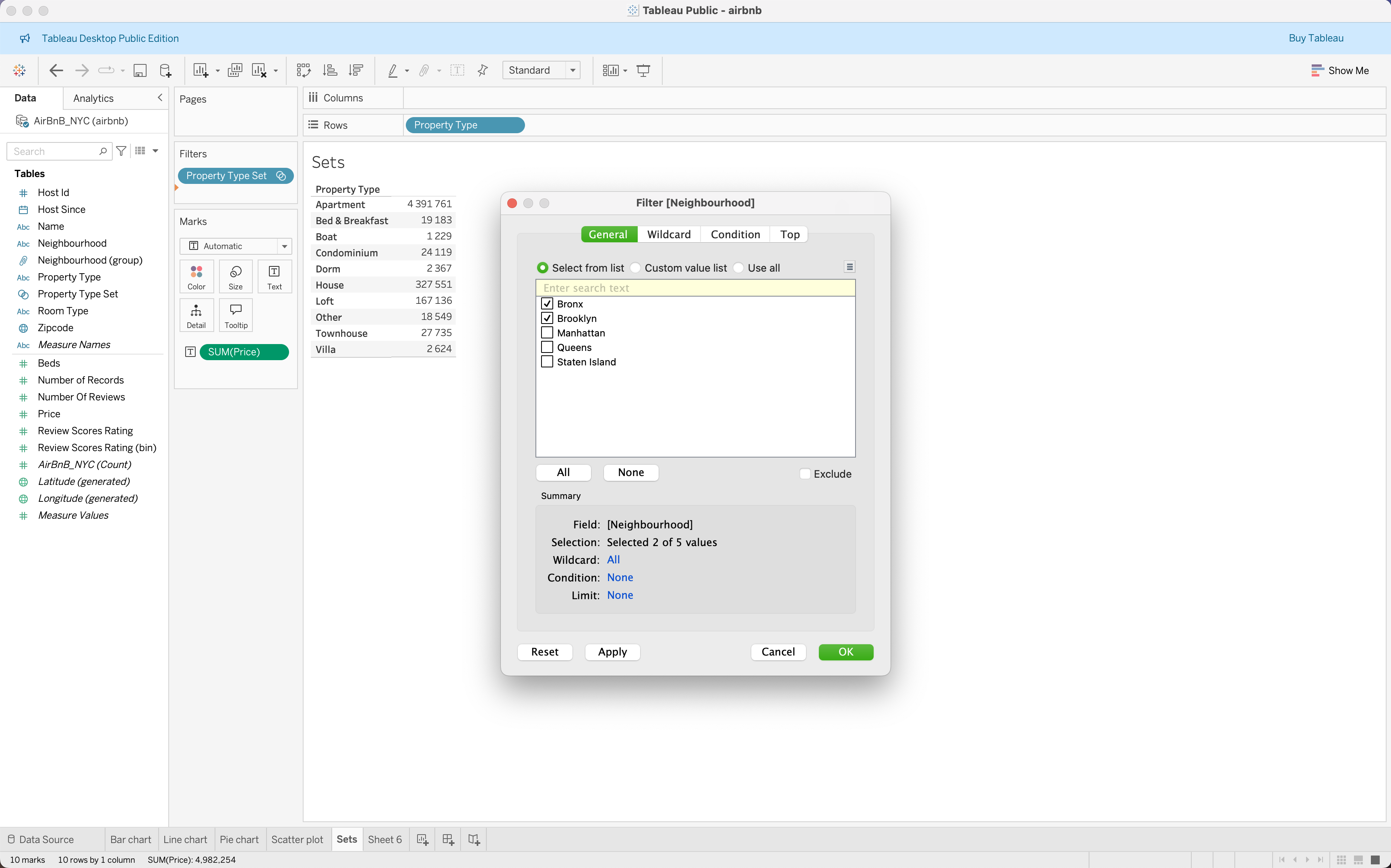
Filters
Filters allow analysts to restrict which data is displayed in a visualization.
They help focus analysis on specific segments of the dataset.
For example, in the Airbnb dataset, a user might want to analyze:
- Listings in a specific neighbourhood
- Listings with price above a certain threshold
- Listings from a specific year
Steps to create a filter:
- Drag a field to the Filters shelf
- Select which values to include
- Optionally show the filter on the dashboard
Example:
Filter listings by Neighbourhood
Neighbourhood = Bronx
Neighbourhood = Brooklyn
Only listings from Bronx, Brooklyn will be displayed.
Filters are commonly used in dashboards to allow user-driven exploration.
Videos
Checkout this video
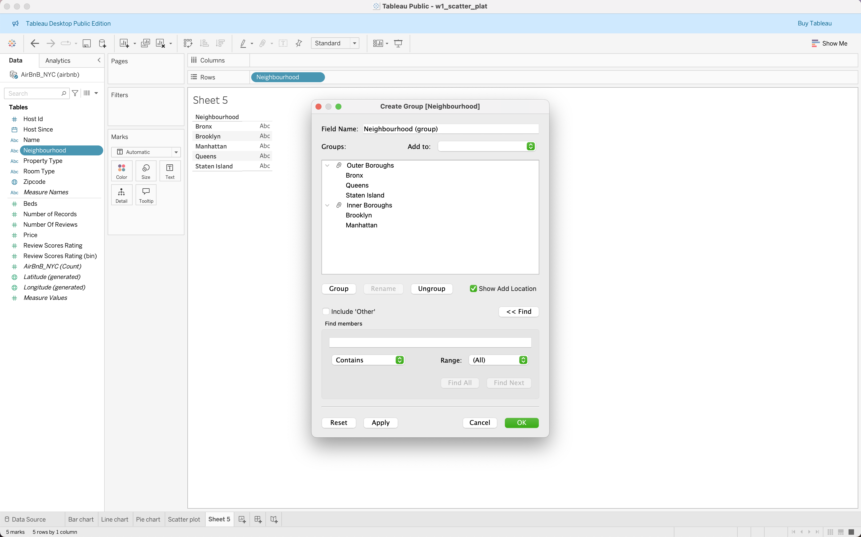
Groups
Groups allow analysts to combine multiple dimension values into a single category.
This is useful when a dataset contains many small categories that should be analyzed together.
Example from the Airbnb dataset:
Several neighbourhoods can be combined into Boroughs:
Inner Boroughs, Outer BoroughsSteps to create a group:
- Select multiple values in a dimension
- Right-click and choose Group
- Rename the group
Groups are helpful for:
- Simplifying complex datasets
- Aggregating small categories
- Creating custom classification structures
Checkout this video
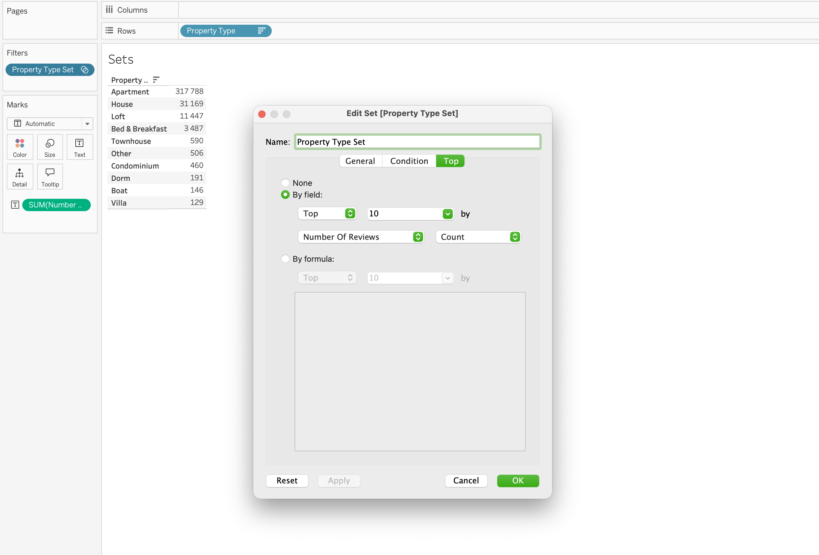
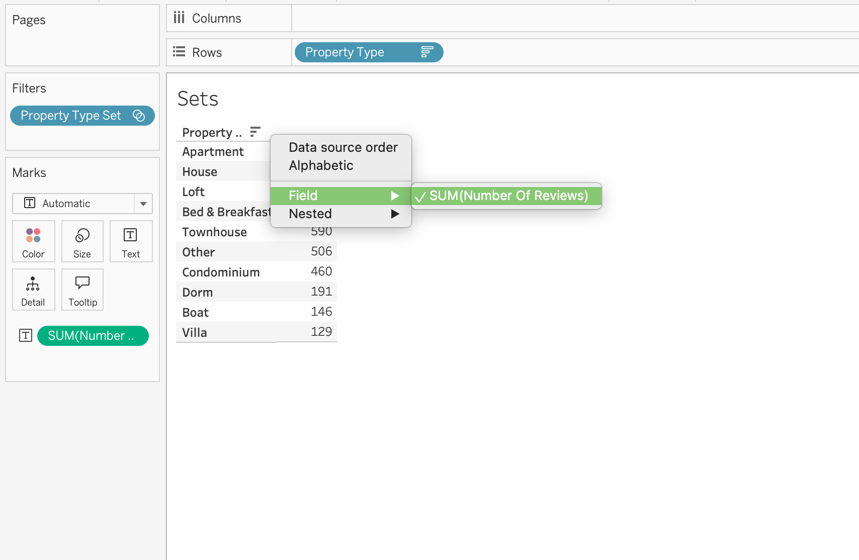
Sets
Sets define a subset of data based on rules or manual selection.
Unlike groups, sets are often dynamic and can change based on conditions.
Examples of sets include:
- Top 10 most expensive listings
- Listings with more than 100 reviews
- Top neighborhoods by average price
Sets are particularly useful for:
- Highlighting important segments
- Creating comparisons between groups
- Supporting advanced calculations
Example: Top 10 listings by Number Of Reviews
Tableau automatically calculates the subset.
Checkout the this video
Sorting
Sorting controls the order in which categories appear in a visualization.
Sorting improves readability and helps highlight patterns.
For example:
Instead of showing property types alphabetically:
Apartment
Bed & Breakfast
Boat
Sorting by number of listings will show:
Apartment
House
Loft
ordered from highest to lowest listing count.
Sorting options include:
- Ascending
- Descending
- Sort by field value
- Manual sorting
Sorting is especially useful in:
- Bar charts
- Ranked lists
- Top-N analysis
Why Interactivity Matters
Interactive dashboards allow users to move from static reporting to exploratory analysis.
Users can:
- Filter the dataset
- Focus on specific segments
- Identify trends quickly
- Explore different scenarios
This capability is one of the reasons Tableau is widely used for business intelligence and analytical dashboards.
Publishing Tableau
In order to be able to publish the Tableau workbook to Tableau public we need to:
- Have Tableau Public account
- Save the Tableau Workbook properly
Tableau File Types
| File Type | Extension | Description |
|---|---|---|
| Workbook | .twb |
Stores visualizations and connections without data |
| Packaged Workbook | .twbx |
Workbook containing embedded data |
| Data Source | .tds |
Connection metadata |
| Packaged Data Source | .tdsx |
Data source with extract |
| Extract | .hyper |
Optimized local data storage |
In the scope of the session we are going to save mostly on .twbx format.
Homework
Using the Airbnb dataset, complete the following:
- Connect to
airbnb.xlsxin Tableau Desktop - Create three charts:
- Bar chart: average Price by Neighbourhood
- Line chart: average Price over time using Host Since
- Scatter plot: Beds vs Price colored by Neighbourhood
- Add one filter filter by Property Type or Room Type
- Format your workbook:
- Apply consistent fonts and colors
- Format Price as currency
- Build a dashboard: combine all three charts into a single view
- Publish to Tableau Public
- Submit your public link to
#homeworkchannel
Resources
GitHub
Tableau Course Code Repository for this session is available in the GitHub repository linked above. It includes:
- Tableau workbook with all examples
- Sample datasets