flowchart LR
A[Global Filters] --> B[Main Charts] --> C[Detailed Views]
D[Side Filters] --> B
Session 04: Dashboard Design & Performance
Strorytelling, Color Theory, UX Principles For Dashboard Design
COLOR THEORY STORYTELLIGN UX PRINCIPLES LAYOUT CONTAINERS
Overview
This session focuses on how to design dashboards that are clear, beautiful, and performant.
Students learn the foundations of visual storytelling, color theory, UX principles, dashboard layout, and types of dashboards used in organizations.
By the end of the class, you should be able to design dashboards that tell a clear story, apply color and layout intentionally, choose the right dashboard type for your audience, and optimize performance for a smooth user experience.
- Visual storytelling principles
- Color theory fundamentals
- UX principles for dashboard design
- Dashboard layout best practices
- Types of dashboards (Operational, Tactical, Analytical, Strategic, Multifunctional / Self-Service)
- Interactive dashboards (Filters, Parameters, Highlights, Actions)
- Performance optimization (reduce extract size, optimize calculations, minimize load time)
Goal
Build an end-to-end business dashboard that:
- Uses consistent layout and color
- Includes filters, parameters, and highlights
- Uses actions (filter, highlight, URL, sheet swapping) to guide the story
Visual Storytelling Principles
\[\text{above all else, show the data}\]
During this session we have already covered the importance of storytelling in data visualization, discussing Tufte’s principles of clarity, integrity, and maximizing the data-ink ratio.
In this section, we will apply these principles specifically to dashboard design.
Minard’s Map of the 1812 Russian Campaign
Charles Joseph Minard’s famous visualization tells the tragic story of Napoleon’s march to Moscow:
- The width of the band represents the army size at each stage.
- The path shows geographic direction.
- The line below shows temperatures during the retreat.
Together, these layers merge six variables into one coherent narrative.
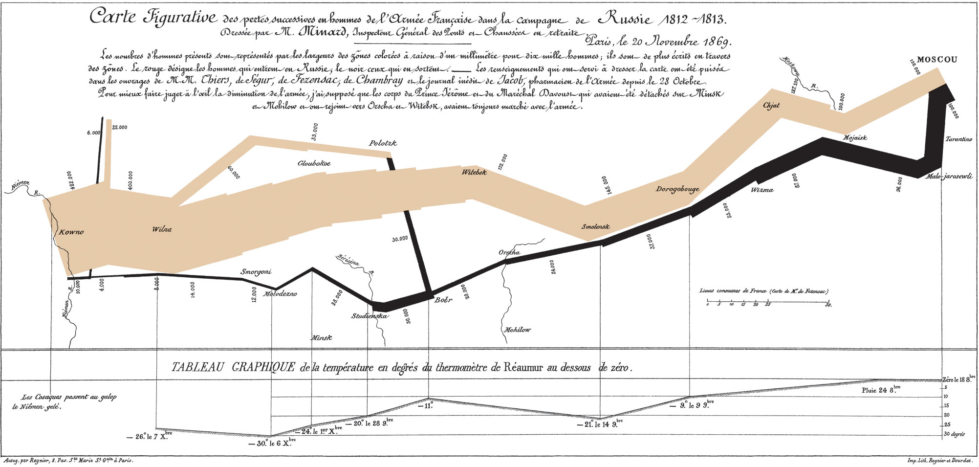
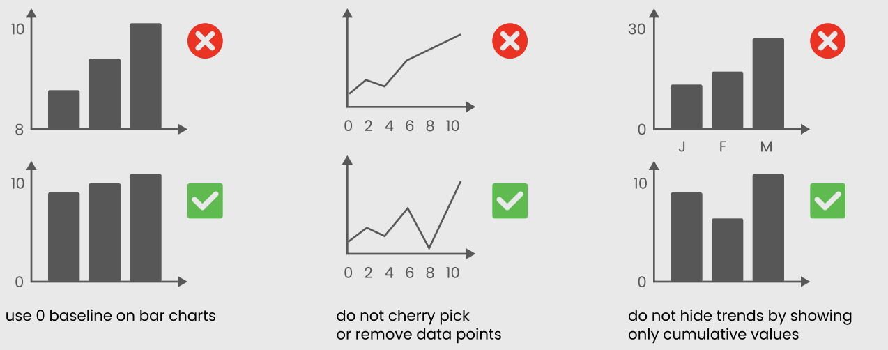
Why it matters:
- Shows that data can convey emotion and consequence, not just numbers.
- Embodies Tufte’s core message: “Above all else, show the data.”
- Demonstrates clarity, precision, and storytelling depth.
TipTufte’s Mindset for Dashboard Design
A single visual can tell a complete story if every element is meaningful.
Small Multiples | Comparing Stories Side by Side
Small multiples are sets of similar charts that share the same scale and layout.
Why they work:
- Make it easy to compare patterns across time, regions, or segments.
- Encourage exploration without overwhelming the viewer.
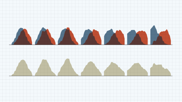
Use repetition and consistent design to show change and contrast across multiple views.
Tufte’s Mindset in Dashboard Design
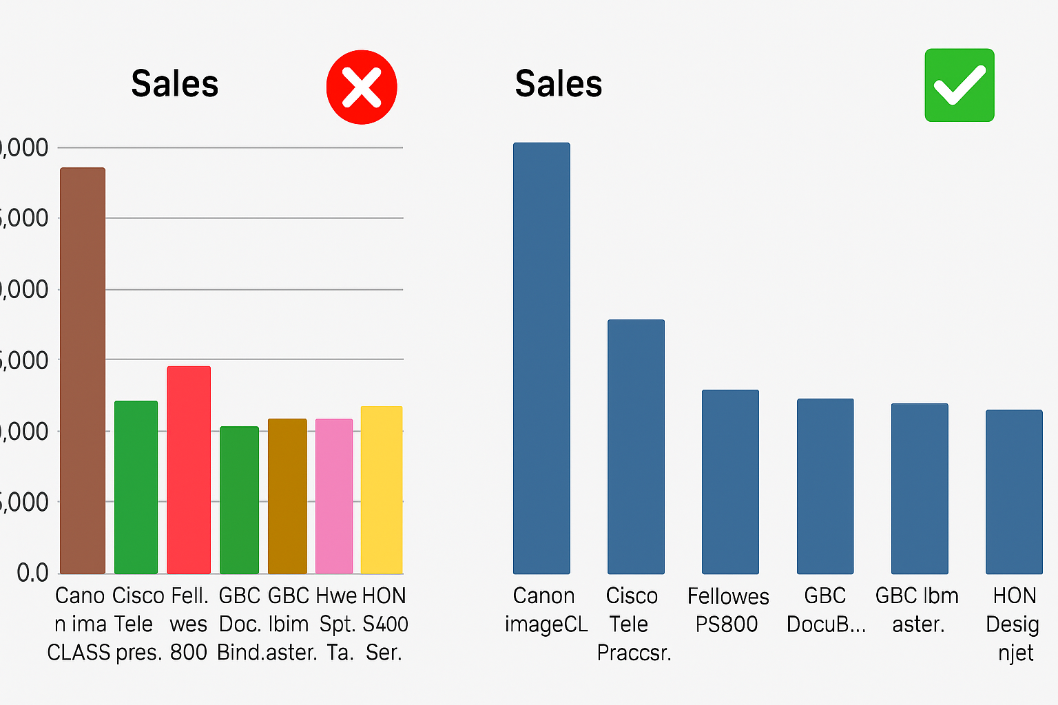
- Focus on the narrative: Highlight insights, not decoration.
- Simplify: Remove any element that doesn’t support the story.
- Use comparison wisely: Small multiples are powerful for showing change.
- Be truthful: Avoid distortion in axes, scales, and annotations.
- Layer context: Use time, geography, and value together when they clarify the story (like Minard’s map).
Color Theory Fundamentals
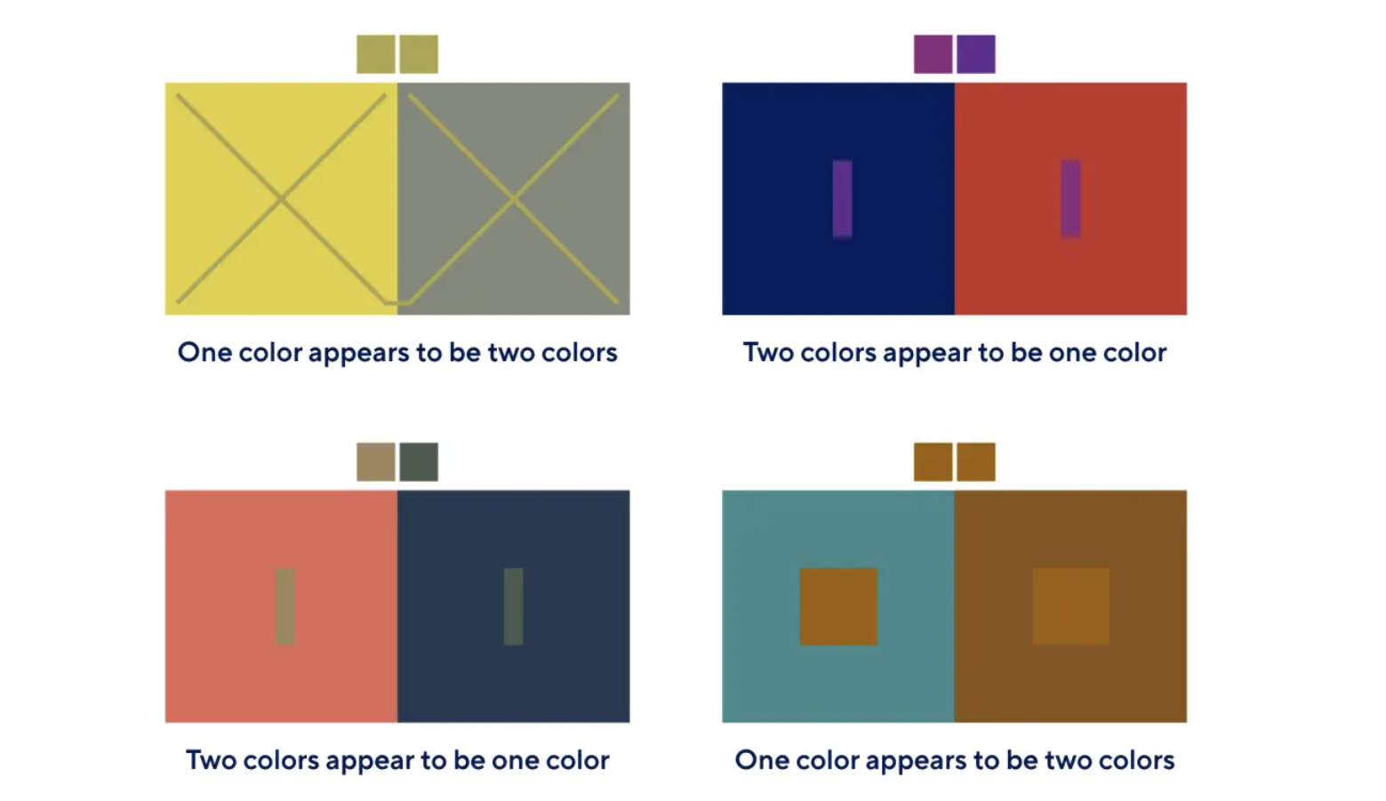
Color is Deceptive
Color perception is context-dependent:
- The same color may appear
lighter/darkerdepending on its background.
- Lighting, screen quality, and surrounding colors influence perception.
When designing dashboard palettes, always consider:
- Context: background, other visuals
- Audience: accessibility, color vision
- Goal: of the visualization
highlightvsneutraltone
Understanding the Color Wheel
The color wheel is a tool for understanding relationships between colors and building harmonious palettes.
It organizes:
- Primary colors: red, blue, yellow
- Secondary colors: green, orange, purple
- Tertiary colors: combinations of primary + neighboring secondary (e.g., blue-green)
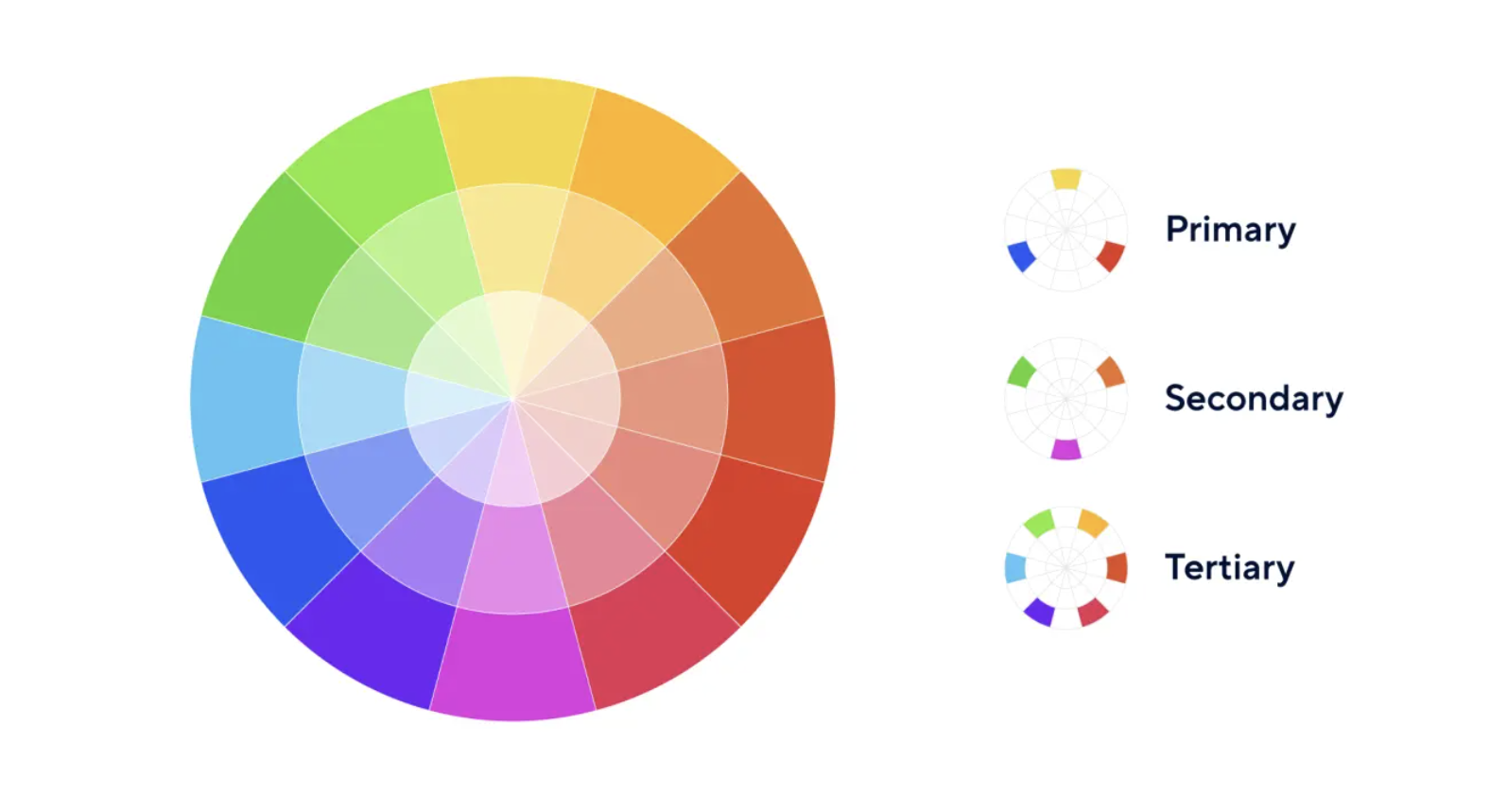
You can experiment with palettes using tools like the Adobe Color Wheel.
- Primary colors: Basic building blocks; cannot be created by mixing (red, blue, yellow).
- Secondary colors: Mixes of two primaries (green, orange, purple).
- Tertiary colors: Primary + neighboring secondary (yellow-orange, blue-green, red-purple).
Tertiary colors give more nuance and flexibility in dashboard palettes.
Color Harmony Schemes for Dashboards
Understanding color relationships helps you create balanced, readable dashboards.
Monochromatic Scheme
- Variations of a single hue (tints, shades, tones).
- Very cohesive, calm, and professional.
- Ideal for minimalist dashboards and background colors.
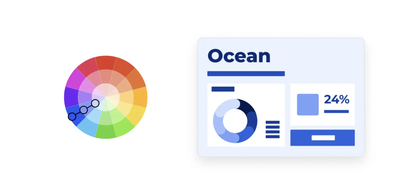
Analogous Scheme
- Uses colors next to each other on the wheel.
- Creates smooth, natural transitions.
- Works well for gradients or multi-series charts with subtle differences.
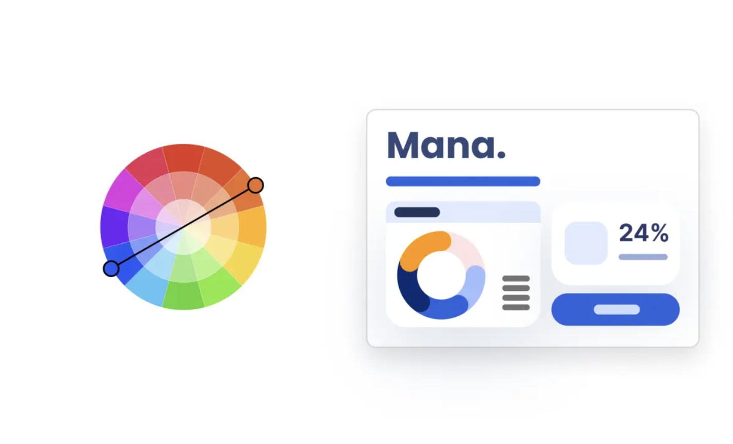
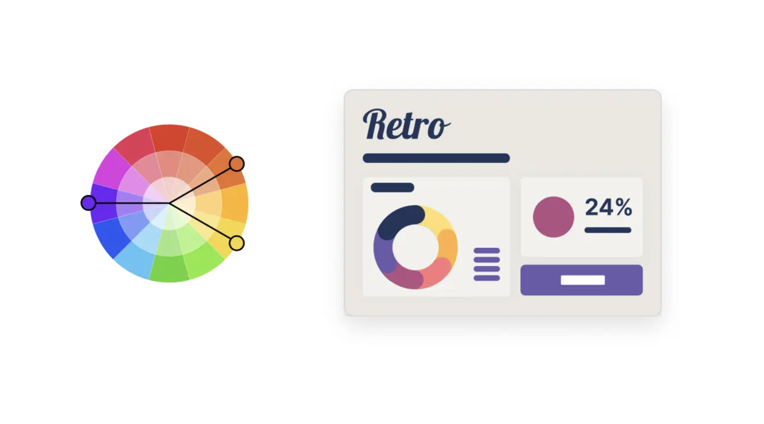
Complementary Scheme
- Colors opposite each other on the wheel.
- High contrast and strong visual energy.
- Great for highlighting key metrics or “good vs bad” signals.
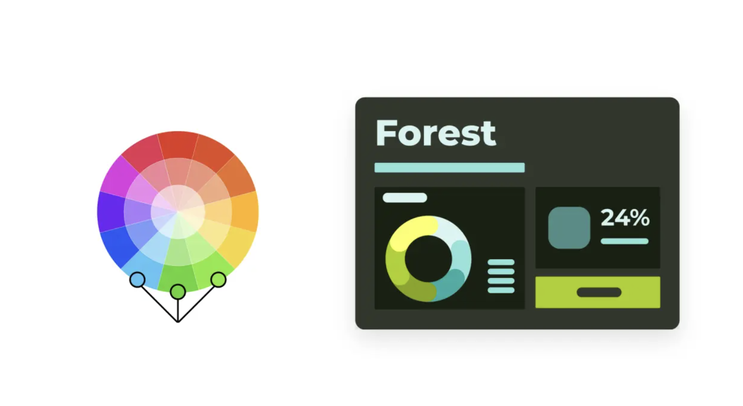
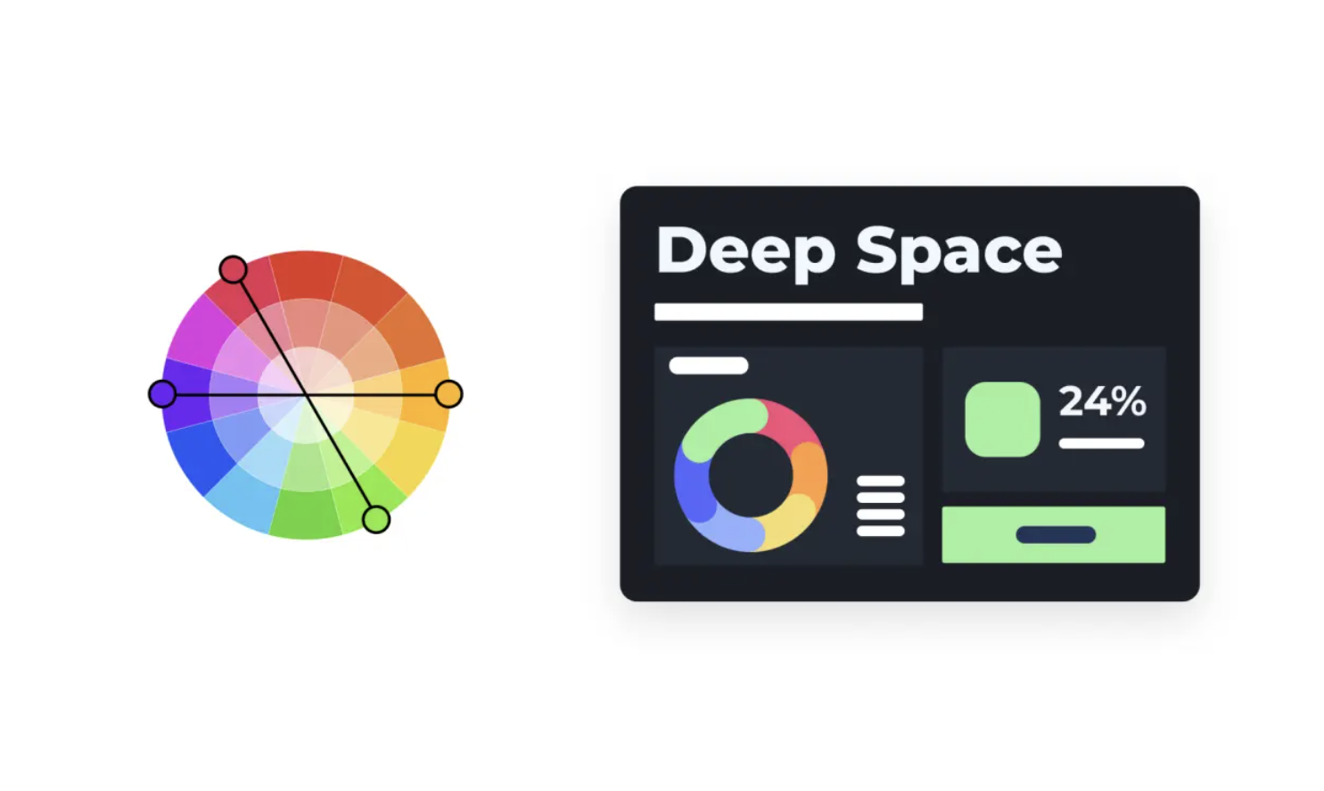
Compound Scheme
- Mix of two or more non-adjacent colors.
- Often forms a rectangle or square on the color wheel.
- Balances variety and harmony.
Tetradic Scheme
- Uses four colors evenly spaced on the wheel.
- Very vibrant and expressive.
- Should be used carefully to avoid visual overload.
Design Principles for Color in Dashboards
Effective dashboards combine color harmony, functionality, readability, consistency, and accessibility.
Color Harmony
Choose colors that work well together and reflect the brand or context.
Limit the number of hues; vary intensity instead.
Functionality
Color should:
- Guide attention
- Signal status (e.g., red vs green)
- Help group related elements
Every color should have a clear role.
Readability
Use color to support comprehension, not to decorate.
Semantic example:
- Green → growth, success, “good”
- Red → decline, risk, “bad”
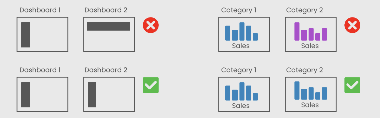
Simplicity Through Consistency
- Reuse the same colors for the same concepts across dashboards.
- Too many colors reduce clarity and create cognitive overload.
Accessibility
Design for users with color vision deficiencies:
- Do not rely on color alone to encode information.
- Ensure strong contrast between foreground and background.
- Test palettes with tools like Coblis.
UX Principles for Dashboard Design
This section summarizes 7 key UX principles for effective dashboards.
1. User-Centricity
Design for specific users and use cases, not for “everyone”.
Ask:
- Who is my audience? (role, data literacy, time)
- What decisions will they make with this dashboard?
- Do they need a quick overview, detailed analysis, or both?
Analysts may want detail and complexity; executives prefer clarity and summaries.
2. Usefulness
A dashboard is only valuable if it supports real decisions or tasks.
Ask:
- Is this dashboard truly needed?
- Does it replace or improve existing workflows (Excel decks, manual reports)?
- Which questions does it answer?
Avoid “dashboard for the sake of dashboard”.
3. Credibility
Users must trust your dashboard.
- Validate data sources.
- Show time stamps or update frequency.
- Avoid misleading charts and titles.
4. Consistency
Consistency makes dashboards predictable and intuitive.
Types:
- Visual: Same colors, fonts, line styles.
- Functional: Interactions (clicks, hovers) behave similarly.
- Naming: Metrics and categories are named consistently.
- Contextual: Align with brand guidelines.
5. Clarity
\[\text{Less is more.}\]
Use Tufte’s data-ink ratio:
- Remove decorative elements and clutter.
- Keep text short and direct.
- Emphasize the most important metrics first.
6. Hierarchy
Visual hierarchy guides the eye through the dashboard.
Use:
- Position: (
top-leftis most prominent)
- Size: (
big = important)
- Contrast: (
boldvssubtle)
- Grouping: (
containers,white space)
TipHierarchy Test
If you squint and still see the main message, your hierarchy works.
7. Accessibility
Make dashboards usable for everyone:
- Use clear fonts (
10–12 pt+).
- Keep layouts simple.
- Don’t rely solely on tooltips or hover for important info.
- Test contrast and color palettes.
Resource: Dataviz Design Checklist
Dashboard Layout Best Practices
Using Layout Containers in Tableau
Containers help you organize, align, and control spacing of dashboard elements.
They are the foundation of a clean and scalable dashboard design.
In tableau there are two types of layout containers:
- Horizontal containers: arrange elements side by side (used for columns or comparisons).
- Vertical containers: stack elements top to bottom (used for sections or storytelling).
1. Adding a Layout Container
- Drag a Vertical or Horizontal Container from the Dashboard pane onto the canvas.
- By default, containers are tiled and snap into position.
- Hold Shift while dragging to create a floating container.
- Apply a temporary background color to visually identify container boundaries during development.
Best practice:
- Start with a main vertical container as the base structure of the dashboard.
- Build all other elements inside it.
2. Container Structure
Containers define the layout hierarchy of the dashboard.
- Single-level containers
- Contain multiple elements in one direction
- Suitable for simple layouts
- Contain multiple elements in one direction
- Nested containers
- Containers placed inside other containers
- Enable complex layouts (e.g., sidebar + main content area)
- Containers placed inside other containers
Best practice:
- Limit nesting to 2–3 levels maximum to avoid complexity and performance issues.
3. Adding Elements
- Use Blank objects first to define spacing and layout structure.
- Replace blanks with:
- Worksheets
- Text objects
- Images or icons
- Worksheets
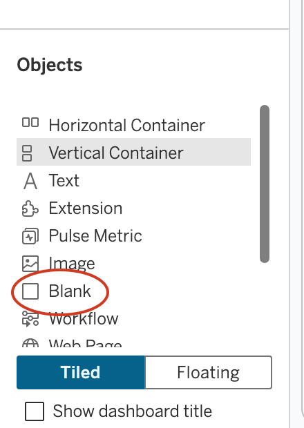
Why use blanks:
- Helps create consistent spacing
- Prevents layout shifts when adding content
Best practice:
- Build layout structure first → then populate with visuals.
4. Orientation and Placement Logic
- Drop on left/right edge → horizontal alignment
- Drop on top/bottom edge → vertical alignment
- Drop in the center → stacked inside container
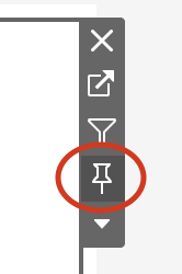
Best practice:
- Use blue placement indicators to control layout precisely.
5. Fitting Visualizations
- Fit Entire View → responsive charts
- Fit Width / Height → controlled resizing
- Standard → fixed size
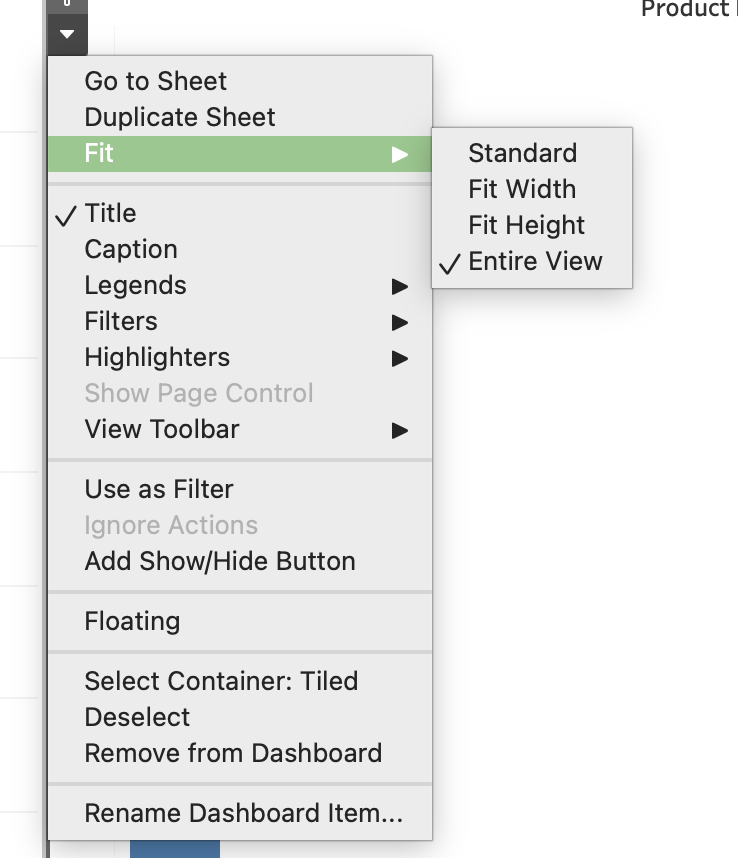 |
 |
 |
|---|---|---|
| Fit Entire View | Fixed Width/Height | Distribute Content |
Additional:
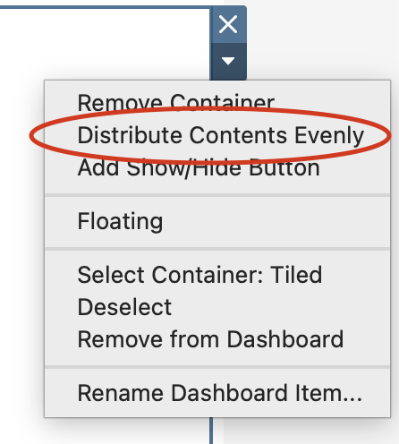
- Use Distribute Evenly for equal spacing
- Use Fixed size when consistency is required
6. Padding and Spacing
- Inner padding → space inside container
- Outer padding → space between elements
Best practice:
- Keep consistent spacing (
4–20 px) across the dashboard.
7. Scaling Options
- Fixed → consistent size (best for presentations)
- Range → adaptive within limits
- Automatic → fills screen (requires testing)
8. Scrollable Dashboards
- Set dashboard height smaller than content
- Use a vertical container
- Tableau adds scroll automatically
Best practice:
- Place key KPIs at the top
- Avoid multiple scroll areas
9. Tiled vs Floating Layout
- Tiled:
- Structured and responsive
- Recommended for main layout
- Structured and responsive
- Floating:
- Free positioning
- Used for KPIs, buttons, overlays
- Free positioning
Best practice:
- Tiled for structure
- Floating for enhancements
10. Dashboard Grid Planning
- Define structure before building
- Choose layout type:
- Top → Revenue, Orders, Customers (KPIs)
- Middle → Sales trend + Category comparison
- Bottom → Detailed table
11. Visual Hierarchy
Visual hierarchy determines how users scan and understand your dashboard.
A well-designed hierarchy ensures that users immediately focus on the most important information.
- Size indicates importance
- Larger elements attract more attention
- Use larger containers for KPIs and key charts
- Larger elements attract more attention
- Position matters
- Top and top-left areas are viewed first
- Place critical insights (KPIs, main trends) at the top
- Top and top-left areas are viewed first
- Grouping related elements
- Place related charts within the same container
- Use proximity to indicate logical relationships
- Example: KPIs grouped in one row, category charts grouped together
- Place related charts within the same container
- Use of white space
- Space between elements improves readability
- Prevents visual clutter
- Helps separate sections clearly
- Space between elements improves readability
- Visual flow: Design dashboards to follow a natural reading pattern:
- Top → summary
- Middle → analysis
- Bottom → details
- Top → summary
Best practice:
- Users should understand the dashboard in 3–5 seconds
- Avoid competing elements of equal importance
12. Consistency Guidelines
Consistency ensures that dashboards are professional, predictable, and easy to use.
Key areas of consistency:
- Alignment
- Align all objects to a grid
- Avoid uneven edges or misaligned containers
- Align all objects to a grid
- Spacing
- Maintain equal spacing between elements
- Use consistent padding values across the dashboard
- Maintain equal spacing between elements
- Typography
- Use consistent font family
- Define hierarchy:
- Title (largest)
- Section headers
- Labels and annotations
- Title (largest)
- Use consistent font family
- Color usage
- Use a consistent color palette
- Assign meaning to colors (e.g., red = decrease, green = increase)
- Avoid unnecessary color variation
- Use a consistent color palette
- Container styling
- Keep consistent:
- Background colors
- Border styles
- Corner radius (if using rounded corners)
- Background colors
- Keep consistent:
Best practice:
- Create a design standard and reuse it across all dashboards
- Consistency reduces cognitive load for users
13. Performance Considerations
Layout and design decisions directly affect dashboard performance.
Key factors:
- Nested containers
- Deep nesting increases rendering complexity
- Makes layout harder to manage
- Deep nesting increases rendering complexity
- Floating objects
- Require additional positioning calculations
- Can slow down rendering, especially when overused
- Require additional positioning calculations
- Number of visuals
- Each worksheet generates a query
- More charts = longer load time
- Each worksheet generates a query
- High mark count
- Charts with many marks take longer to render
- Interactive elements
- Filters and actions trigger additional queries
Best practices:
- Keep layouts simple and structured
- Limit dashboard to essential views
- Use summary views instead of raw-level data
- Optimize heavy charts (aggregation, filtering)
14. Placement of Interactive Elements
Proper placement of interactive components improves usability and user flow.
Guidelines:
- Top section (global controls)
- Date filters
- Global parameters
- High-level selectors
- Date filters
- Side panels (detailed filters)
- Category filters
- Segment selectors
- Drill-down options
- Category filters
- Near related visuals
- Action filters
- Highlight actions
- Context-specific controls
- Action filters
- Logical grouping
- Group filters together
- Avoid scattering controls across the dashboard
- Group filters together
Best practices:
- Place controls where users expect them
- Keep interaction close to the data it affects
- Minimize unnecessary user movement across the dashboard
- Use filter actions instead of too many quick filters
- Ensure interactive elements are intuitive and clearly labeled
15. Rounded Corners (Tableau 2026.1)
Tableau 2026.1 introduces rounded corners for containers, enabling modern dashboard design.
Rounded corners:
- Replace sharp edges with smooth curved corners
- Improve visual aesthetics and readability
TipHow to Apply
- Select a container
- Open the Layout pane
- Adjust corner radius in border/shading settings
Best Practices
- Use consistent radius across dashboard
- Combine with:
- Background color
- Inner padding
- Background color
Recommended values:
5–10 px→ subtle
12–20 px→ card-style design
Use Cases
- KPI cards
- Filter panels
- Section containers
16. Common Layout Mistakes
- Overcrowded dashboards
- Misaligned elements
- Inconsistent spacing
- Too many floating objects
- Multiple scroll areas
Types of Dashboards
Following Stephen Few, we classify dashboards by function:
- Operational
- Tactical
- Analytical
- Strategic
- Multifunctional / Self-Service
Each serves a different decision-making level.
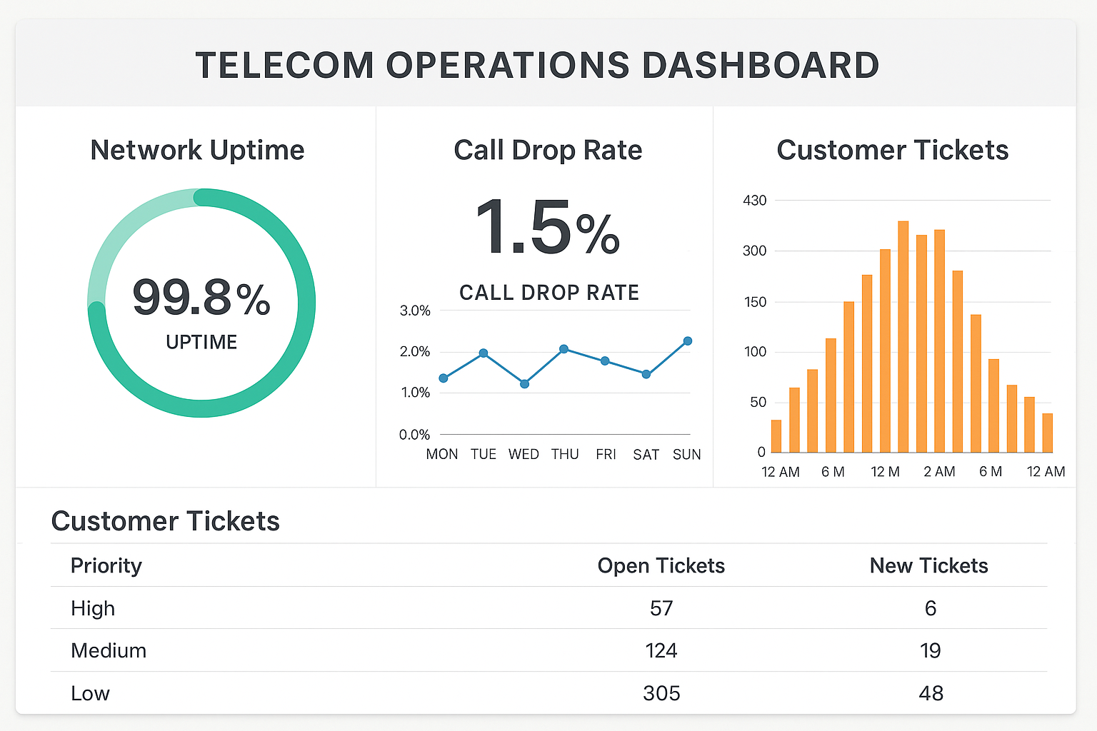
Operational Dashboards
Question: “What is happening right now?”
- Purpose: Monitor day-to-day operations and detect issues as they occur.
- Audience: Frontline staff, operations teams, call center supervisors.
- Example: Telecom operations dashboard with uptime, call drop rate, open tickets.
Common visuals:
- KPI cards with thresholds
- Gauges / bullet charts
- Real-time tables and alerts
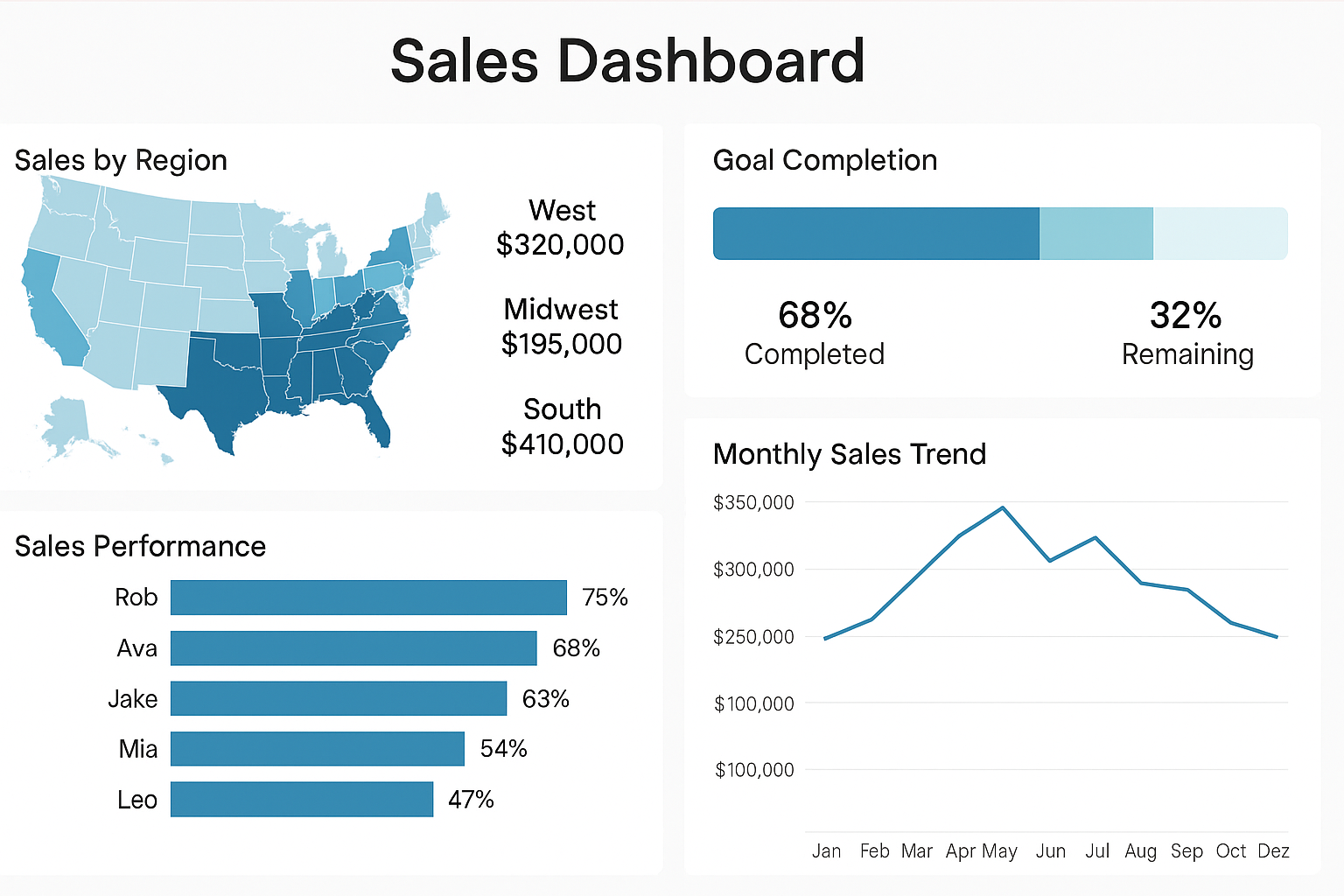
Tactical Dashboards
Question: “How are we performing against our goals?”
- Purpose: Track short- and mid-term performance vs targets.
- Audience: Team leads, department heads, project managers.
- Example: Sales dashboard tracking regional results vs monthly targets.
Common visuals:
- Variance-to-target bars
- Trend lines by month/quarter
- Progress bars by region/team
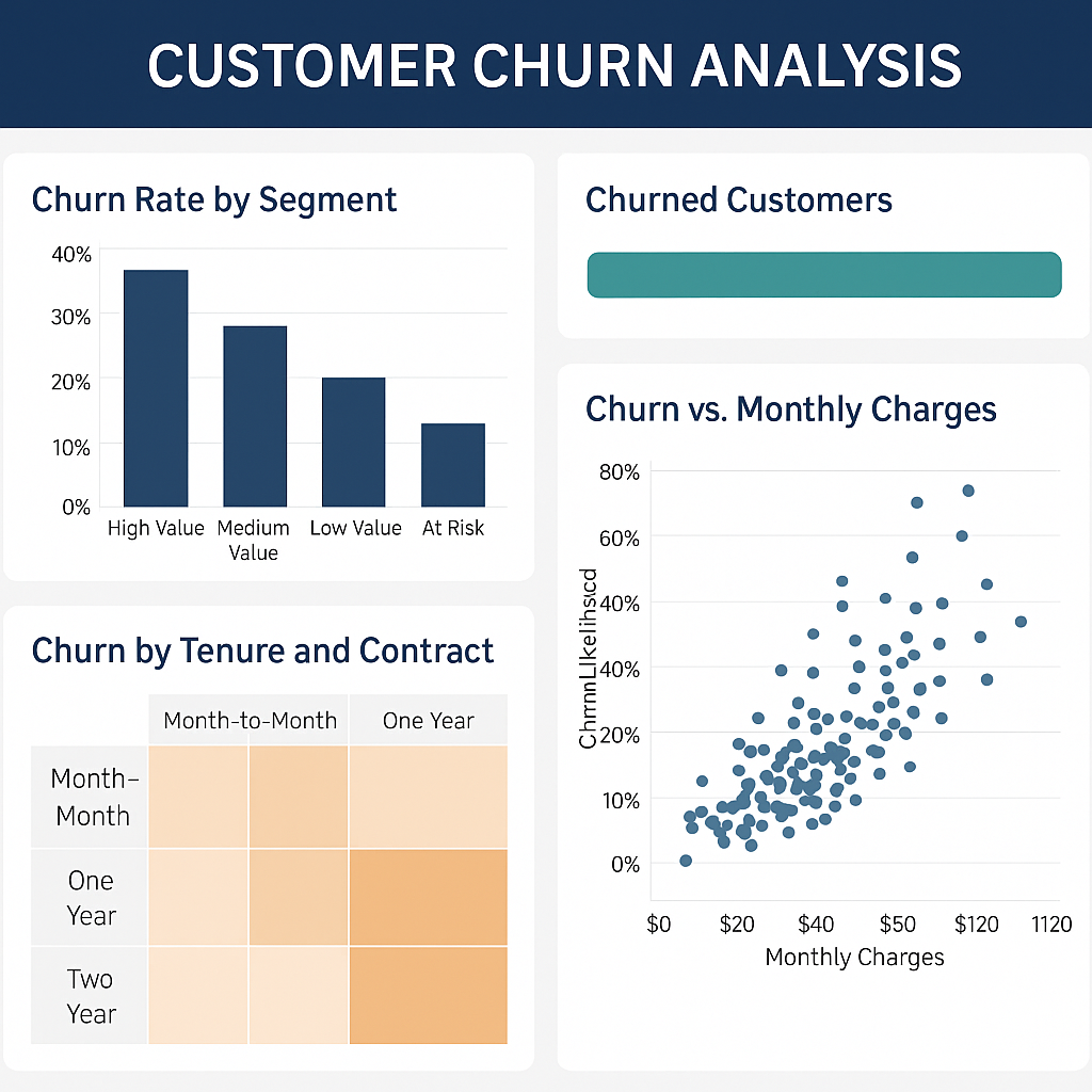
Analytical Dashboards
Question: “Why is this happening?”
- Purpose: Explore data deeply, detect patterns, and understand root causes.
- Audience: Data analysts, BI teams, advanced users.
- Example: Churn dashboard showing which segments are at higher risk and why.
Common visuals:
- Heatmaps
- Scatter plots
- Cohort charts
- Drillable tables
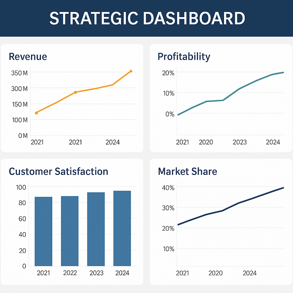
Strategic Dashboards
Question: “Where are we heading?”
- Purpose: Provide a high-level view of organizational performance and strategy.
- Audience: Executives, directors, board members.
- Example: Executive dashboard with revenue, profitability, market share, and satisfaction over time.
Common visuals:
- KPI scorecards
- Trend lines & forecasts
- High-level maps and summaries
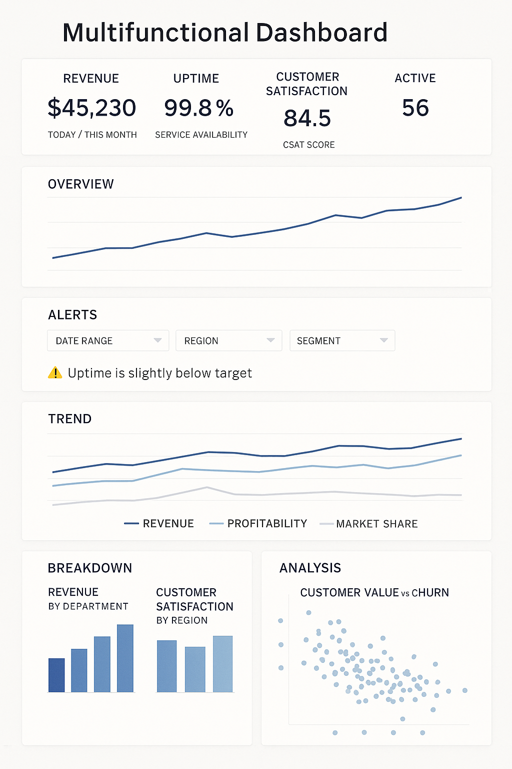
Multifunctional Dashboards
Some dashboards combine elements from several types.
Purpose: Allow users to access multiple levels of insight in one place.
Example:
- Top section → Overview (strategic KPIs + operational health).
- Lower sections → Detailed analysis (trends, breakdowns, drill-downs).
Best practice: design these as scrollable dashboards with clear sections.
Dashboard Type Summary
| Type | Question | Audience | Update Frequency | Focus | Example KPI |
|---|---|---|---|---|---|
| Operational | What’s happening now? | Frontline teams | Real-time | Efficiency | Average handling time |
| Tactical | Are we meeting our goals? | Managers | Weekly / Monthly | Performance | Sales vs target |
| Analytical | Why is this happening? | Analysts | On-demand | Insight & causes | Churn drivers |
| Strategic | Where are we heading? | Executives | Monthly / Quarterly | Outcomes | Revenue growth |
Tableau Dashboard Creation
In Tableau, a Dashboard is a workspace that combines multiple worksheets, filters, legends, and interactive components into a single analytical interface. Dashboards allow analysts to present different perspectives of data in one place and enable users to explore insights through interaction.
Dashboard creation involves designing the layout, responsiveness, visual formatting, and interactivity of visualizations so users can easily interpret and explore the data.
When creating dashboards, analysts configure:
- Dashboard size and responsiveness
- Layout containers and object positioning
- Dashboard objects
- Visual formatting and styling
- Interactive dashboard actions
A well-designed dashboard enables users to quickly identify patterns, compare metrics, and drill into detailed insights.
Tableau Dashboard Interface Sections
The Tableau Dashboard workspace is divided into several sections that help analysts
- design layouts
- add visualizations
- manage dashboard components.
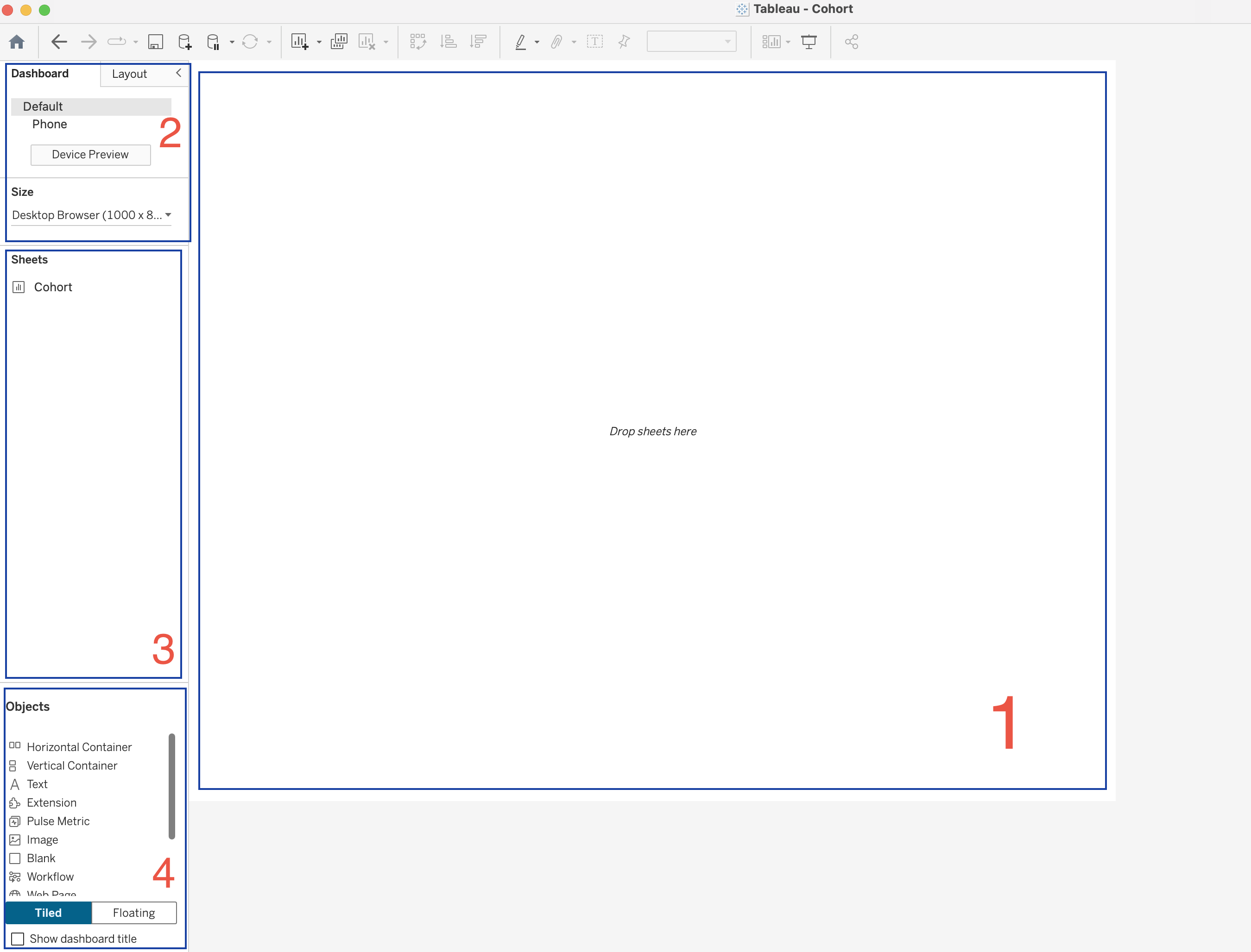
1. Dashboard Canvas
The Dashboard Canvas is the central workspace where the dashboard is built.
When a dashboard is empty, Tableau displays the message:
Drop sheets hereThis area is used to:
- Place worksheets
- Arrange visualizations
- Add filters and legends
- Organize layout containers
- Design the final dashboard layout
Worksheets are dragged from the Sheets panel and dropped into this canvas.
2. Dashboard Settings Panel
The Dashboard Settings panel allows users to configure the overall dashboard properties.
Device Layout
Device layouts allow dashboards to be optimized for different screen types.
Options include:
- Default (Desktop layout)
- Phone layout
- Device Preview
This ensures dashboards remain readable across different devices.
Dashboard Size
The Size option controls the overall dimensions of the dashboard.
Desktop Browser (1000 × 800)Tableau provides three size options.
| Size Mode | Description |
|---|---|
| Automatic | Dashboard resizes according to screen size |
| Fixed Size | Dashboard maintains constant dimensions |
| Range | Dashboard scales between minimum and maximum sizes |
3. Sheets Panel
The Sheets panel lists all worksheets available in the workbook.
Worksheets represent visualizations such as:
- charts
- tables
- maps
- KPI indicators
- cohort analysis views
To add a worksheet to the dashboard:
- Drag the worksheet from the Sheets panel
- Drop it onto the Dashboard Canvas
Multiple worksheets can be combined to create a complete analytical dashboard.
4. Objects Panel
The Objects panel contains elements that help structure dashboards and add interactivity. These objects appear in the lower left part of the Dashboard pane.
Dashboard objects help organize the layout, add information, and enable interaction.
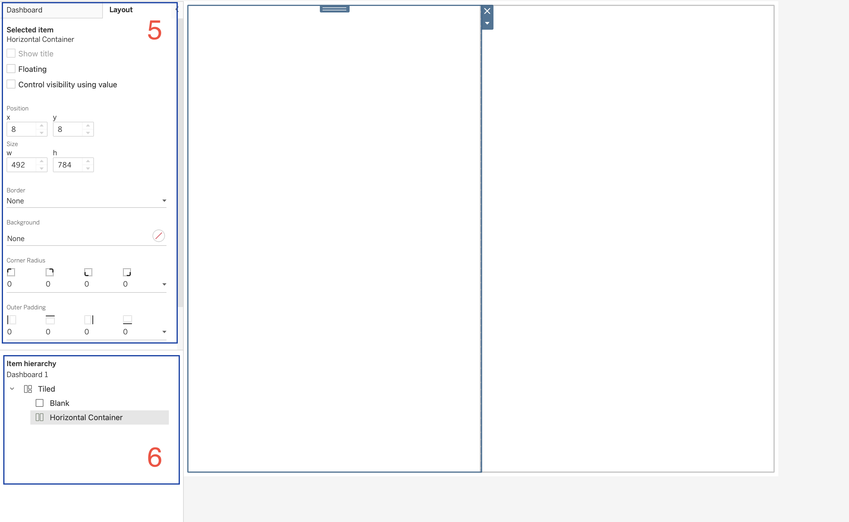
5. Layout Panel
The Layout panel allows configuration of properties for the selected dashboard object.
Properties include:
| Property | Description |
|---|---|
| Position | X and Y coordinates |
| Size | Width and height |
| Border | Border styling |
| Background | Background color |
| Corner Radius | Rounded container corners |
| Padding | Space around objects |
These settings allow precise control of dashboard layout.
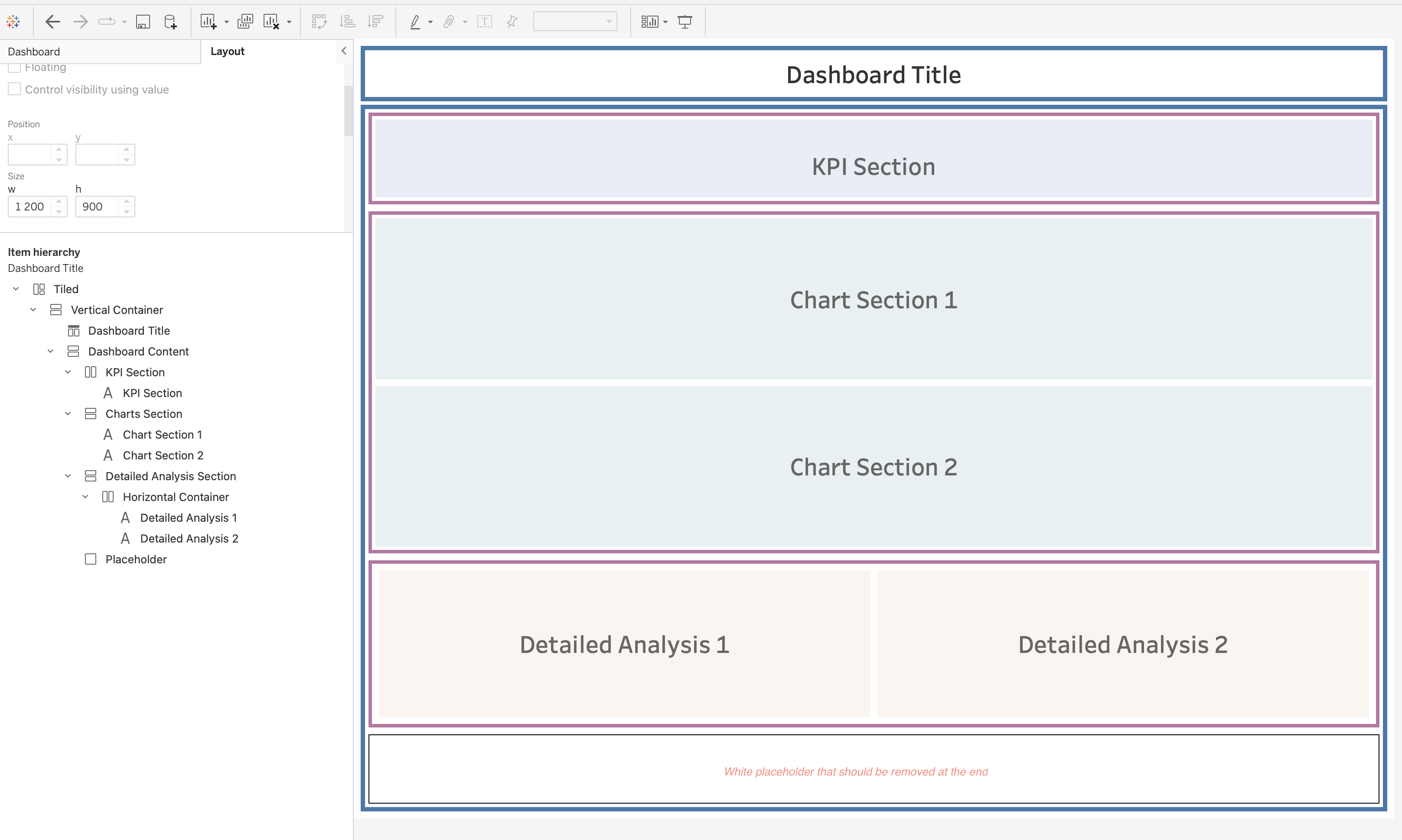
6. Item Hierarchy
The Item Hierarchy panel displays the structure of objects within the dashboard.
Example structure:
Dashboard
   Tiled
      Blank
      Horizontal Container
The hierarchy panel helps users:
- understand dashboard structure
- manage nested containers
- select objects within complex layouts
Layout Containers
Containers are the backbone of dashboard design.
They allow multiple objects to be grouped together and aligned properly.
| Container | Description |
|---|---|
| Horizontal Container | Arranges objects side-by-side |
| Vertical Container | Stacks objects vertically |
Containers can hold:
- worksheets
- text
- images
- other containers
Containers support advanced features such as:
- Show/Hide buttons
- Dynamic Zone Visibility (introduced in newer Tableau versions)
This allows dashboards to show or hide entire sections depending on user interaction.
Text Object
The Text object is a simple text box used to display information.
Common uses include:
- Dashboard titles
- Section headers
- Explanatory notes
- Footnotes
- Dynamic labels
Text objects can also be dynamic by inserting parameter values.
Example use:
If a dashboard allows selecting a custom date range, the selected start and end dates can be inserted into the text box to display the current filter range.
Image Object
The Image object is one of the most versatile dashboard objects.
Images can be used for:
- Company logos
- Navigation buttons
- Background images
- Custom icons
- Alerts or visual indicators
Images can be linked to:
- Local files
- Image URLs
Images can also function as navigation buttons by linking them to URLs or dashboards.
This makes them useful for creating custom interactive interfaces.
Blank Object
The Blank object is an empty dashboard element.
Although simple, it is extremely useful for layout design.
Blank objects can be used to:
- Add white space
- Create separators
- Improve alignment
- Hide dashboard elements
Blank objects can be colored, resized, or used as layout placeholders.
Extension Object
The Extension object allows third-party developers to add additional functionality to Tableau dashboards.
Examples of extensions include:
- custom visualizations
- advanced formatting tools
- embedded code editors
- custom styling options
Extensions can be downloaded from Tableau Exchange and added to dashboards.
There are two types of extensions:
| Type | Description |
|---|---|
| Sandboxed | Hosted securely by Tableau |
| Network-enabled | Can access external systems |
When using network-enabled extensions, it is important to review data security settings.
Web Page Object
The Web Page object functions as a mini web browser within the dashboard.
It can display:
- external websites
- documentation
- embedded applications
- maps
Web Page objects can be static or dynamic.
Dynamic web pages can update based on URL actions triggered by user interaction.
Download Object
The Download object allows users to export data from dashboards.
Export options include:
| Export Type | Description |
|---|---|
| Crosstab | Export data table (Server / Cloud only) |
| Image | Export dashboard as PNG |
| Export workbook or dashboard | |
| PowerPoint | Export dashboards as slides |
This feature is often required by stakeholders who need data snapshots for reporting.
Add Filters Extension
The Add Filters extension allows dashboard users to choose which filters they want to display.
Instead of creating multiple dashboard versions, users can dynamically select filters relevant to them.
Example:
Different users may want different filters:
- one group filters by date and location
- another group filters by sales and profit
The Add Filters extension allows each user group to configure filters themselves.
Dashboard Actions
Dashboard Actions allow visualizations to interact with each other.
Actions are configured using:
Dashboard → Actionsflowchart LR A[User Interaction] --> B[Dashboard Action] B --> C[Filter Action] B --> D[Highlight Action] B --> E[Navigation Action] B --> F[Parameter Action] B --> G[URL Action] B --> H[Set Action]
Filter Actions
Filter actions allow one worksheet to filter another worksheet.
Example workflow:
- User selects a category in a chart
- Other charts update to show related data
Highlight Actions
Highlight actions emphasize related data across visualizations without filtering the data.
URL Actions
URL actions allow dashboards to open external web resources.
Examples include:
- linking to product pages
- connecting to external systems
Parameter Actions
Parameter actions allow interactions to update parameter values dynamically.
Set Actions
Set actions allow users to dynamically modify sets through interaction.
This enables:
- dynamic segmentation
- interactive comparisons
- scenario analysis
Resources
Github Repo
Tableau Course Code Repository for this session is available in the GitHub repository linked above. It includes:
- Tableau workbook with all examples
- Sample datasets
Videos
Containers | Must Watch
P