flowchart LR A[Customer ID] --> B[Find First Invoice Date] B --> C[Assign Cohort Month] C --> D[Calculate Months Since First Purchase] D --> E[Measure Retention or Sales] E --> F[Build Cohort Heatmap]
Tableau Session 03: Advanced Analytics
ADVANCED CALCULATIONS
DATE FUNCTIONS
COHORT ANALYSIS
SPATIAL ANALYTICS
DATA MODELING
TABLEAU PREP
Learning Goals
- Use advanced Tableau functions for analytical modeling
- Build complex calculated fields
- Apply table calculations (running totals, percent of total, ranking, differences, moving averages)
- Work with advanced date logic and date parameters
- Build cohort and retention analysis views
- Perform spatial analysis and spatial joins
- Connect and visualize geographic data
- Apply Tableau data modeling concepts from Session 2 in more complex use cases
- Build advanced KPI dashboards and analytical heatmaps
In previous sessions, we focused on building visualizations, working with filters and parameters, and creating calculated fields. We also introduced key concepts such as relationships, joins, and Level of Detail expressions, which form the foundation of analytical work in Tableau.
In this session, we move from building charts to building analytical logic inside Tableau. Instead of focusing only on how data is displayed, we focus on how calculations are performed, how different components interact, and how to ensure that results remain accurate across different analytical scenarios.
This shift allows us to move from simple dashboards to more advanced analytical systems, where calculations, date logic, and data modeling work together to answer more complex business questions.
Advanced Table Calculations
In real analytical scenarios, calculations rarely rely on a single function. Instead, they combine multiple layers of logic, including aggregation, table calculations, conditional expressions, and sometimes date logic. These are referred to as complex calculations.
Complex calculations are used when simple aggregations such as SUM or AVG are not sufficient to answer analytical questions. They allow analysts to model behavior such as growth rates, comparisons across time, cumulative metrics, and conditional ranking.
A key characteristic of complex calculations is that they often combine multiple computation stages, where:
- Some parts are calculated at the row or aggregate level
- Other parts are computed as table calculations after aggregation
Understanding this layered computation is essential for building correct analytical models.
Combining Aggregation with Table Calculations
One of the most common patterns in complex calculations is combining aggregation with table calculations.
For example, calculating the percentage contribution of each category over time:
RUNNING_SUM(SUM([Order Total])) / WINDOW_SUM(SUM([Order Total]))This calculation combines:
- Aggregation:
SUM([Order Total])
- Running accumulation:
RUNNING_SUM
- Total window comparison:
WINDOW_SUM
This type of calculation is often used to understand cumulative contribution.
Nested Table Calculations
Tableau allows nesting of table calculations, where one table calculation is used inside another.
For example, calculating percent difference between consecutive running totals:
RUNNING_SUM(SUM([Order Total])) - LOOKUP(RUNNING_SUM(SUM([Order Total])), -1)This calculation combines:
- A running total
- A lookup to the previous value
Nested calculations like this are powerful but require careful configuration of partitioning and addressing.
Conditional Table Calculations
Complex calculations often include conditional logic to control behavior dynamically.
For example, showing only positive growth:
IF SUM([Order Total]) - LOOKUP(SUM([Order Total]), -1) > 0 THEN
    SUM([Order Total]) - LOOKUP(SUM([Order Total]), -1)
END
This type of logic allows analysts to highlight specific patterns such as growth periods.
Window Functions
Window functions perform calculations across a defined range of data within a partition.
These are essential for complex analytics.
Moving Average
WINDOW_AVG(SUM([Order Total]), -3, 0)Calculates average over the last 4 periods (offset -3 to 0 means the current period plus 3 previous periods = 4 total).
Window Sum
WINDOW_SUM(SUM([Order Total]))Calculates total within the partition.
Window Max
WINDOW_MAX(SUM([Order Total]))Finds the maximum value within a window.
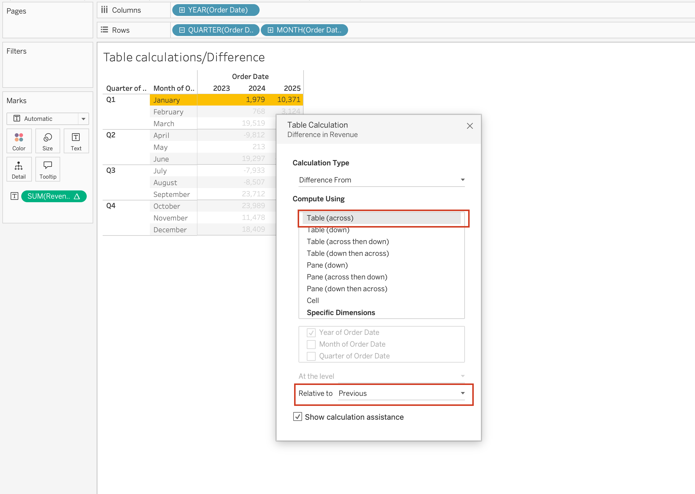
Difference and Percent Difference
Complex calculations often involve comparing values across time or categories.
Difference
SUM([Order Total]) - LOOKUP(SUM([Order Total]), -1)Percent Difference
(SUM([Order Total]) - LOOKUP(SUM([Order Total]), -1))
/ LOOKUP(SUM([Order Total]), -1)
These calculations are used for:
- Growth analysis
- Trend comparison
- Performance tracking
Multi-Level Calculations
Complex calculations often operate across multiple levels of detail within the same view.
For example:
- Category-level aggregation
- Within-region ranking
- Across-time accumulation
This requires careful control of partitioning and addressing to ensure that calculations are applied correctly at each level.
Interaction with View Structure
One of the most important aspects of complex table calculations is that they are highly dependent on the structure of the view.
Changes such as:
- Adding a dimension
- Changing sort order
- Modifying layout
can significantly alter the result.
Because of this, it is important to always validate:
- Partitioning fields
- Addressing fields
- Compute Using configuration
Table Calculations
When you add a table calculation, you must account for all dimensions in the level of detail.
Each dimension must be used either for:
- Partitioning (scoping), or
- Addressing (direction)
Partitioning Fields (Scope)
Partitioning fields define how the data is grouped before the table calculation is applied.
- They break the view into multiple sub-tables (partitions)
- The table calculation is performed separately within each partition
- They determine the scope of the calculation
In other words, partitioning controls where the calculation resets.
Addressing Fields (Direction)
Addressing fields define how the calculation moves within each partition.
- They determine the direction of the calculation
- They control the sequence of marks used in calculations such as:
- Running totals
- Differences between values
- Percent change
- Running totals
In short, addressing controls how the calculation progresses.
How Partitioning and Addressing Work Together
- Partitioning fields split the view into multiple sub-views (sub-tables).
- The table calculation is applied independently inside each partition.
- The addressing fields determine the direction in which the calculation moves through the marks within each partition.
For example:
- In a running total, addressing determines the order of accumulation.
- In a difference calculation, addressing determines which value is compared to which.
Common Table Calculations
Table calculations are widely used in analytical dashboards to understand trends, comparisons, and rankings.
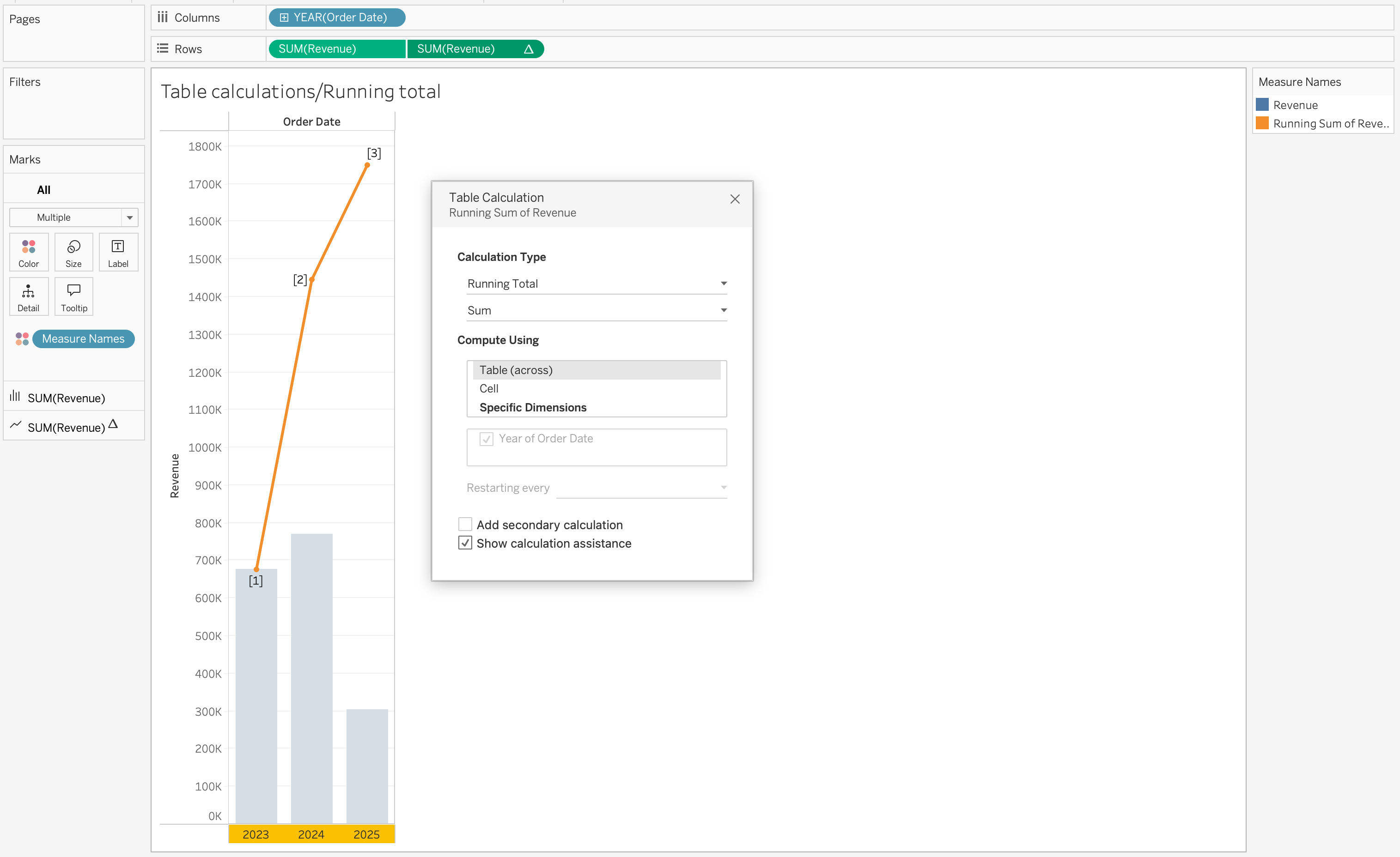
Running Total
Running totals accumulate values across a defined direction.
RUNNING_SUM(SUM([Order Total]))This is commonly used to track cumulative metrics such as revenue growth over time.
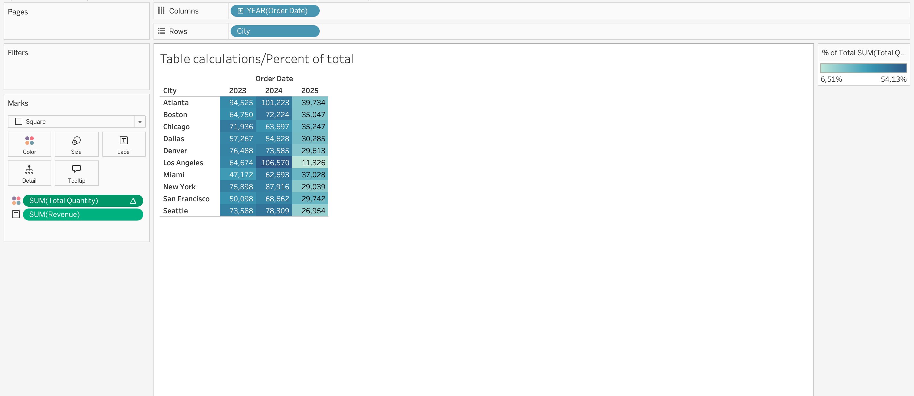
Percent of Total
Percent of total calculates each value’s contribution relative to the total.
SUM([Order Total]) / TOTAL(SUM([Order Total]))This is useful for understanding share distribution across categories or regions.
Rank
Ranking assigns a position to values based on a selected measure.
RANK(SUM([Order Total]))This is often used for identifying top or bottom performers.
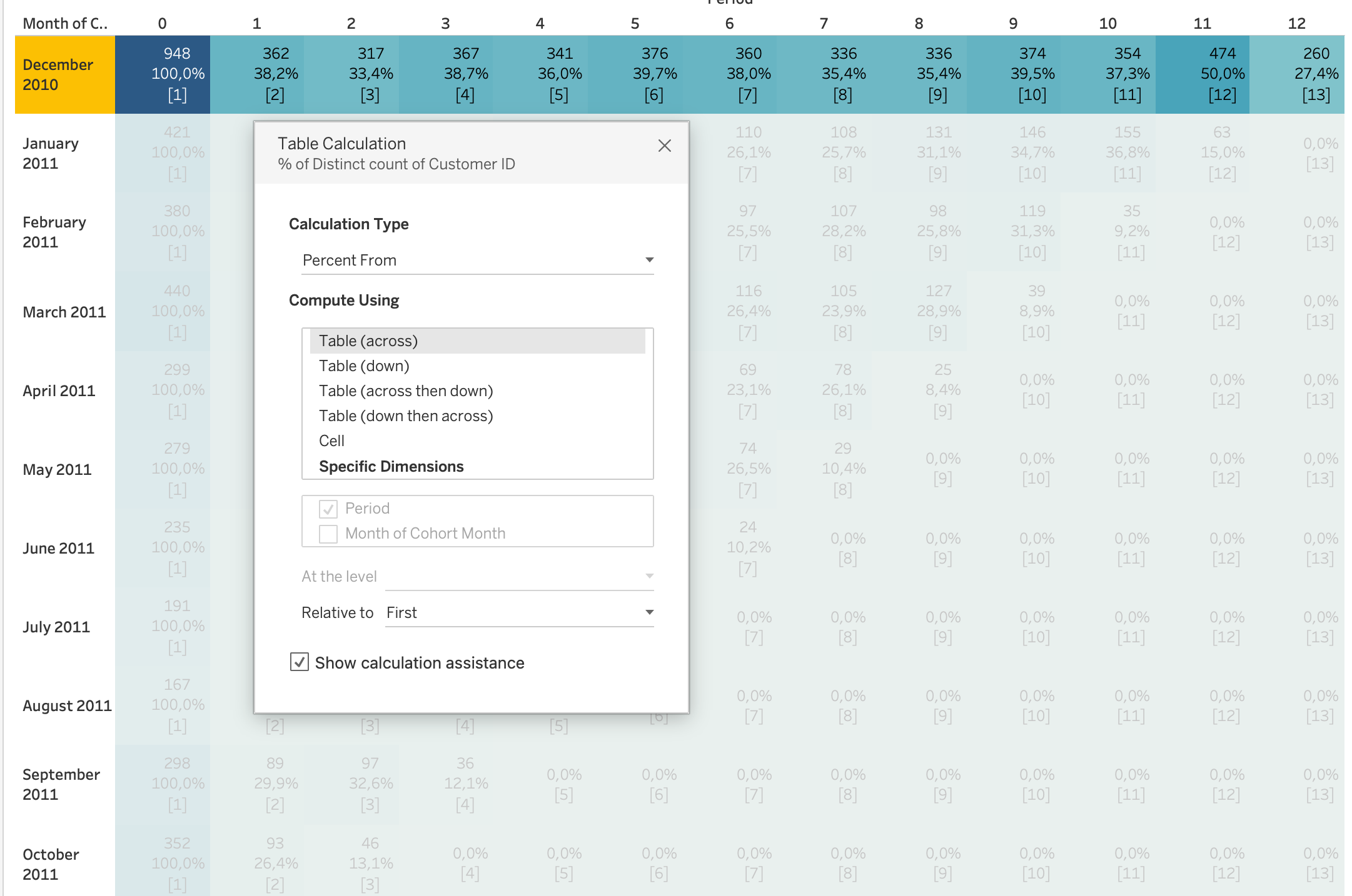
Specific Dimensions vs Compute Using
When using Compute Using options, Tableau automatically assigns some dimensions as:
- Partitioning fields
- Addressing fields
However, when selecting Specific Dimensions, you must manually decide:
- Which dimensions define the partition (scope)
- Which dimensions define the addressing (direction)
![]()
![]()
In the Specific Dimensions section of the Table Calculation dialog:
- The order of fields determines the direction of movement through the marks:
Pane (Down)
- Checked dimensions define how Tableau computes the table calculation across the view:
Year of Order Date,Region
Tip
A helpful mental model:
- Partitioning = Where does the calculation reset?
- Addressing = In what order does it move?
Understanding this distinction is essential for correctly configuring running totals, rankings, percent differences, and other table calculations.
More Examples of Table Calculations
Using Table Calculations on Marks card fields
When you place a table calculation on the Marks card Color, the table will be colored based on the measure on the view SUM(Revenue), while the table calculation on Color SUM(Total Quantity) will determine how those values are visually encoded.
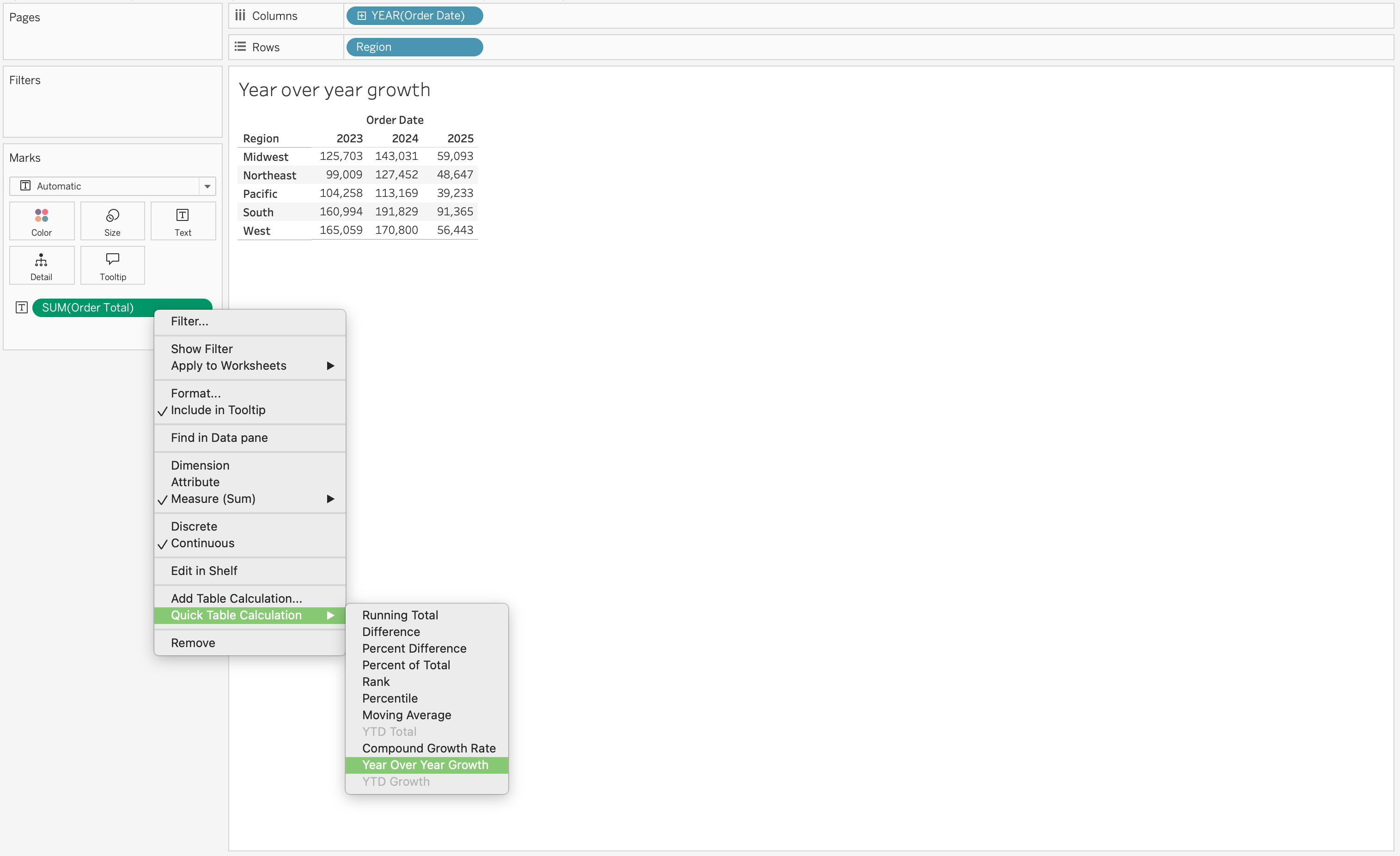
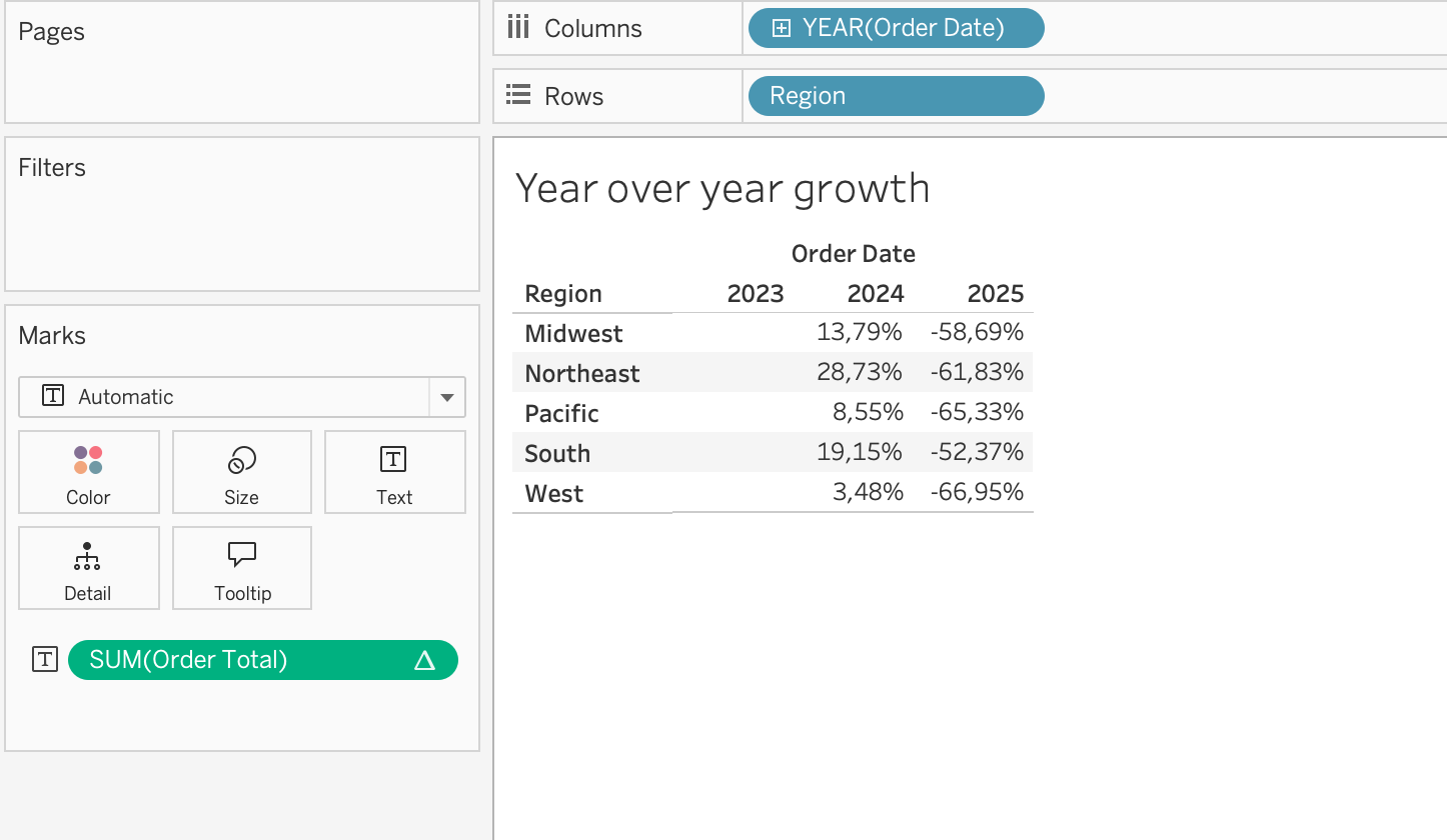
Year-over-year growth is another common use case. If you place SUM(Revenue) on the view and apply a table calculation for year-over-year growth, Tableau will compute the change in revenue across periods based on the addressing direction.
Using Table Calculations on Rows or Columns fields
When you place a table calculation on the Rows or Columns shelf, Tableau modifies the structure of the visualization.
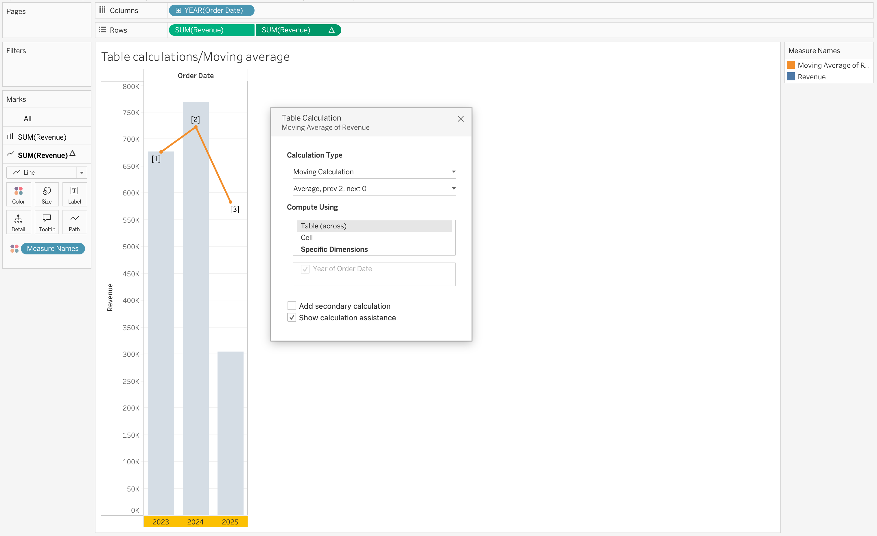
For example, adding a moving average to SUM(Revenue) introduces a smoothed trend line that helps identify patterns over time.
Using Table Calculations on Filters
When you place a table calculation on the Filters shelf, Tableau filters the results after aggregation.
For example, applying a ranking calculation allows you to filter the view to show only the Top N values based on a measure such as Revenue.
This is commonly used in scenarios where users want to focus on the highest-performing categories, customers, or regions.
Date Functions
Dates are a common element in most data sources.
If a field contains recognizable dates, Tableau automatically assigns it a Date or Date & Time data type and enables special functionality.
When date fields are used in visualizations, Tableau provides:
- Automatic date hierarchy (Year → Quarter → Month → Day)
- Date-specific filtering options
- Continuous and discrete date options
- Specialized date formatting
Date functions are used to manipulate date values, not just change how they are displayed.
If you only want to change appearance (for example, show 01/09/24 instead of September 01, 2024), use formatting — not a calculation.
Date Parts
Many date functions use a date_part argument.
Common date parts include:
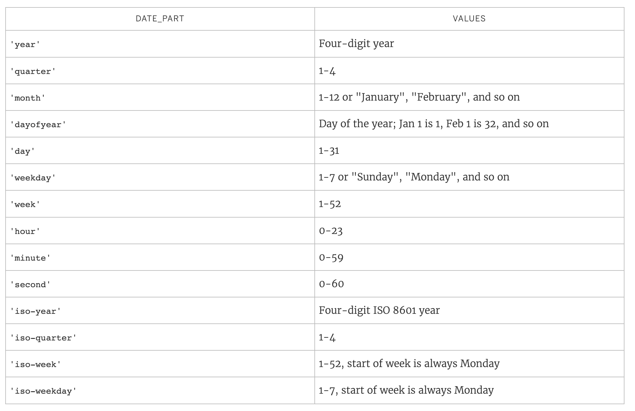
Core Date Functions
DATE
Date converts a string to a date. It can also be used to truncate a datetime to a date.
DATE(string) DATEADD
DateAdd adds a specified time interval to a date.
DATEADD(date_part, interval, date)Example: Calculate Expected Delivery Date
Objective: Add 5 days to Order Date to estimate delivery.
DATEADD('day', 5, [Order Date])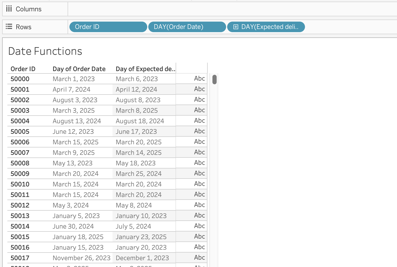
Example: Rolling 12-Months Window
Objective: Filter records from the last 12 months dynamically.
[Order Date] >= DATEADD('month', -12, TODAY())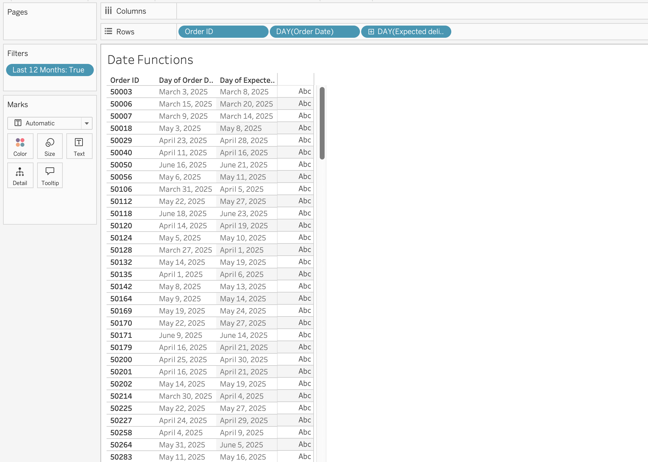
DATEDIFF
Datediff calculates the difference between two dates in specified date parts.
DATEDIFF(date_part, start_date, end_date, [start_of_week])Optional parameter:
[start_of_week] defines week beginning (Sunday, Monday, etc.)
Example: Time to First Order
Objective: Measure when customers place their first order after signing up.
First order date per customer:
{ FIXED [Customer ID] : MIN([Order Date]) }Months between signup and first order:
DATEDIFF('month', [Signup Date], [First Order Date])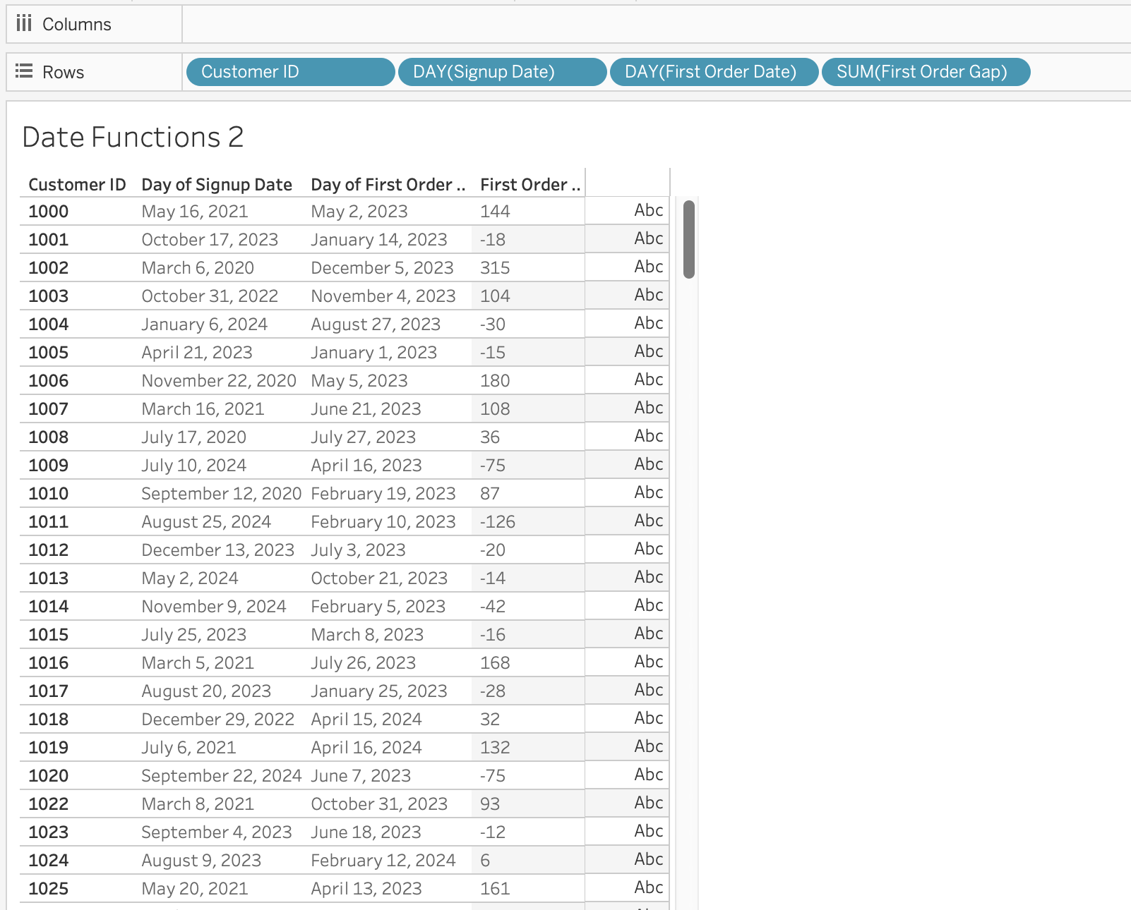
DATENAME
DateName returns the name of a date part as a string. For example, if you want to extract the month from a date, DATENAME will return the name of the month (e.g., “January”, “February”, etc.).
DATENAME(date_part, date)DATEPART
Datepart returns the integer value of a date part. For example, if you want to extract the month from a date, DATEPART will return a number between 1 and 12, while DATENAME would return the name of the month (e.g., “January”, “February”, etc.).
DATEPART(date_part, date)
Note
DATEPART is typically faster than DATENAME.
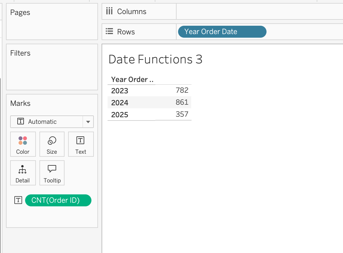
Example: Extract Year for Grouping
Objective: Build yearly trend charts, create custom year filters
DATEPART('year', [Order Date])When used in the view, make the calculated field discrete dimension to group by year.
DATEPARSE
Converts a specifically formatted string into a date.
DATEPARSE(format, string)Use case: When DATE cannot recognize custom format
DATETRUNC
Truncates a date to a specified level.
DATETRUNC(date_part, date, [start_of_week])
Important
DATETRUNC changes the actual value, not just the display.
Example: Order Date = 28-12-2023 15:45:30
DATETRUNC('month', [Order Date])
→ 01-12-2023 00:00:00
DATETRUNC('year', [Order Date]) → 01-01-2023 00:00:00
Notice that:
- The date is not just displayed differently
- The underlying value is changed
If you only want to hide the time portion (for example, remove hours/minutes visually), you should format the field instead of using DATETRUNC.
Formatting affects appearance.
DATETRUNC affects the data itself.
What Is [start_of_week]?
This optional parameter defines which day is considered the first day of the week. The further calculations will be based on this definition of a week.
Example: Calculate week based on ISO standard (week starts on Monday) and week starting on Sunday.
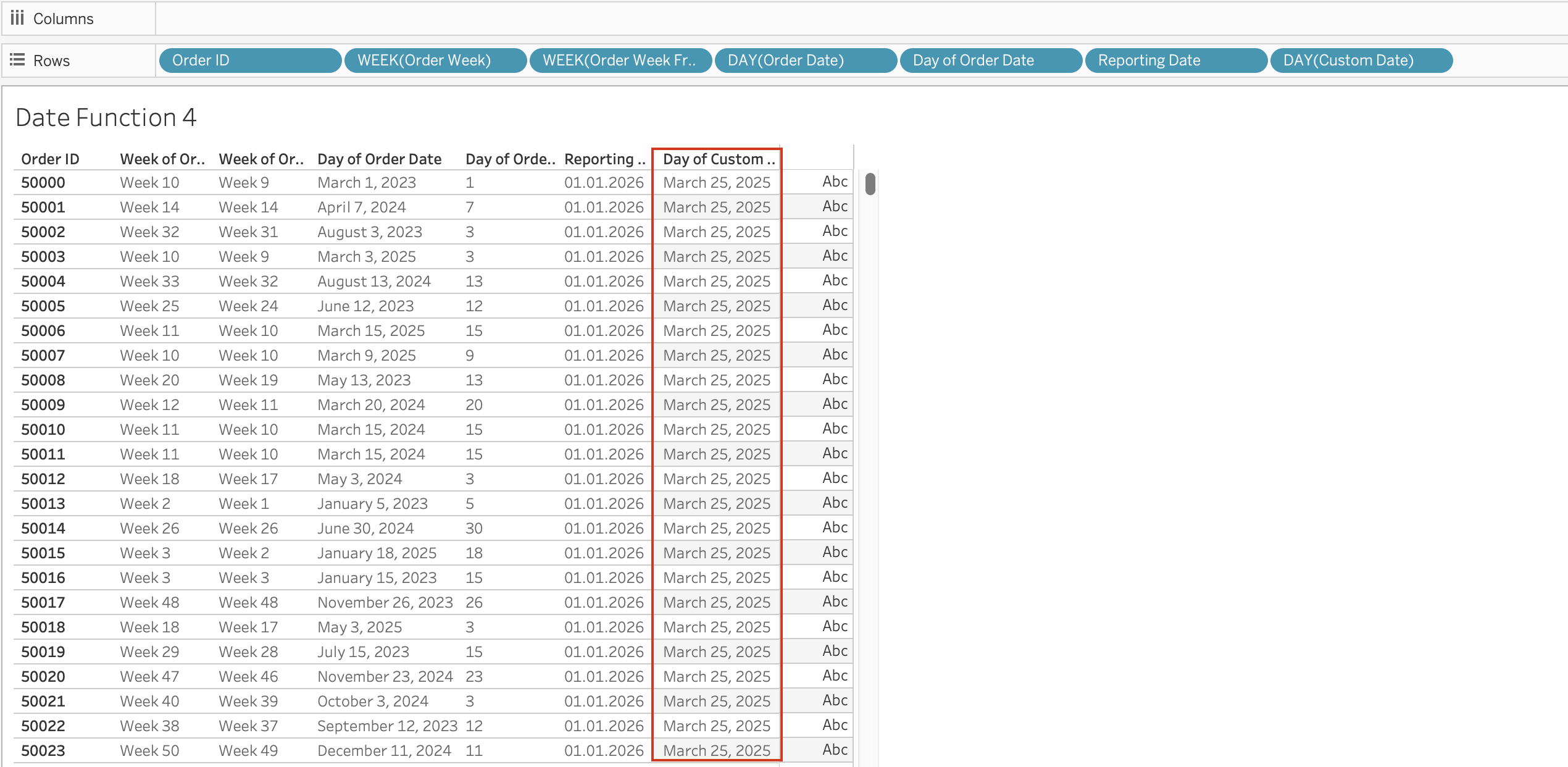
DATETRUNC('week', [Order Date], 'sunday')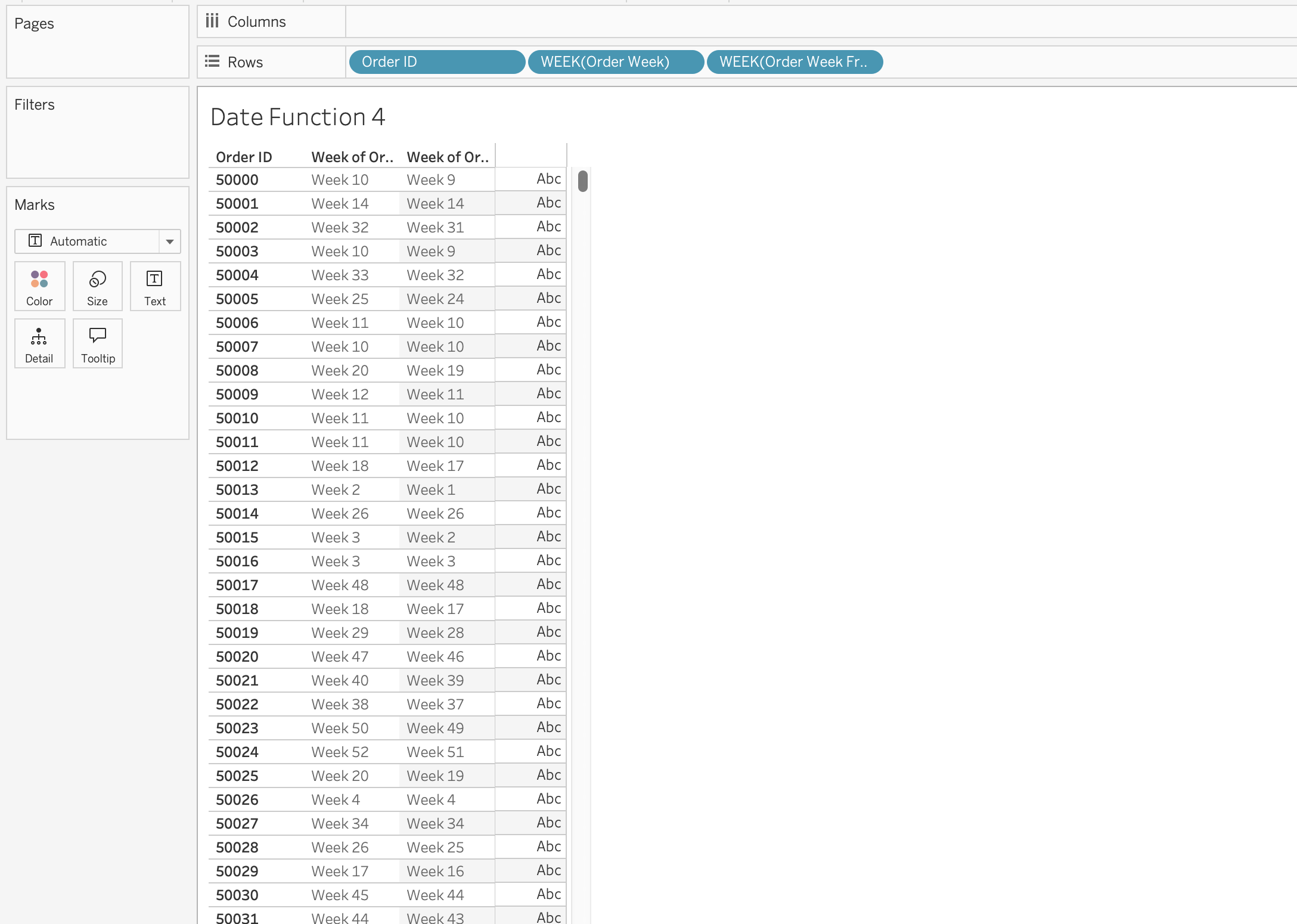
The first calculated field [Order Week] will calculated week based on ISO standard, which will group orders by week starting on Monday, while the second one [Order Week From Sunday] will group orders by week starting on Sunday.
DAY / MONTH / QUARTER / YEAR / WEEK
These functions extract specific parts of a date as integers.
DAY(Order Date) 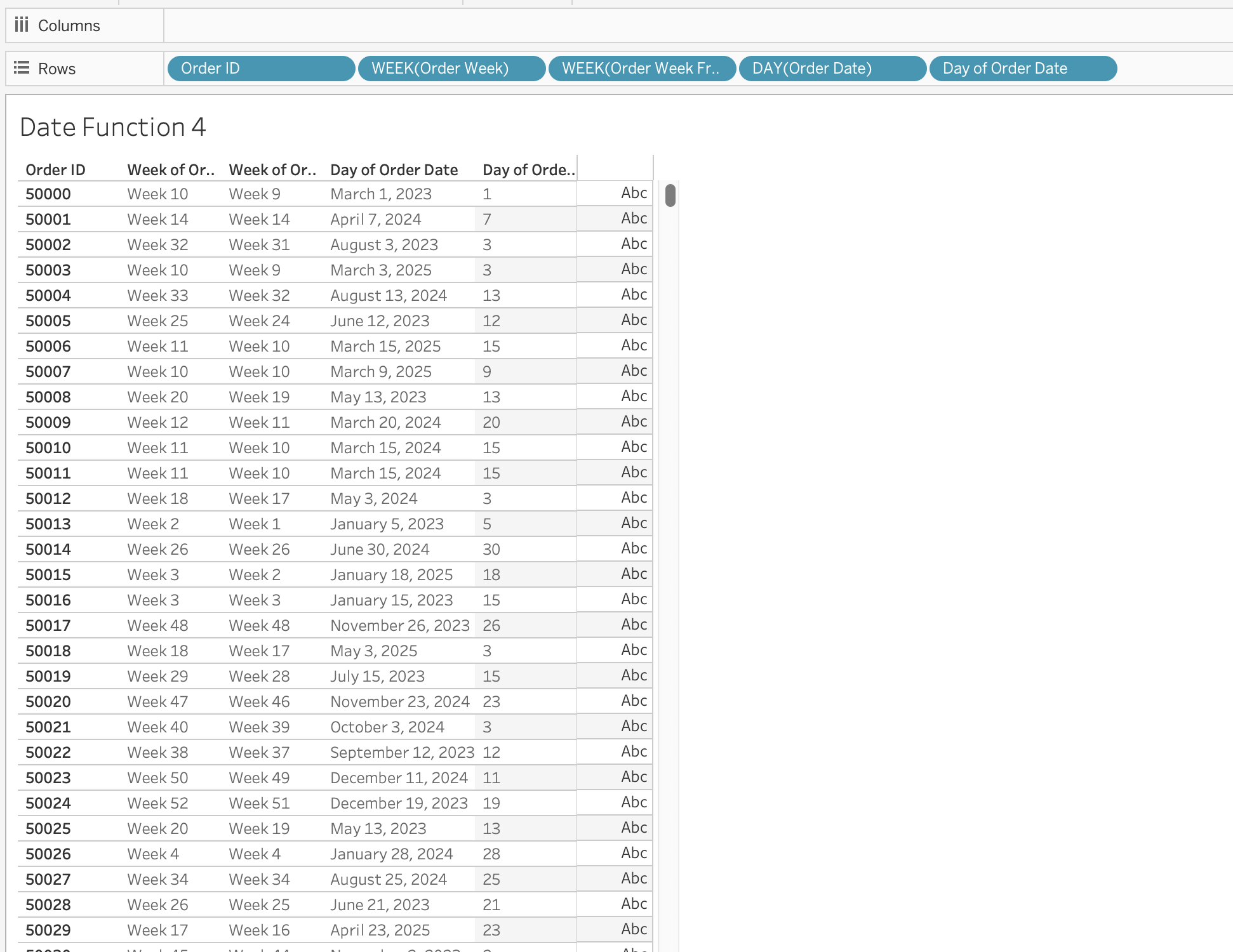
TODAY
Returns the current system date (without time).
TODAY()NOW
Returns the current system date and time.
NOW()MAKEDATE
Constructs a date from numeric year, month, and day.
MAKEDATE(year, month, day)Example: Create Date for 01.01.2026 as [Reporting Date]
MAKEDATE(2026, 1, 1)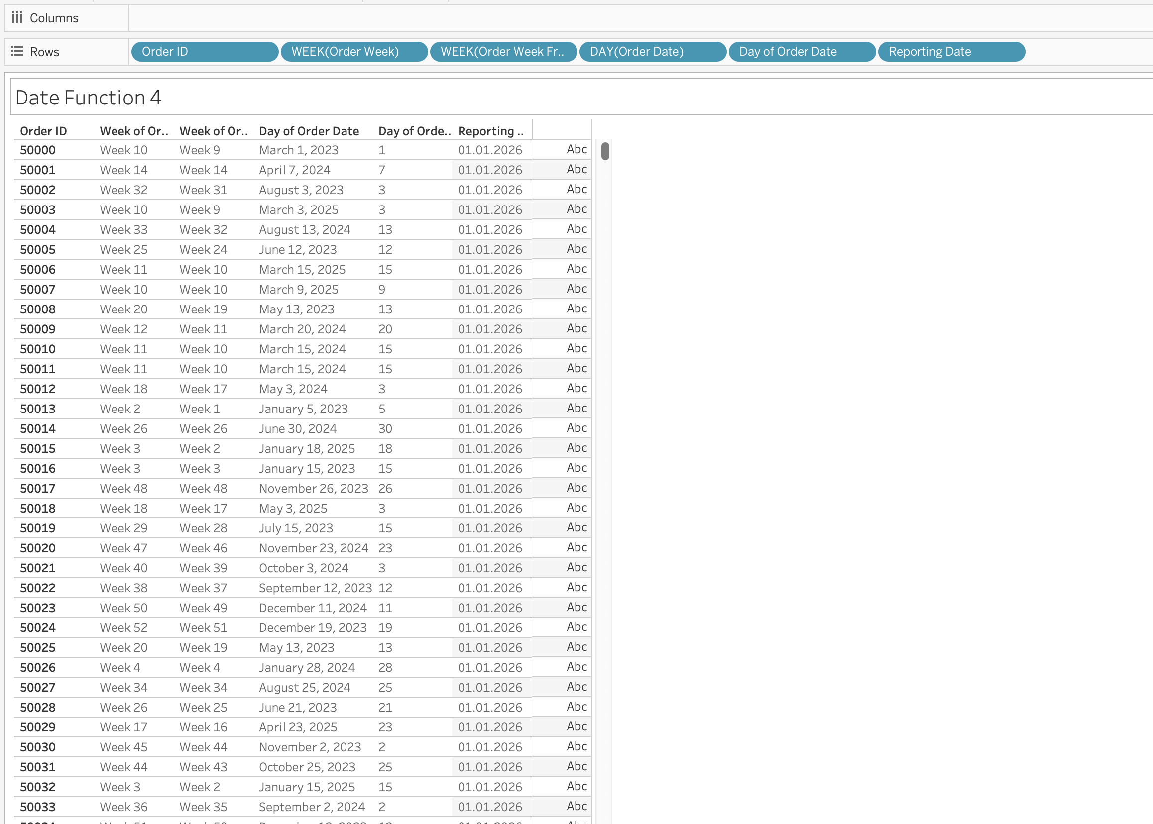
MAKEDATETIME
Combines date and time into datetime.
MAKEDATETIME(date, time)MAKETIME
Constructs time using hour, minute, second.
MAKETIME(hour, minute, second)
Note
Output is datetime (Tableau does not support standalone time type).
ISDATE
Checks whether a string is a valid date.
ISDATE(string)Use case is data validation and cleaning messy datasets.
MAX and MIN (with Dates)
Most recent date:
MAX(date)Earliest date:
MIN(date) The Date Literal (#)
Date values enclosed in # symbols are interpreted as date literals.
Example: #3/25/2025#
This is a special syntax that allows you to directly input date values in calculations without using functions like DATE().
When you use #3/25/2025#, Tableau recognizes it as a date literal and treats it as a date value in calculations.
Without #, Tableau may interpret the value as:
- String
- Number
- Invalid format
Date Parameters
Date parameters are user-defined controls that allow viewers to dynamically select dates and influence calculations, filters, and visual behavior within a Tableau workbook.
Unlike quick filters, which are directly tied to a specific field in a specific data source, parameters are independent objects. This independence makes them extremely powerful in advanced analytical scenarios, especially when working with multiple data sources, custom logic, or dynamic aggregations.
Conceptual Understanding
A parameter in Tableau is a single value that can be referenced inside one or more calculated fields. When that parameter is of data type Date (or Date & Time), it becomes a flexible time control that can drive time-based logic across worksheets.
Date parameters do not filter data automatically. Instead, they act as inputs to calculations. This means you must explicitly reference them inside a calculated field to control behavior.
For example:
- They can define the start and end of a reporting period.
- They can determine which dates should be included in a KPI.
- They can dynamically adjust the level of time aggregation on an axis.
- They can drive rolling windows or forecast periods.
Because parameters are global to the workbook, one Date parameter can influence multiple worksheets simultaneously.
How Date Parameters Differ from Filters
A standard date filter:
- Is tied to a single data source.
- Automatically filters the data.
- Cannot easily control multiple data sources.
A Date parameter:
- Is independent of any single data source.
- Must be referenced in a calculation.
- Can control multiple data sources.
- Can drive complex logic beyond simple filtering.
This distinction is important. Filters limit data directly. Parameters influence calculations that then determine what to display.
Custom N Date Part Selection
This type of date parameter is flexible because it allows users to simultaneously choose:
- The date part (day, week, month, quarter, year)
- The date range (N periods)
Instead of creating separate filters for:
- Last 30 Days
- Last 3 Months
- Last 1 Year
the user can dynamically control both:
- The unit of time
- The number of periods
Step 1
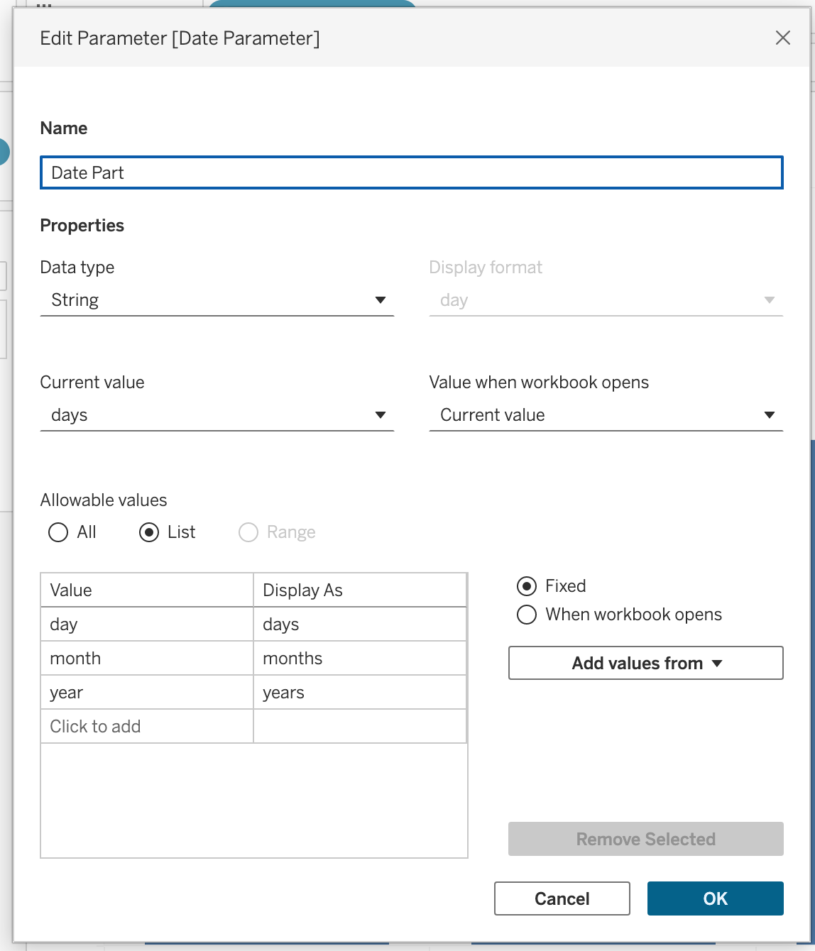
Create a parameter named: Date Part
Configuration:
- Data Type → String
- Allowable Values → List
- Add values:
- Day
- Month
- Year
Right-click the parameter → Select Show Parameter
This parameter controls the time unit.
Step 2
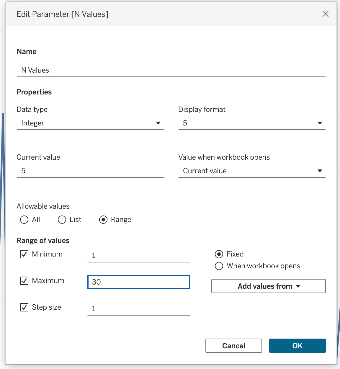
Create another parameter named: N Values
Configuration:
- Data Type → Integer
- Allowable Values → Range
- Minimum → 1
- Maximum → 30
- Step Size → 1
Right-click → Select Show Parameter
This parameter controls how many periods to include.
Step 3
Create an Anchor Date (Recommended)
We will anchor the calculation to the latest available Order Date in the dataset.
Create a calculated field: Latest Order Date
{ FIXED : MAX([Order Date]) }We are doing this way beacause
TODAY()→ depends on the system date
NOW()→ depends on server timezone
{ FIXED : MAX([Order Date]) }→ finds the most recent order in the dataset, removes any dimension filtering from the view
Step 4
Create a calculated field named: p. Date Part
Note
The p. prefix is a naming convention used throughout this course to indicate that a calculated field is parameter-driven — its value depends on a parameter rather than raw data. This makes it easy to identify parameter-linked fields in the Data pane at a glance.
IF [Date Part] = 'day' then ([Order Date]) > DATEADD('day', -[N Values], [Latest Order Date])
ELSEIF [Date Part] = 'month' THEN ([Order Date]) > DATEADD('month', -[N Values], [Latest Order Date])
ELSE ([Order Date]) > DATEADD('year', -[N Values], [Latest Order Date])
END
Step 5
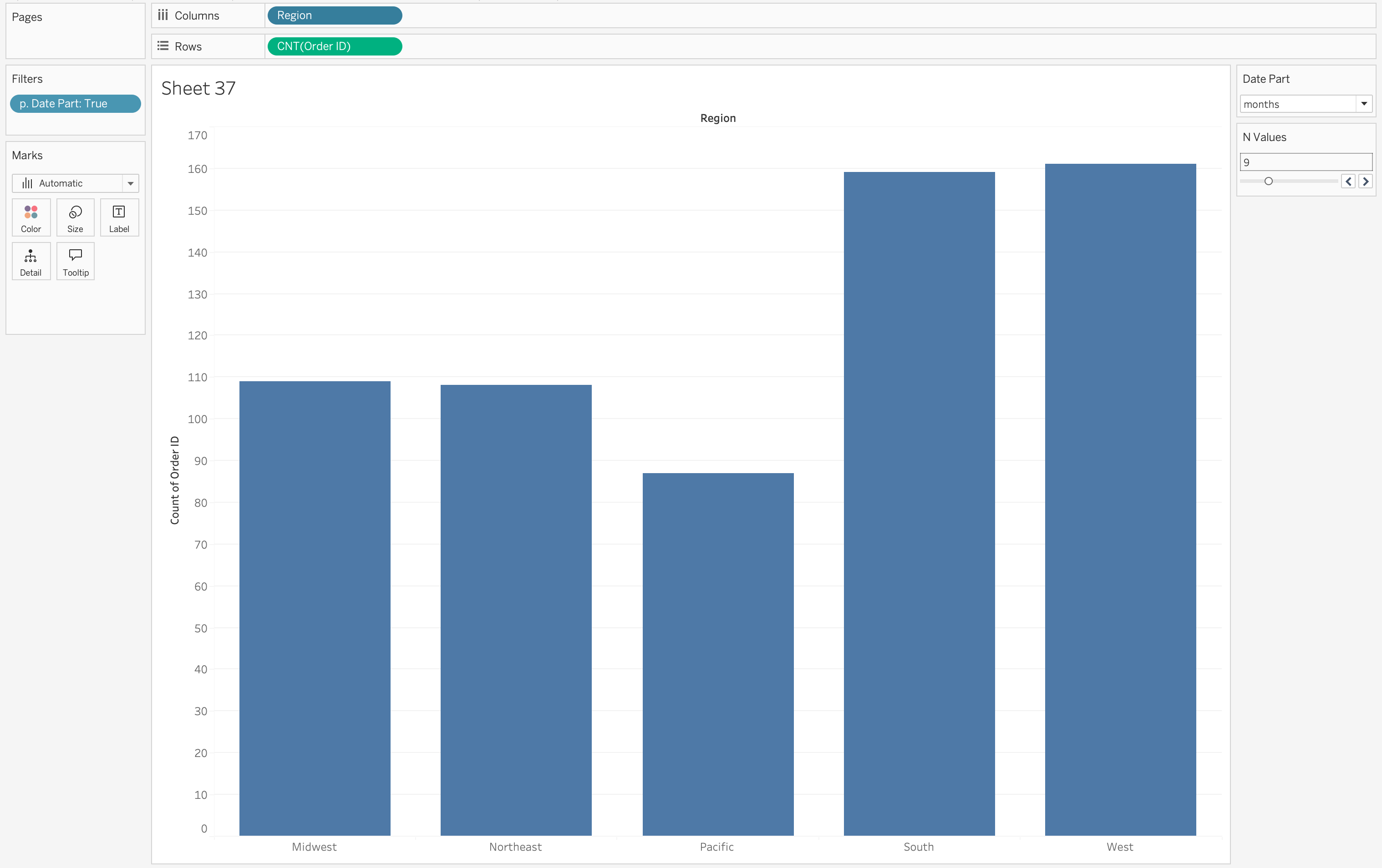
- Drag p. Date Part to filters shelf
- Select True
Step 6
- Drag to the column shelf a dimension: Region
- Drag
COUNT([Order ID])to the Rows shelf
Step 7
Change the parameter values to observe the changes in dimension aggregation.
Dynamic KPI Calculations
Date parameters can define a reporting window inside calculations.
For example, instead of filtering out data outside the selected range, you can write a calculation that returns Sales only if the Order Date falls between the selected parameters.
This allows you to:
- Compare full dataset vs selected period.
- Build dynamic period-to-period comparisons.
- Create flexible dashboard controls.
This will be further explored in the KPI section.
Dynamic Time Aggregation
One advanced use of Date Parameters is dynamically controlling the level of date aggregation.
For example, the date axis can automatically aggregate by:
- Day
- Week
- Month
- Quarter
- Year
depending on the selected parameter value.
This is achieved using DATETRUNC, which adjusts the aggregation level dynamically.
By using this approach, the visualization adapts automatically to the selected time granularity, improving readability and analytical clarity.
Step 1
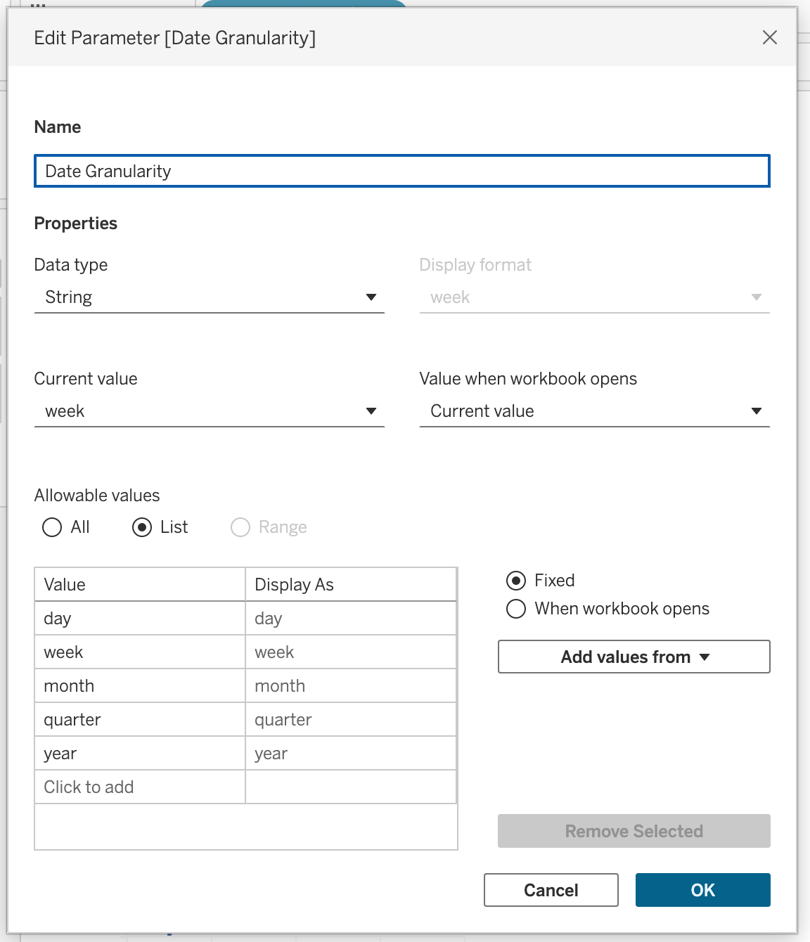
Create a parameter named Date Granularity.
Parameter configuration:
- Data Type → String
- Allowable values → List
- Values → day, week, month, quarter, year
Right-click the parameter and select Show Parameter.
Step 2
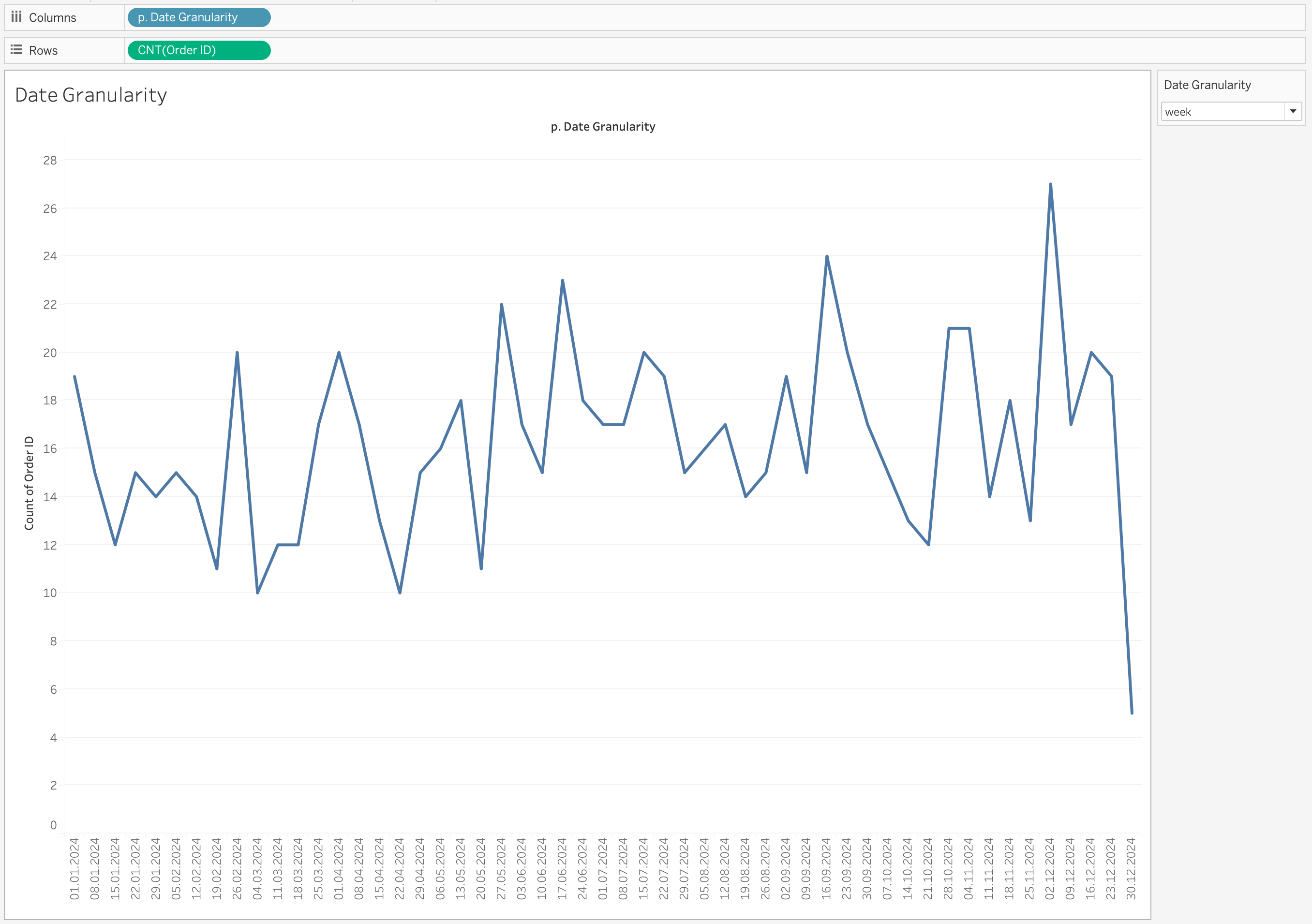
Create a calculated field named p. Date Granularity with the following calculation:
DATE(
CASE [Date Granularity]
WHEN 'day' THEN [Order Date]
WHEN 'week' THEN DATETRUNC('week', [Order Date])
WHEN 'month' THEN DATETRUNC('month', [Order Date])
WHEN 'quarter' THEN DATETRUNC('quarter', [Order Date])
ELSE DATETRUNC('year', [Order Date])
END
)
Step 3
- Drag p. Date Granularity to the Columns shelf
- Right-click the pill
- Select Exact Date
- Change it to Discrete
- Drag
COUNT([Order ID])to the Rows shelf
Selecting Exact Date ensures Tableau uses the full date value returned by the calculation.
Without this, Tableau may automatically aggregate the date into a higher-level hierarchy (for example, Year or Month), which would override the dynamic logic we created.
Changing the field to Discrete creates distinct headers for each date value instead of a continuous timeline.
This is important because:
- Each truncated date (day/week/month/quarter/year) should appear as a separate category.
- It prevents Tableau from interpolating values across a continuous axis.
- It ensures the view respects the exact granularity selected in the parameter.
Step 4
Change the parameter value to observe how the granularity changes dynamically.
When you switch between:
- day
- week
- month
- quarter
- year
the axis updates automatically to reflect the selected time level.
Multi-Source Dashboards
When working with multiple data sources, each source typically has its own date field.
If you use quick filters, you would need:
- One date filter per data source
This leads to duplicated controls on the dashboard and a less clean user experience.
Using Date parameters instead allows you to create:
- A single Date Part parameter
- A single Start Date parameter
- A single End Date parameter
Each data source then contains its own calculated filter that references the same parameters.
As a result:
- All worksheets respond to the same date controls
- The dashboard remains clean and professional
- The user interacts with one unified time control
This creates a seamless and consistent experience across multi-source dashboards.
Spatial Analytics (spatial relationships, spatial joins, spatial functions)
Spatial analytics focuses on analyzing data that contains a geographic component. Unlike traditional visualizations, spatial analysis allows us to understand how data behaves in relation to location, distance, and geographic structures. It enables answering questions such as where events occur, how locations interact, how movement happens across space, and how metrics vary across regions.
Maps are powerful because they allow patterns to be understood visually. They are especially useful when geography is not just a visual element, but a key part of the analysis.
Geographic Data Formats
Geographic data can exist in multiple formats, and understanding these formats is essential for correct analysis.
- Spatial files such as Shapefile, GeoJSON, KML
- Flat files such as Excel or CSV
- Databases with spatial or location-based fields
Spatial files store both:
- Geometry → the shape (point, line, polygon)
- Attributes → descriptive data
When a spatial file is connected, Tableau automatically creates a Geometry field, which can be directly used for mapping.
Location-based data (like City, Country, Latitude, Longitude) does not contain shapes. Tableau uses geocoding to convert these values into map coordinates.
Dataset for Spatial Analysis
In this session, we use:
- Citi Bike dataset (trip-level data with coordinates)
- NYC District GeoJSON file (polygon-level data)
The Citi Bike dataset contains:
- Start and End coordinates
- Time information
- Station details
Since the dataset is split across multiple CSV files, we combine them using Union.
The GeoJSON dataset contains:
- District boundaries (MultiPolygon)
- Geographic shapes for mapping
Spatial Relationships
Spatial relationships are used when datasets do not share a common key but still need to be analyzed together.
Steps to Create Spatial Relationship
- Load the Citi Bike dataset
- Combine all CSV files using Union
- Add the GeoJSON file to the data model
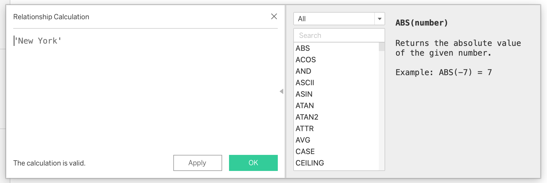
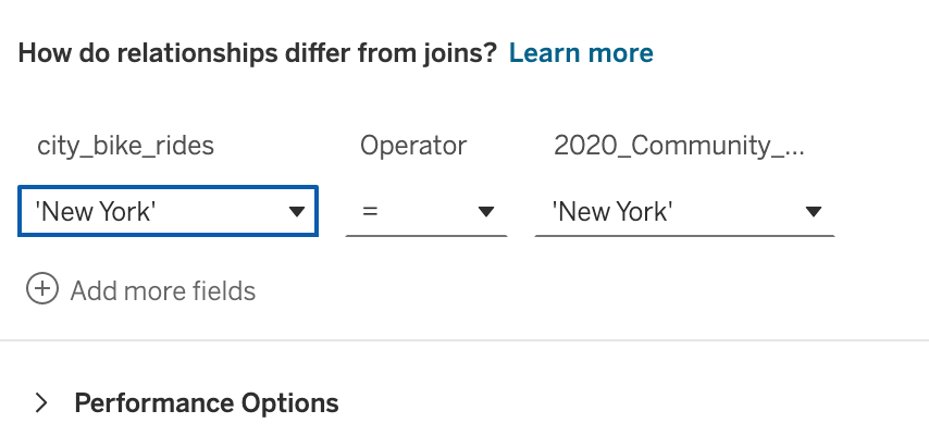
- Create a calculated field in both datasets:
'New York'- Use this field to create a relationship between the datasets
This approach allows Tableau to connect the datasets logically without physically joining them, preserving flexibility and avoiding duplication.
Now we have a working relationship between two tables.
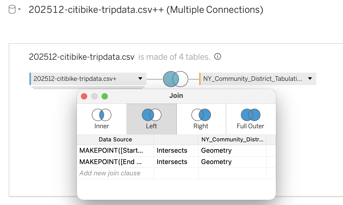
Spatial Joins
Spatial joins combine datasets based on geographic relationships rather than keys.
The most common spatial join is:
- INTERSECTS → checks if two geometries overlap
Steps to Create Spatial Join
- In the data source tab, switch to the physical layer
- Add the Citi Bike dataset
- Create calculated fields:
MAKEPOINT([Start Lat], [Start Lng])MAKEPOINT([End Lat], [End Lng])- Drag the GeoJSON dataset next to the Citi Bike dataset
- Choose Left Join
- Set join condition:
- Spatial field (point) INTERSECTS polygon geometry
This will match each trip to a district based on location.
Troubleshooting Spatial Joins
Common issue:
- Geometry is incompatible with geography
Solution:
- Convert geometry to geography
- Use coordinate system EPSG:4326
- Ensure coordinates follow Longitude, Latitude order
Spatial Functions
Spatial functions enable advanced geographic calculations directly within Tableau. They allow you to create, transform, and analyze spatial objects such as points, lines, and polygons. These functions are especially important when working with coordinate-based datasets, as they convert raw latitude and longitude values into map-ready objects and allow analytical operations such as distance measurement, movement analysis, and spatial comparison.
Spatial functions are commonly used together with mapping and spatial joins. They help bridge the gap between raw data and geographic insight, making it possible to answer questions about proximity, interaction, and movement.
Common Use Cases
- Converting latitude and longitude into spatial points
- Visualizing movement between two locations
- Measuring distance between locations
- Creating service or coverage areas
- Identifying overlapping or interacting regions
Examples
Creating a spatial point from coordinates:
MAKEPOINT([Latitude], [Longitude])Visualizing movement between two locations:
MAKELINE(
    MAKEPOINT([Start Lat], [Start Lng]),
    MAKEPOINT([End Lat], [End Lng])
)
Calculating distance between two points:
DISTANCE(
    MAKEPOINT([Start Lat], [Start Lng]),
    MAKEPOINT([End Lat], [End Lng]),
    'km'
)
Spatial Functions Reference
| Function | Description | Typical Use Case |
|---|---|---|
| MAKEPOINT | Converts latitude and longitude columns into a spatial point. | Enabling spatial joins for coordinate-based datasets. |
| MAKELINE | Creates a line between two spatial points. | Origin–destination maps, mobility analysis, route visualization. |
| DISTANCE | Calculates the distance between two spatial points using specified units. | Nearest branch analysis, trip distance calculation, proximity analysis. |
| AREA | Returns the total surface area of a spatial polygon. | Territory size comparison, land coverage analysis. |
| LENGTH | Returns the total geodetic length of a linestring geometry. | Route length measurement, infrastructure analysis. |
| BUFFER | Creates a radius around a point, line, or polygon. | Service coverage zones, delivery radius modeling, proximity analysis. |
| INTERSECTS | Returns True or False indicating whether two geometries overlap. | Spatial joins, containment checks. |
| INTERSECTION | Returns the overlapping portion between two geometries. | Market overlap analysis, shared service area evaluation. |
| DIFFERENCE | Subtracts the overlapping area of one polygon from another. | Identifying uncovered or restricted areas. |
| SYMDIFFERENCE | Removes overlapping portions from both geometries and returns the remaining parts. | Territory comparison and competitive analysis. |
| OUTLINE | Converts polygon geometry into boundary lines. | Styling borders separately from polygon fill. |
| SHAPETYPE | Returns the geometry structure as text (Point, Polygon, etc.). | Debugging spatial data issues. |
| VALIDATE | Confirms whether spatial geometry is topologically correct. | Cleaning corrupted spatial files and preventing join errors. |
Mapping in Tableau (Map Layers, Map Styling & Configuration)
Mapping in Tableau is not only about placing marks on a geographic background.
It is a combination of:
- Data modeling
- Geocoding
- Aggregation logic
- Visual design
For a map to function correctly — analytically and visually — four foundational components must be configured properly:
- Data Type
- Data Role
- Geographic Role
- Geographic Hierarchy
If any of these elements are misconfigured, you may encounter:
- Unknown locations
- Incorrect aggregation
- Missing map rendering
- Broken drill-down behavior
- Spatial joins that do not work as expected
Geographical data configuration
Mapping accuracy begins with proper data configuration.
Data Type — Structural Foundation
The Data Type determines how Tableau stores and interprets the raw values.
This is the first layer of configuration.
Common Geographic Data Types
| Field Type | Required Data Type | Why |
|---|---|---|
| Latitude | Number (Decimal) | Must allow precise coordinate plotting |
| Longitude | Number (Decimal) | Must allow precise coordinate plotting |
| Country/State/City | String | Needed for geocoding |
| Postal Code | String | Preserves leading zeros |
| Geometry (GeoJSON/Shapefile) | Geometry | Native spatial object |
Incorrect data types can cause:
- Aggregation errors
- Loss of leading zeros (postal codes)
- Tableau not recognizing geographic information
- Failure in map rendering
Example:
If Postal Code is stored as Number: - 01234 becomes 1234 - Geocoding fails
Data Role — Analytical Behavior
The Data Role defines how Tableau treats the field in analysis.
Two primary roles:
- Dimension → categorical grouping
- Measure → numeric aggregation
Typical Configuration for Mapping
| Field | Data Role |
|---|---|
| Latitude | Measure |
| Longitude | Measure |
| Country | Dimension |
| State | Dimension |
| City | Dimension |
| Geometry | Measure |
If Latitude/Longitude are set as Dimensions: - Points may not render correctly
- Aggregation logic may break
Geographic Role — Geocoding Layer
The Geographic Role connects a field to Tableau’s geocoding engine.
This tells Tableau: > “This field represents a real-world geographic level.”
Common Geographic Roles
- Country/Region
- State/Province
- County
- City
- Postal Code
- Latitude
- Longitude
Once a geographic role is assigned:
- Tableau generates Latitude (generated)
- Tableau generates Longitude (generated)
These generated fields are automatically used for plotting.
How Tableau Geocoding Works
When using location names:
- Tableau references its internal geographic database
- Matches names to coordinates
- Places marks accordingly
If Tableau cannot match values, you will see:
- Unknown locations warning
To resolve:
- Click the warning icon
- Edit locations
- Specify country context
- Correct spelling inconsistencies
Geographic Hierarchy — Drill-Down Structure
A Hierarchy defines the logical order of geographic levels.
Example:
- Country
- State
- City
- Postal Code
- City
- State
Hierarchies allow:
- Drill-down navigation
- Controlled aggregation
- Structured geographic exploration
How to Create a Hierarchy
- Right-click a geographic field (e.g., Country)
- Select Hierarchy → Create Hierarchy
- Drag lower levels into it
Benefits
- Enables + / − drill controls
- Maintains geographic logic
- Improves dashboard interactivity
Mapping
Mapping with Raw Coordinates
If your dataset contains Latitude and Longitude:
Required Configuration
- Data Type → Number (Decimal)
- Data Role → Measure
- Geographic Role → Latitude / Longitude
Validation Rules
- Longitude range: -180 to 180
- Latitude range: -90 to 90
- Coordinates must be decimal degrees
Longitude always goes to:
- Columns (X-axis)
Latitude always goes to:
- Rows (Y-axis)
If properly configured:
- Tableau plots points automatically
- No internal geocoding is required
Mapping with Location Names
If your dataset contains names instead of coordinates:
Required Configuration
- Data Type → String
- Data Role → Dimension
- Geographic Role → Appropriate geographic level
Tableau converts names into coordinates using geocoding. In some cases, you may need to specify the country context to resolve ambiguities.
Mapping with Spatial Files (GeoJSON / Shapefile)
Spatial files contain embedded geometry objects.
When imported:
- Field Type → Geometry
- Data Role → Measure
Characteristics:
- Coordinates are embedded
- No geocoding required
- Supports polygon and line rendering
Enables:
- Choropleth maps
- Boundary overlays
- Spatial joins
- Spatial calculations
Map Styling and Layering
Map Styles
Once configuration is correct, map styling enhances interpretability.
Background Map Styles are
- Light
- Normal
- Streets
- Satellite
Choose style based on:
- Analytical clarity
- Contrast with marks
- Density visualization
Map Layers
Tableau allows multiple layers:
- Polygon layer (district boundaries)
- Point layer (stations)
- Line layer (routes)
Multi-layer maps enable:
- Territory + event visualization
- Origin–destination flows
- Hotspot analysis
Each layer can have:
- Independent mark type
- Independent color
- Independent size
Basic Map Creation
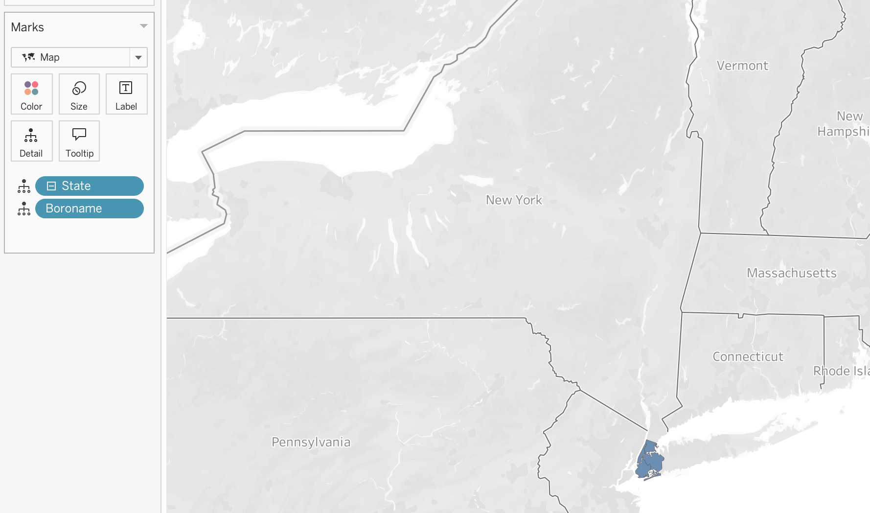
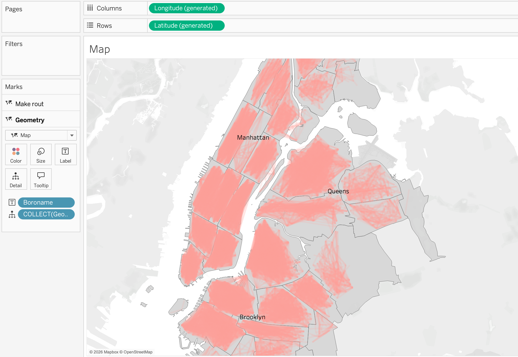
Now let’s create a simple map showing the distribution of the trips across New York city using the geometry field from the spatial file.
Step 1
As we do not have a column with states we will make a calculated field 'New York' and assign it as a geographic role with the level of State/Province. This will allow us to use the geometry field from the spatial file to plot the map of New York city.
Step 2
Now we can make a hierarchy by right clicking on the newly created field, [State] and choosing Hierarchy → Create Hierarchy and then dragging the [Boroname] field (NYC borough) to the hierarchy. This will allow us to drill down from the state level to the geometry level and see the different districts of New York city which are available in our spatial file.
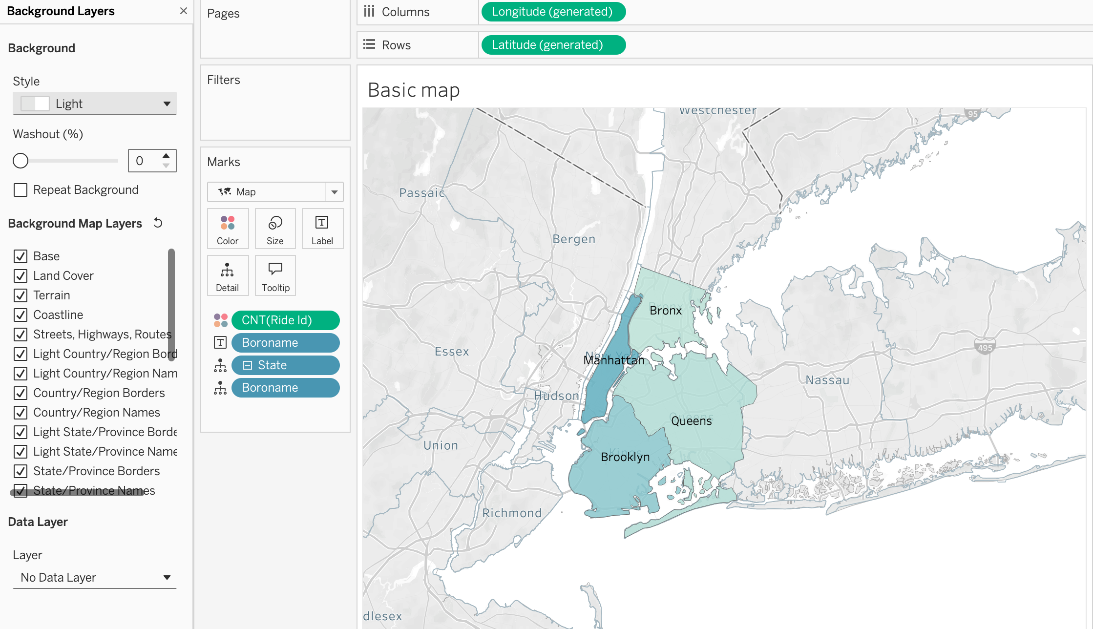
Step 3
In order to count rides by district, we will drag the Ride ID field to the view and change the aggregation to Count. To show the distribution we can place the Count of Ride ID on the color mark and we will have a choropleth map showing the distribution of the rides across the different districts of New York city.
Step 4
To make districts more visible drag and drop [Boroname] field to the label mark and we will have the name of the district on the map.
Step 5
To make the map more readable, we can also change the background map style by right clicking on the map and choosing Background Layers and then choosing the style that we like. In this case, we will choose the Light style to make the districts more visible and add Background Map Layer by ticked prefferences such as Land Cover and Labels to make the map more informative.
Map with layers, polygons, points, and lines
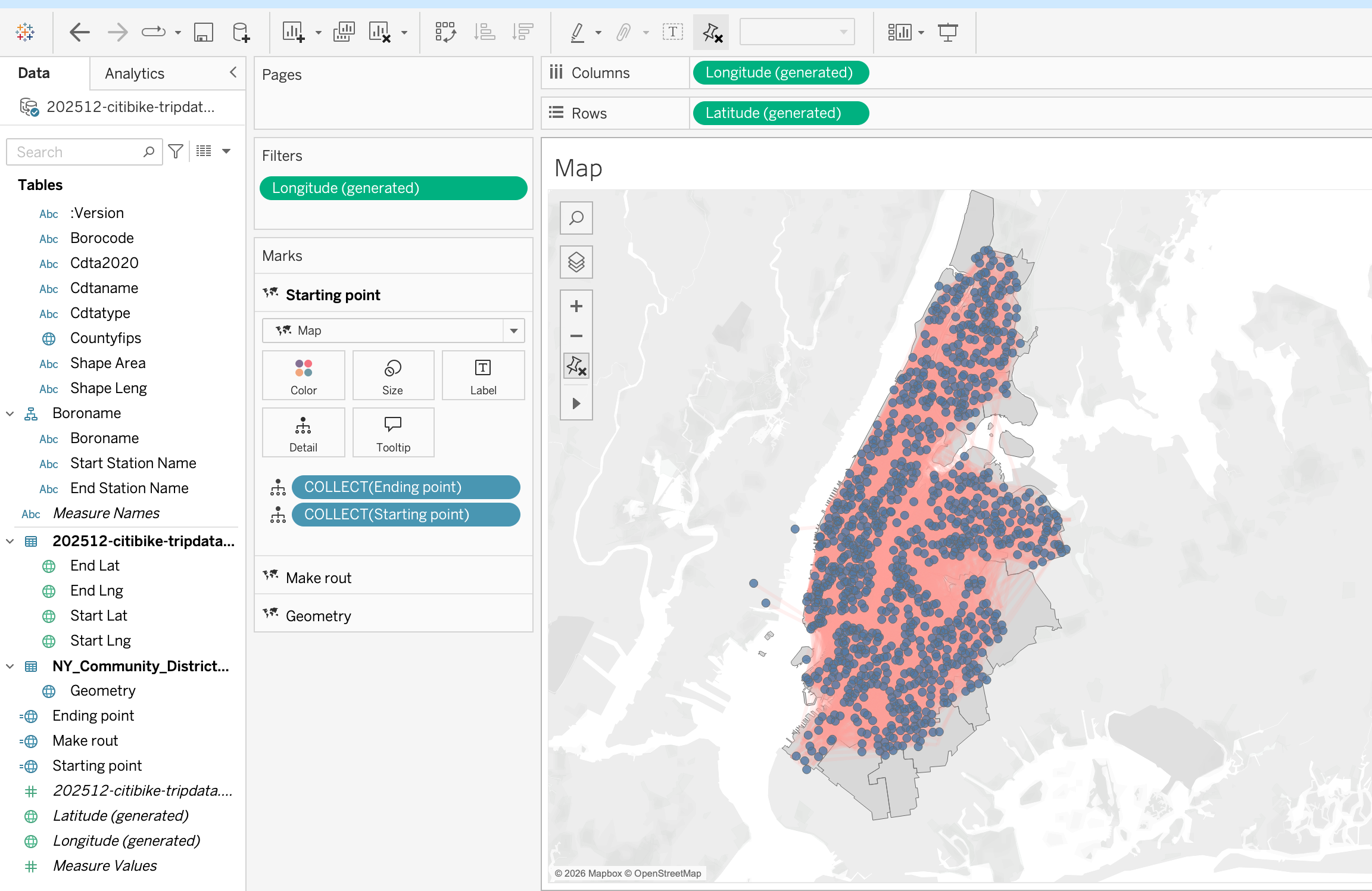
Step 1
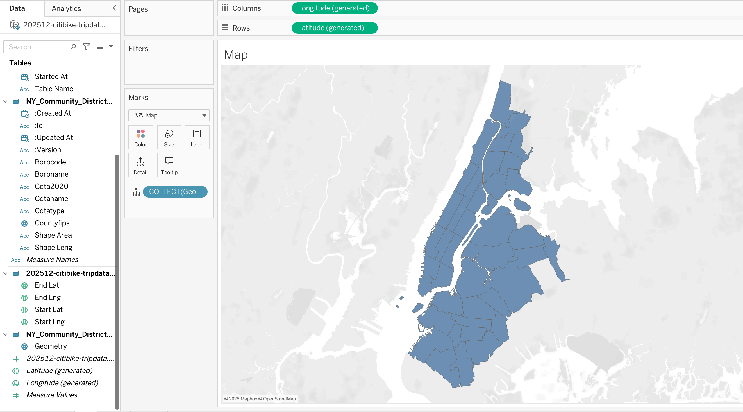
As we have already done the join between the spatial file and the tabular file, we can now build a map using the geometry field from the spatial file. To do that:
- First make sure that the fields with geographic roles are correctly assigned
- Double click on the geometry field and it will be added to the view
Tableau automatically:
- Adds Latitude (generated) to Rows
- Adds Longitude (generated) to Columns
- Places Geometry on the Marks card, Details
The result is a map of New York City with its districts.
Step 2
Now we can add the trips data to the map. To do that let’s create calculated fields for the start and end locations of the trips using MAKEPOINT() function as explained in the spatial joins section. Then we can add these calculated fields to the view to show the trip start and end locations on the map.
Step 3
Having the trip start and end locations we can now make a flow map to show the movement of the trips between the start and end locations. To do that we will use MAKELINE() function to create a line between the start and end points of each trip. Then we can add this line to the view to visualize the flow of trips across the city.
Step 4
In map visualizations, we can use different geometry types adding map layers to show different aspects of the data. For example, we can draw routes to the polygon layer by dragging the line geometry to the view and we can also show the start and end points of the trips by dragging the point geometry to the view. This allows us to create a multi-layered map that shows both the routes and the locations of trip starts and ends.
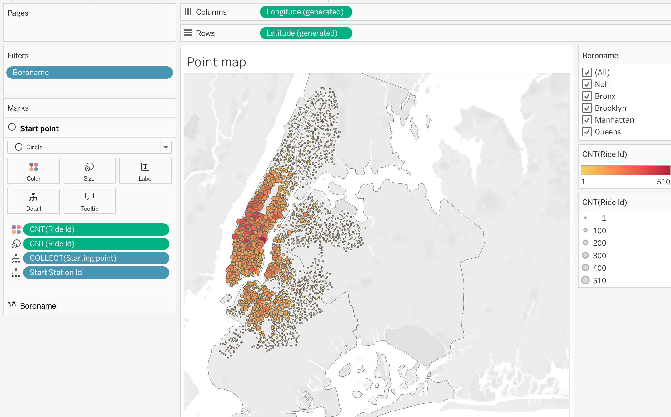
Proportional Symbol Map
Proportional symbol maps use sized marks (usually circles) to represent the magnitude of a measure at specific locations. The size of each mark is proportional to the value it represents.
Step 1
As in previous examples, we will start by creating a map using the geometry field [Boroname] from the spatial file to show the districts of New York city.
Step 2
Add [Starting point] to the view to show the start locations of the trips on the map.
Step 3
Now we can add the Count of Ride ID to the size mark to show the number of trips starting at each location. This will create a proportional symbol map where the size of each mark corresponds to the number of trips starting at that location.
Step 4
Add the Count of Ride ID to the color mark to show the distribution of the trips across the city. From color marks activate borders.This will allow us to quickly identify areas where there are more trips starting based on the color intensity of the marks on the map.
Step 5
Add [Starting Point ID] to the detail mark to show the individual starting points of the trips on the map.
Step 6
From the Marks card, we can also change the mark type to Circle and adjust the size and color to make the map more visually appealing and easier to interpret. This will allow us to quickly identify areas with high trip activity based on the size of the circles on the map.
Step 7
Add [Boroname] to the filter shelf for interactive filtering by district. This will allow users to select specific districts and see the corresponding trip data on the map, enabling more detailed analysis of trip patterns within different areas of New York City.
This analysis can help identify which districts have the highest demand for Citi Bike trips, and can inform decisions about where to add more bike stations or increase bike availability.
Density Map
Density maps use color intensity to represent the concentration of points in a given area. They are useful for visualizing patterns of activity across a geographic space.
Step 1
Bring [Make route] calculated field, [Start Station ID] and [End Station ID] to the view to show the routes of the trips on the map.
Step 2
Change the mark type to Density to create a density map that shows the concentration of trips across the city. The color intensity will indicate areas with higher or lower trip activity.
Step 3
Adjust map style to Streets to make the trips density patterns more visible on the street map background. This will allow us to better understand the spatial distribution of trips in relation to the city’s street layout.
Step 4
Make density color intensity and opacity adjustments to enhance the visibility of high-density areas. This will help us quickly identify hotspots of trip activity across New York City.
This type of analysis can be useful for understanding where the highest demand for Citi Bike trips is located, and can inform decisions about where to focus resources for bike station placement or maintenance.
Step 5
Untick Aggregate Measures on the top pane Analysis section to show the individual trip routes on the map. Density maps calculate intensity based on the number of marks in a geographic area, so if we want to see the actual routes of the trips, we need to turn off aggregation.
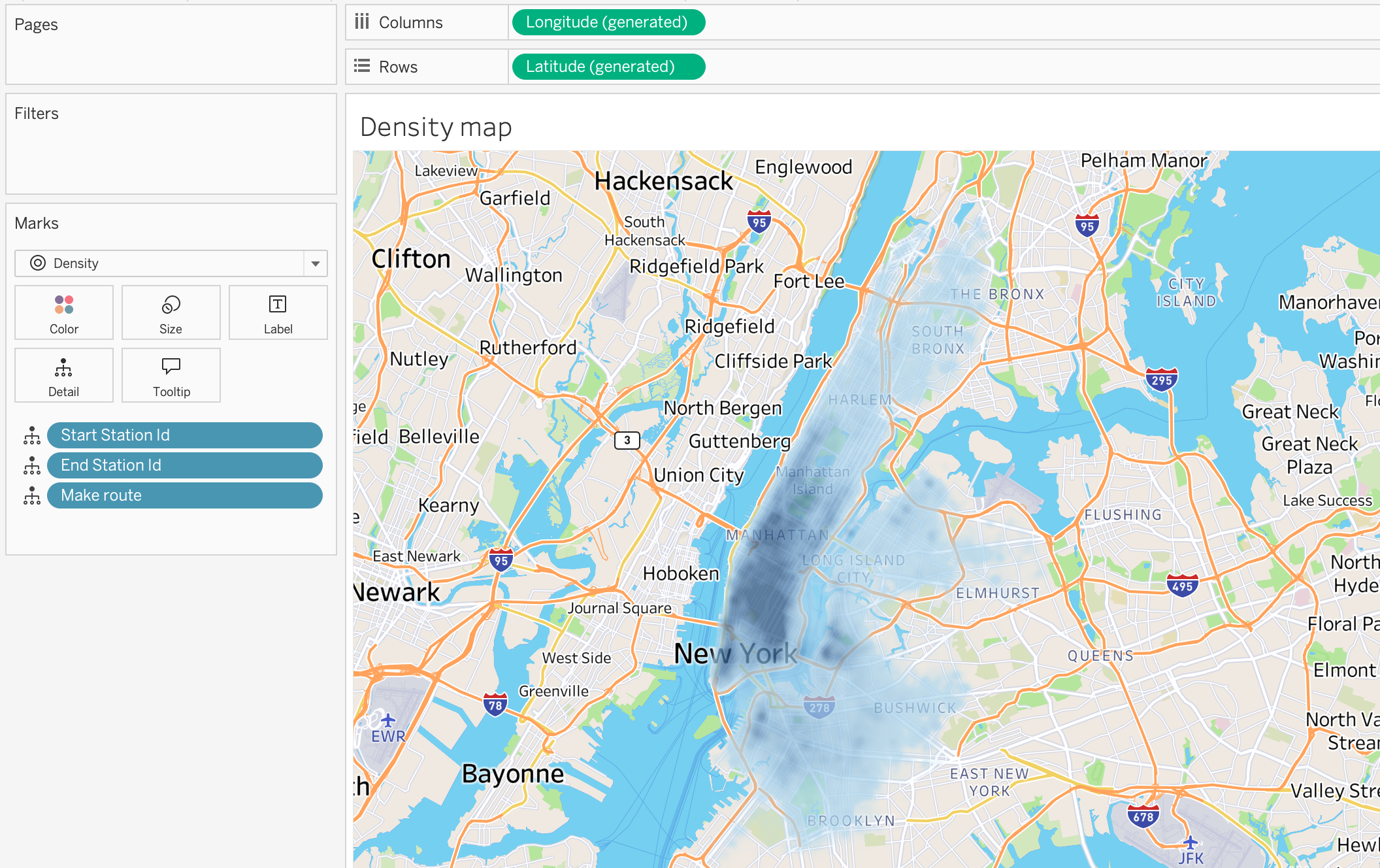
NoteAnalysis → Aggregate Measures in Maps
ON (default) → Measures are summarized (SUM, AVG, etc.).
Use for choropleth maps, KPIs by region, and territory comparison.OFF → Each row becomes an individual mark.
Use for point distribution maps, density maps, and event-level analysis.
Rule of thumb:
Use aggregation for regional summaries.
Turn it off for raw spatial events and clustering analysis.
Cohort Analysis in Tableau
Cohort Analysis is a technique used to analyze the behavior of groups of users that share a common characteristic over time.
Instead of analyzing all users together, cohort analysis groups users based on a shared starting event, allowing to observe how behavior changes across time for each group.
Common cohort grouping criteria include:
- First purchase date
- First login date
- First subscription date
- First product activation
This method is widely used in:
- Customer retention analysis
- Product usage analysis
- Marketing performance evaluation
- Telecom subscriber lifecycle analysis
For example:
- Customers who made their first purchase in January
- Customers who made their first purchase in February
Each of these groups becomes a cohort.
Cohort Analysis Concept
A cohort analysis typically consists of three components:
- Period
- Start Date
- Metric Being Measured
Example:
| Start Date | Period 0 | Period 1 | Period 2 | Period 3 |
|---|---|---|---|---|
| Jan 2024 | 100% | 70% | 55% | 40% |
| Feb 2024 | 100% | 75% | 60% | 45% |
| Mar 2024 | 100% | 72% | 58% | 44% |
Interpretation:
- Month 0 → when users first appeared
- Month 1 → one month after acquisition
- Month 2 → two months after acquisition
This structure allows us to analyze retention or activity decay over time.
Cohort Analysis Workflow in Tableau
Steps include:
- Identify the first activity date for each user
- Assign each user to a cohort group
- Calculate time elapsed since the cohort start
- Aggregate metrics by cohort and time period
Cohort Analysis Example
Let’s explore Cohort Analysis in Tableau using the Online Retail Dataset :contentReferenceoaicite:0
Cohort analysis becomes very practical with the Online Retail dataset because the table contains transactional data at the invoice line level.
From the dataset, we can see the following important fields:
- Customer ID identifies the customer
- Invoice Date identifies when the transaction happened
- Quantity and Unit Price can be used to calculate sales
- Multiple rows can belong to the same invoice because one invoice may contain several products
In cohort analysis, we usually group customers based on the date of their first purchase and then track their later activity.
In this dataset:
- Each row is a product line within an invoice
- One customer can have many invoices
- One invoice can contain many products
- Customers purchase at different times
This allows us to answer questions such as:
- In which month did the customer make the first purchase?
- Did the customer return in later months?
- Which cohort has better retention?
- Which cohort generates more revenue over time?
Cohort Definition
For this dataset, the cohort is defined as:
Customers grouped by the month of their first invoice date
So:
- Customers whose first order was in January 2011 belong to the January 2011 cohort
- Customers whose first order was in February 2011 belong to the February 2011 cohort
Cohort Analysis Logic
Step 1: Find the First Purchase Date per Customer
{ FIXED [Customer ID] : MIN([Invoice Date]) }Name: First Purchase Date
This calculation:
- Identifies the earliest purchase per customer
- Returns the same value for all rows of that customer
Step 2: Create the Cohort Month
DATETRUNC('month', [First Purchase Date])Name: Cohort Month
Step 3: Create Invoice Month
DATETRUNC('month', [Invoice Date])Name: Invoice Month
Step 4: Calculate Period
DATEDIFF('month', [Cohort Month], [Invoice Month])Name: Period
Step 5: Calculate Active Customers
COUNTD([Customer ID])Name: Active Customers
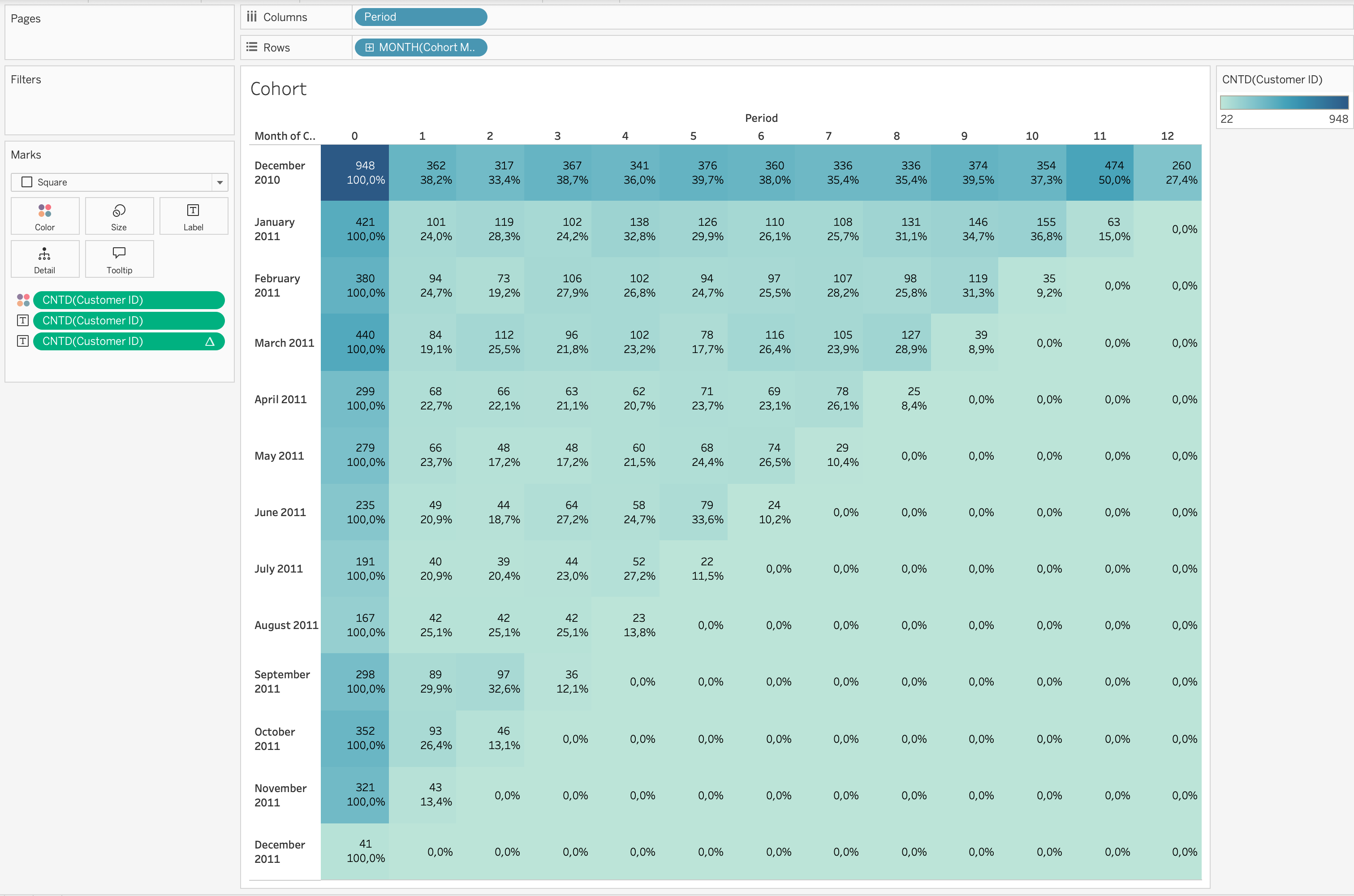
Step 6: Build the Heatmap
- Drag
MONTH([Cohort Month])→ Rows
- Drag
[Period]→ Columns
- Set both as Discrete Dimensions
- Set Marks type → Square
- Drag
COUNTD([Customer ID])→ Color
- Drag
COUNTD([Customer ID])→ Label
Retention Rate Calculation (Important)
Retention rate is calculated using a table calculation.
- Duplicate
COUNTD([Customer ID])on Label
- Apply Quick Table Calculation → Percent From
- Compute Using → Table (Across)
- Relative to → First
This means:
- Each value is divided by the value in Period 0
- Period 0 becomes 100% baseline
- All other periods show retention relative to cohort size
Important
Retention Rate is a table calculation, not a basic aggregation.
It depends on the view layout and uses Percent From First logic.
Step 7: Clean the View
- Create field
[Retention Rate]from table calculation
- Drag to Filters
- Filter values >= 0.01%
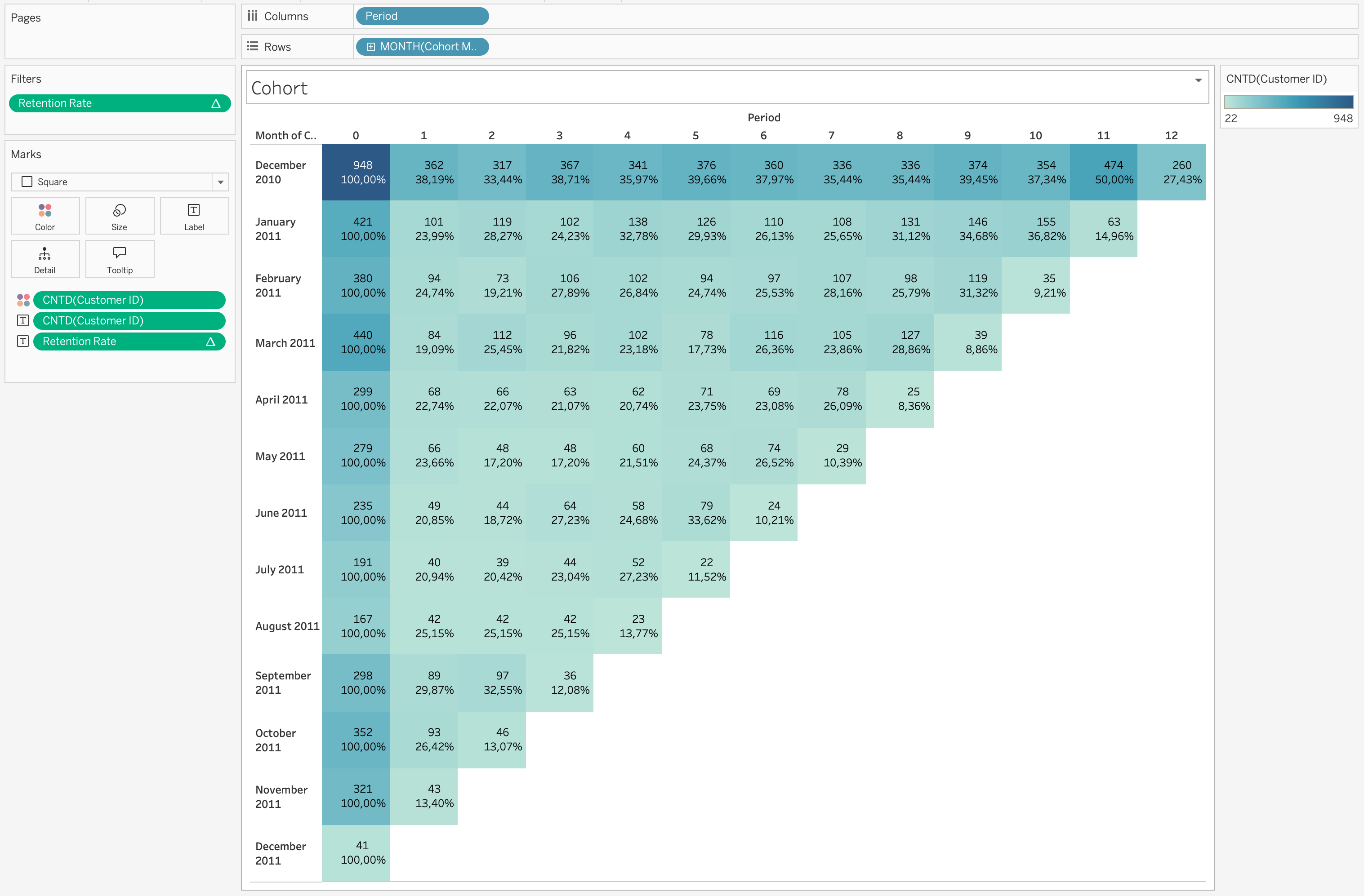
Example Interpretation
If a cohort shows:
- Month 0 = 100%
- Month 1 = 38%
- Month 2 = 33%
This means:
- All users were active in first month
- 38% returned next month
- 33% remained active after two months
Additional Analysis
Cohort by Country
- Add Country to Filters
Questions:
- Which countries retain better?
- Which markets are stronger?
Product-Based Cohort
Group customers by first product category.
Questions:
- Which products drive retention?
- Which products lead to repeat purchases?
Revenue Cohort
Analyze revenue instead of user count.
Questions:
- Which cohort generates highest revenue?
- Do newer cohorts spend more?
Cleaning and Reshaping Data in Tableau
Before building visualizations or dashboards, data must often be cleaned and reshaped.
Real-world datasets rarely arrive in a perfectly structured format suitable for analysis.
Common issues include:
- Missing values
- Incorrect data types
- Duplicated records
- Inconsistent formatting
- Wide tables that need to be normalized
- Columns containing multiple values
Cleaning ensures data accuracy, while reshaping ensures data structure fits analytical needs.
flowchart LR
A[Raw Data] --> B[Data Cleaning]
B --> C[Data Reshaping/optional/]
C --> D[Structured Analytical Dataset]
D --> E[Visualization & Analysis]
Data Cleaning in Tableau
Data cleaning focuses on improving data quality before performing analysis.
Tableau allows several cleaning operations directly inside the Data Source page or through Calculated Fields.
Handling Missing Values (NULL Values)
Missing values are one of the most common problems in datasets.
NULL values may represent missing records, unavailable information, or incomplete data collection.
Common approaches to handle NULL values include:
- Replace NULL values with a default value
- Filter out rows containing NULL values
- Use calculated fields to define fallback values
Example calculation replacing NULL revenue with zero:
IFNULL([Revenue],0)Another common approach:
ZN([Revenue])ZN() converts NULL numeric values to zero, which is often useful in financial analysis.
Correcting Data Types
Each field in Tableau has a data type such as:
- String
- Number
- Date
- Boolean
- Geographic
Incorrect data types can lead to incorrect aggregations or calculation errors.
Common corrections include:
- Converting strings to numeric values
- Converting strings to date values
- Changing dimensions to measures
Example converting a field to a date:
DATE([Order Date])Example converting a string to a number:
INT([Customer Age])Ensuring the correct data type improves calculation accuracy and visualization behavior.
Removing Duplicate Records
Duplicate rows can distort metrics such as totals, averages, or counts.
Instead of counting all records, analysts often count distinct entities.
Example:
COUNTD([Customer ID])This ensures that each customer is counted only once.
Splitting Columns
Some datasets contain multiple pieces of information within a single column.
For proper analysis, it is often necessary to separate these values into multiple fields.
In the Online Retail dataset, the Description column contains long product names that may include multiple descriptive elements.
Example:
| Description |
|---|
| SET/4 BADGES CUTE CREATURES |
| SET/4 SKULL BADGES |
| FANCY FONT BIRTHDAY CARD |
Sometimes product descriptions may contain structured information such as category and product name within a single field.
Steps:
- Right-click the column
- Select Split or Custom Split
- Choose the delimiter (for example
/or a space)
After splitting, Tableau automatically creates new columns.
Example result:
| Product Type | Product Name |
|---|---|
| SET | 4 BADGES CUTE CREATURES |
| SET | 4 SKULL BADGES |
| FANCY | FONT BIRTHDAY CARD |
Splitting fields improves:
- filtering
- grouping
- hierarchical analysis
- product categorization
Creating Hierarchies
Hierarchies organize fields into structured levels that support drill-down analysis.
Hierarchies allow:
- Drill-down exploration
- Structured navigation in dashboards
- Aggregated views across levels
- Simplified analysis of large datasets
The Online Retail dataset naturally supports a hierarchy such as:
graph TD
A[Country] --> B[Customer ID]
B --> C[Invoice No]
Example structure:
| Country | Customer ID | Invoice No |
|---|---|---|
| United Kingdom | 17850 | 541696 |
| France | 12583 | 541697 |
This hierarchy allows users to:
- Analyze sales by Country
- Drill down into Customers
- Explore specific Invoices
Steps:
- Drag one dimension onto another in the Data Pane
- Tableau creates a hierarchy automatically
- Rename the hierarchy if needed
- Use the hierarchy in visualizations for drill-down analysis
Using Tableau Prep for Advanced Data Preparation
When datasets become more complex, Tableau Prep provides a visual workflow for preparing and reshaping data.
Tableau Prep allows:
- Joining multiple datasets
- Removing duplicates
- Standardizing values
- Pivoting and unpivoting columns
- Aggregating datasets
- Cleaning inconsistent values
flowchart LR
A[Raw Sources] --> B[Tableau Prep Flow]
B --> C[Cleaning Steps]
C --> D[Reshaped Dataset]
D --> E[Tableau Visualization]
Prep uses a visual flow interface, allowing analysts to inspect transformations step by step before publishing the final dataset.
When Data Cleaning Should Be Done Outside Tableau
Although Tableau supports many data preparation operations, some transformations are better performed upstream.
Typical tools include:
- SQL databases
- ETL pipelines
- Python data pipelines
- Data warehouses
Reasons include:
- Better performance for large datasets
- Centralized transformation logic
- Reusable data pipelines
- Improved data governance
In production environments, Tableau often connects to pre-cleaned analytical datasets.
Data Reshaping in Tableau
Data reshaping changes the structure of a dataset so that it fits analytical needs.
Many datasets are stored in wide format, while Tableau analysis works better with long format.
flowchart LR
A[Wide Data Format] --> B[Pivot Operation]
B --> C[Long/Tidy Data Format]
Pivoting Data in Tableau
Pivoting is a data reshaping technique used to convert columns into rows.
This transformation is particularly useful when datasets store similar measures in multiple columns instead of a single column.
Many analytical workflows and visualization tools work better with long (tidy) data structures, where:
- one column represents the type of measure
- another column represents the value of the measure
flowchart LR
A[Gold Column]
B[Silver Column]
C[Bronze Column]

A --> D[Pivot Operation]
B --> D
C --> D

D --> E[Medal Type]
D --> F[Medal Count]
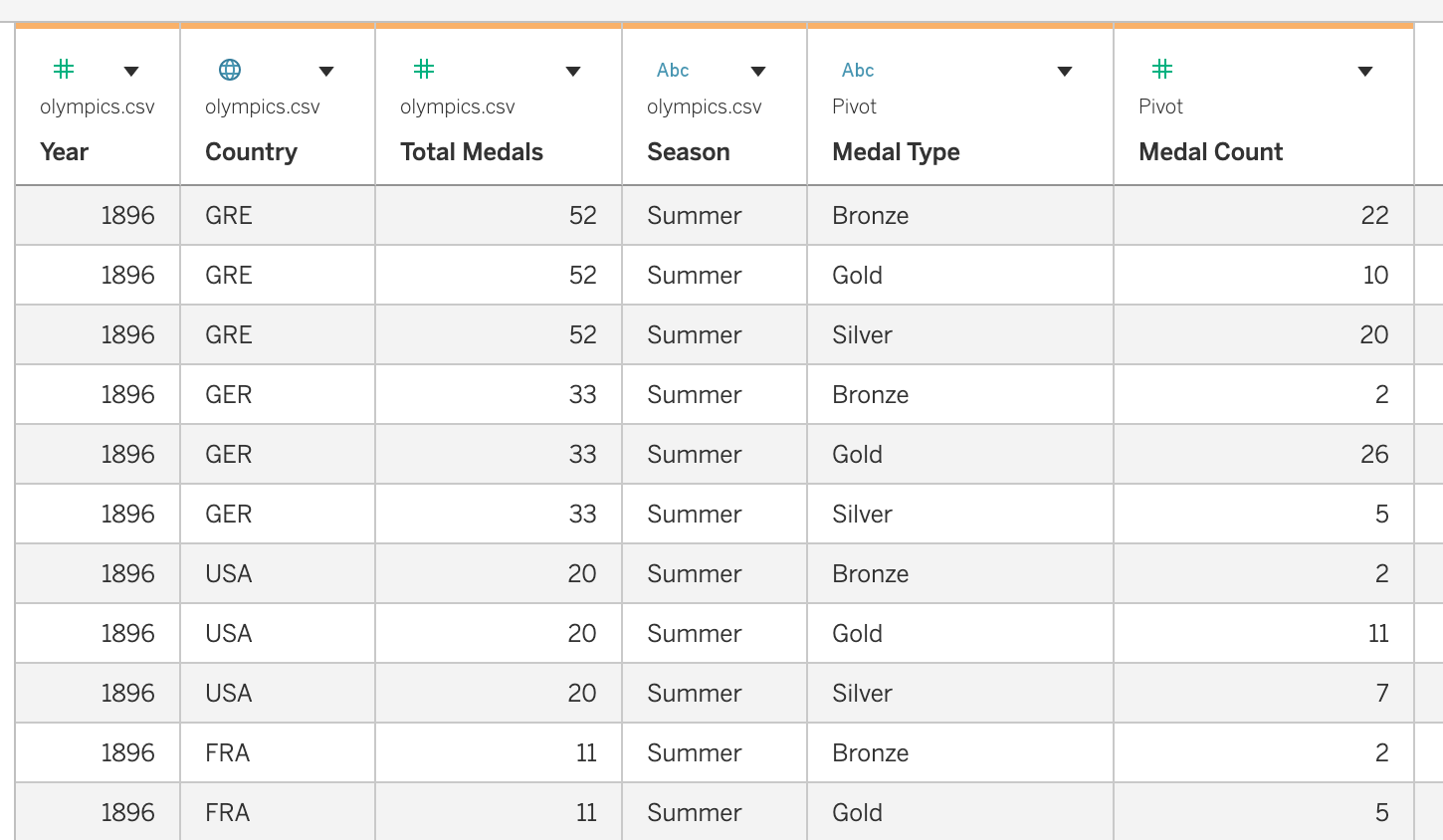
Example Dataset: Olympic Medals
For this example we use a dataset containing Olympic medal counts by country and year.
The dataset contains the following columns:
CountryYearSeasonGoldSilverBronzeTotal Medals
Structure before pivoting:
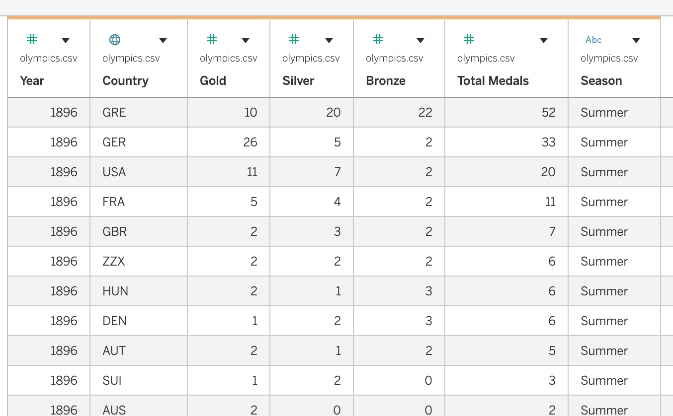
In this structure:
- each medal type is stored in a separate column
- this is called a wide format dataset
However, comparing medal types dynamically in Tableau becomes easier when the dataset is reshaped.
Pivoting Medal Columns
To reshape the dataset, we pivot the following columns:
GoldSilverBronze
Steps in Tableau
Open the dataset in Tableau
Navigate to the Data Source page
Select the columns:
- Gold
- Silver
- Bronze
- Gold
Right-click the selected columns
Choose Pivot
Tableau automatically creates two new fields:
Pivot Field NamesPivot Field Values
Rename these fields:
| Default Name | New Name |
|---|---|
| Pivot Field Names | Medal Type |
| Pivot Field Values | Medal Count |
Dataset after pivoting:
Benefits of Pivoting
Pivoting provides several advantages for analysis and visualization:
- Enables comparison of multiple measures within one chart
- Simplifies dataset structure
- Allows filtering by measure type
- Supports dynamic dashboards and parameter-driven visualizations
Example visualization setup:
| Columns | Rows | Color |
|---|---|---|
| Year | SUM(Medal Count) | Medal Type |
This visualization shows Gold, Silver, and Bronze medals over time in a single chart.
Analytical Questions Enabled by Pivoting
After reshaping the dataset, it becomes easier to answer questions such as:
- How do Gold, Silver, and Bronze medals change over time?
- Which countries win the most gold medals?
- How do medal distributions differ between Summer and Winter Olympics?
- Which countries have the highest total medal counts across seasons?
Pivoting therefore helps transform datasets into a structure that is more flexible for exploration and analysis in Tableau.
Tableau Prep vs Tableau Desktop
Both Tableau Prep and Tableau Desktop support data preparation tasks, but they are designed for different stages of the analytics workflow.
Tableau Desktop is primarily used for data exploration and visualization, while Tableau Prep is designed for building reusable data preparation pipelines.
Summary
| Task Type | Tableau Desktop | Tableau Prep |
|---|---|---|
| Quick data fixes | ✓ | |
| Calculated fields | ✓ | |
| Simple pivots | ✓ | |
| Complex joins | ✓ | |
| Large dataset cleaning | ✓ | |
| Reusable data pipelines | ✓ |
In practice, analysts often use both tools together:
- Tableau Prep to prepare and structure the dataset
- Tableau Desktop to explore, analyze, and visualize the data
Best Practices for Data Cleaning and Reshaping
- Inspect datasets before building visualizations
- Verify data types and formats
- Handle NULL values explicitly
- Convert wide datasets into tidy structures when needed
- Document data transformations
Properly cleaned and reshaped data leads to more reliable analysis and better-performing dashboards.