Strorytelling, Color Theory, UX Principles For Dashboard Design
tableau
Overview
This session focuses on how to design dashboards that are clear, beautiful, and performant.
Students learn the foundations of visual storytelling, color theory, UX principles, dashboard layout, and types of dashboards used in organizations.
By the end of the class, you should be able to design dashboards that tell a clear story, apply color and layout intentionally, choose the right dashboard type for your audience, and optimize performance for a smooth user experience.
This week covers:
Visual storytelling principles
Color theory fundamentals
UX principles for dashboard design
Dashboard layout best practices
Types of dashboards (Operational, Tactical, Analytical, Strategic, Multifunctional / Self-Service)
Task: Build an end-to-end business dashboard that:
Uses consistent layout and color
Includes filters, parameters, and highlights
Uses actions (filter, highlight, URL, sheet swapping) to guide the story
Visual Storytelling Principles
The Role of Edward Tufte in Visual Storytelling
In the field of visual storytelling, Edward R. Tufte plays a foundational role.
His work connects data, design, and narrative, showing how information can be communicated not only clearly but also elegantly.
Tufte’s philosophy encourages designers and analysts to transform raw data into visual stories that inform and move audiences.
“Above all else, show the data.”
Who is Edward Tufte?
Edward R. Tufte is an American statistician, artist, and former Yale professor, often called the father of data visualization.
He argues that visual storytelling should combine:
Truth – no distortion of data
Clarity – no unnecessary complexity
Design integrity – every element has a purpose
His most influential books include:
The Visual Display of Quantitative Information
Envisioning Information
Beautiful Evidence
Tufte’s principles are not about decoration but purposeful simplicity — every mark, color, or shape should tell part of the story.
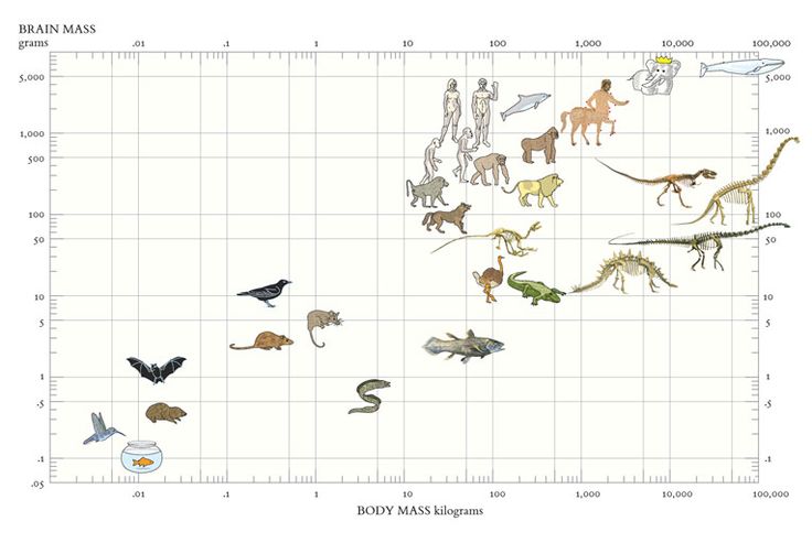
Storytelling with Data: Minard’s Map of the 1812 Russian Campaign
Minard’s Map
Charles Joseph Minard’s famous visualization tells the tragic story of Napoleon’s march to Moscow:
The width of the band represents the army size at each stage.
The path shows geographic direction.
The line below shows temperatures during the retreat.
Together, these layers merge six variables into one coherent narrative.
Why it matters:
Shows that data can convey emotion and consequence, not just numbers.
Embodies Tufte’s core message: “Above all else, show the data.”
Demonstrates clarity, precision, and storytelling depth.
Storytelling takeaway:
A single visual can tell a complete story — if every element is meaningful.
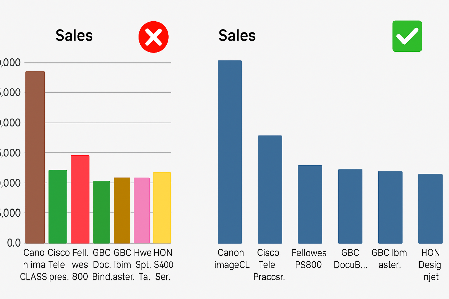
Avoid “Chartjunk” — Keep the Story Clear
Chartjunk Example
Chartjunk refers to unnecessary decorative elements (3D effects, clip art, heavy borders, textures) that do not add information.
Why it matters:
Visual noise hides the message; simplicity reveals it.
Guideline:
Every pixel, line, and color must serve the story, not style.
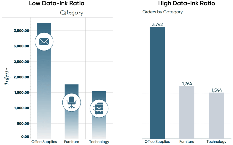
Maximize the Data-Ink Ratio — Tell More with Less
Data-Ink Ratio Example
The data-ink ratio describes how much of the ink in a chart actually represents data (instead of decoration).
Storytelling principle:
When visuals are simplified, the message becomes more powerful.
Practical rules:
Remove redundant labels and borders.
Use subtle gridlines or remove them if they don’t help.
Highlight only what matters (e.g., key lines, outliers).
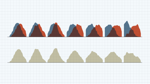
Small Multiples — Comparing Stories Side by Side
Small Multiples Example
Small multiples are sets of similar charts that share the same scale and layout.
Why they work:
Make it easy to compare patterns across time, regions, or segments.
Encourage exploration without overwhelming the viewer.
Storytelling takeaway:
Use repetition and consistent design to show change and contrast across multiple views.
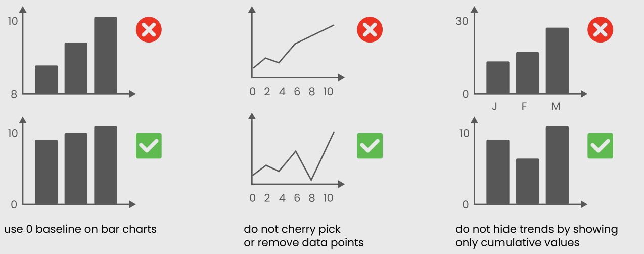
Graphical Integrity — Be Honest in Your Story
Lie Factor Example
A visualization must not distort the data.
Key practices:
Keep proportions true to values (no misleading scaling).
Avoid truncated axes that exaggerate small differences (especially on bar charts).
Represent differences accurately in height, length, and area.
Storytelling takeaway:
Integrity builds credibility — the story must be as honest as the data.
Tufte’s Mindset in Dashboard Design
Focus on the narrative: Highlight insights, not decoration.
Simplify: Remove any element that doesn’t support the story.
Use comparison wisely: Small multiples are powerful for showing change.
Be truthful: Avoid distortion in axes, scales, and annotations.
Layer context: Use time, geography, and value together when they clarify the story (like Minard’s map).
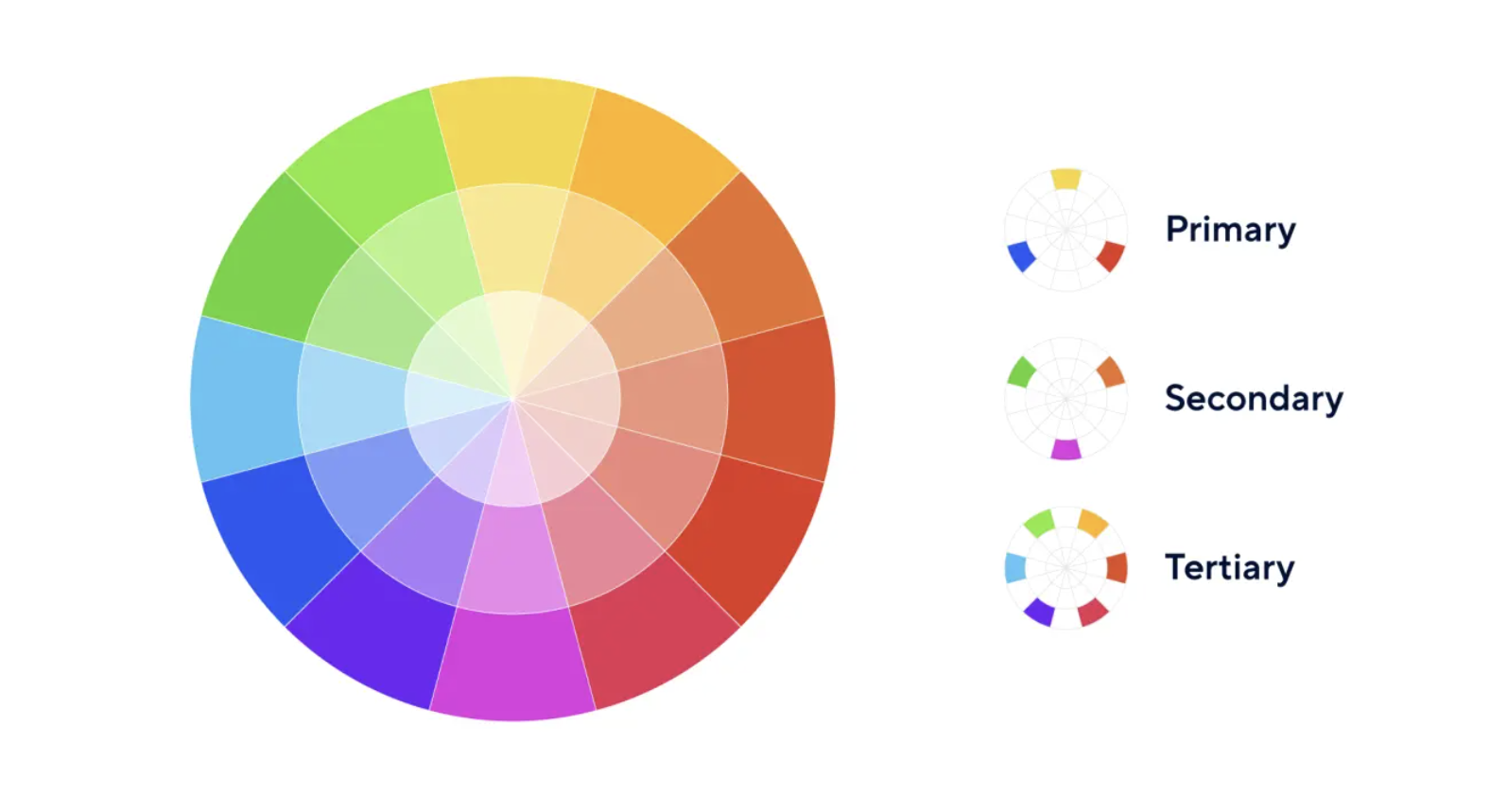
Color Theory Fundamentals
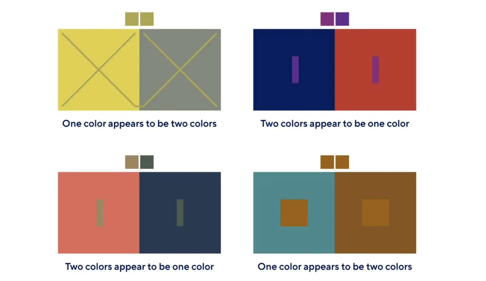
Color is Deceptive
Color is Deceptive
Color perception is context-dependent:
The same color may appear lighter/darker depending on its background.
Lighting, screen quality, and surrounding colors influence perception.
When designing dashboard palettes, always consider:
Context (background, other visuals)
Audience (accessibility, color vision)
Goal of the visualization (highlight vs neutral tone)
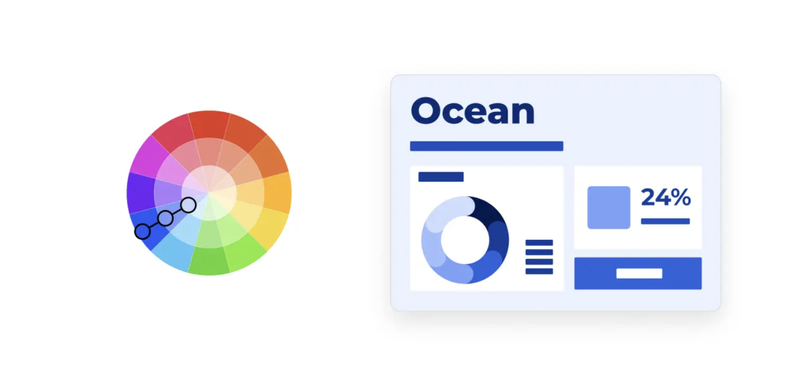
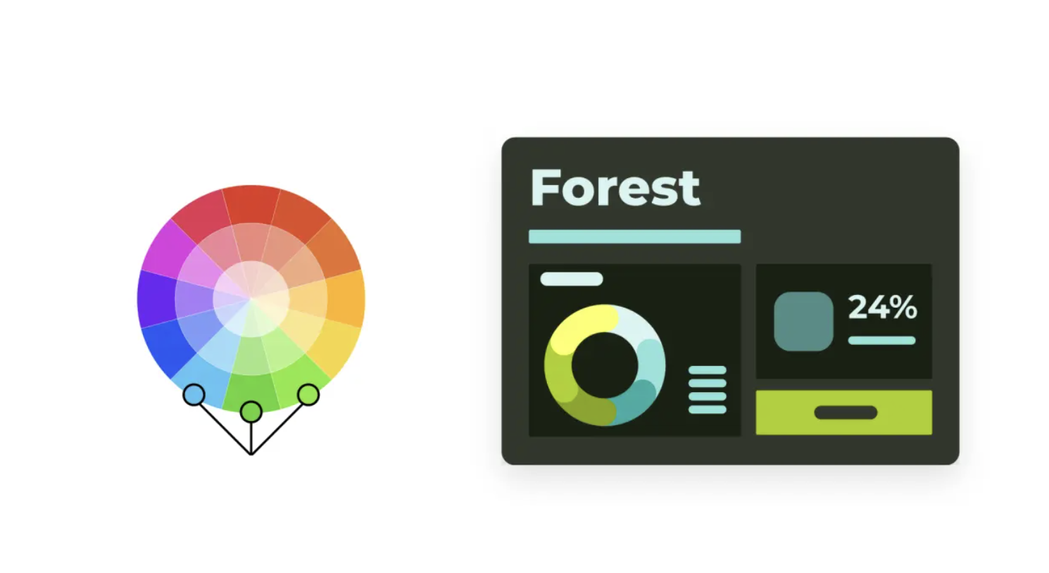
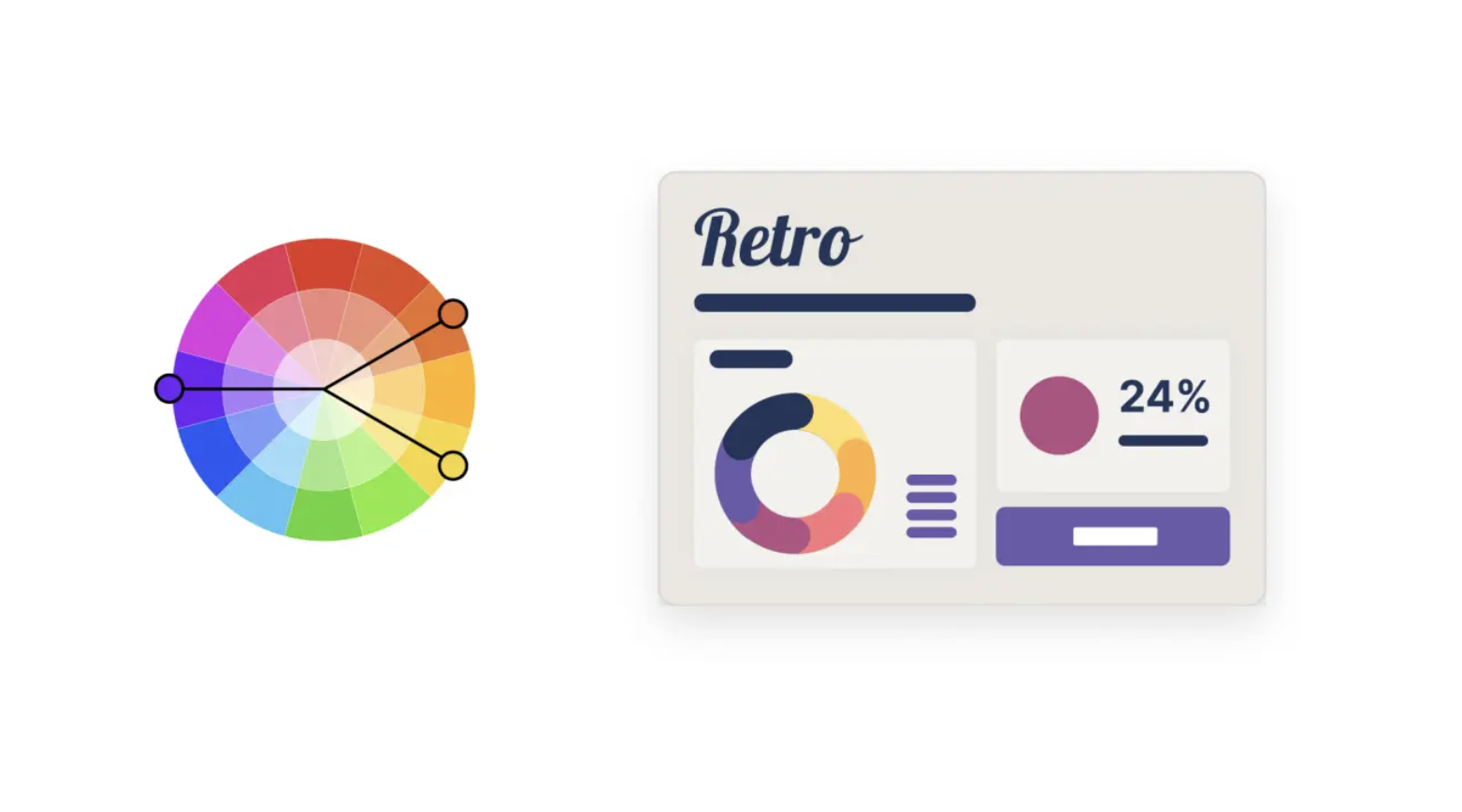
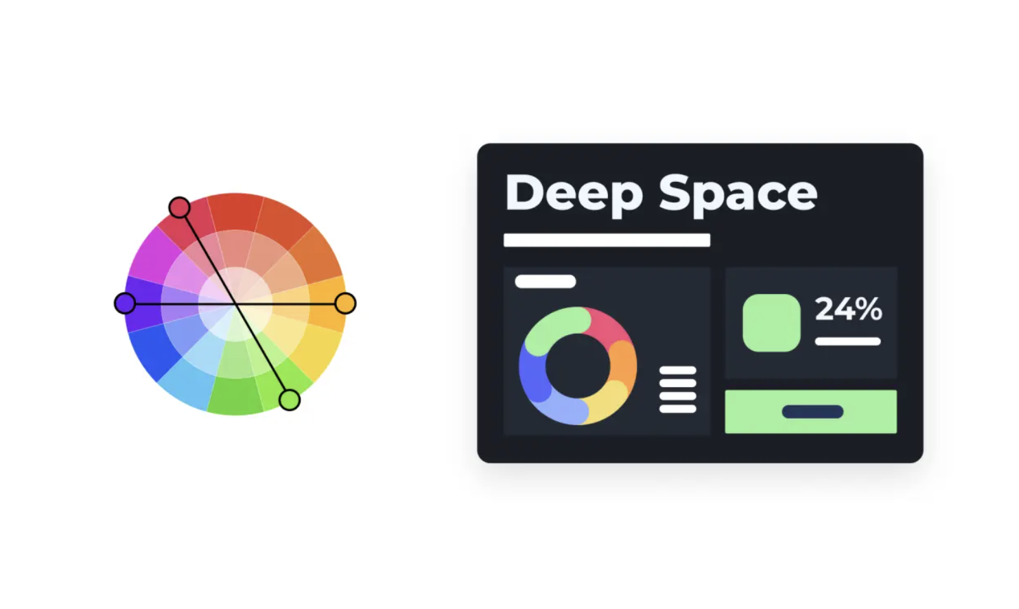
Understanding the Color Wheel
The color wheel is a tool for understanding relationships between colors and building harmonious palettes.
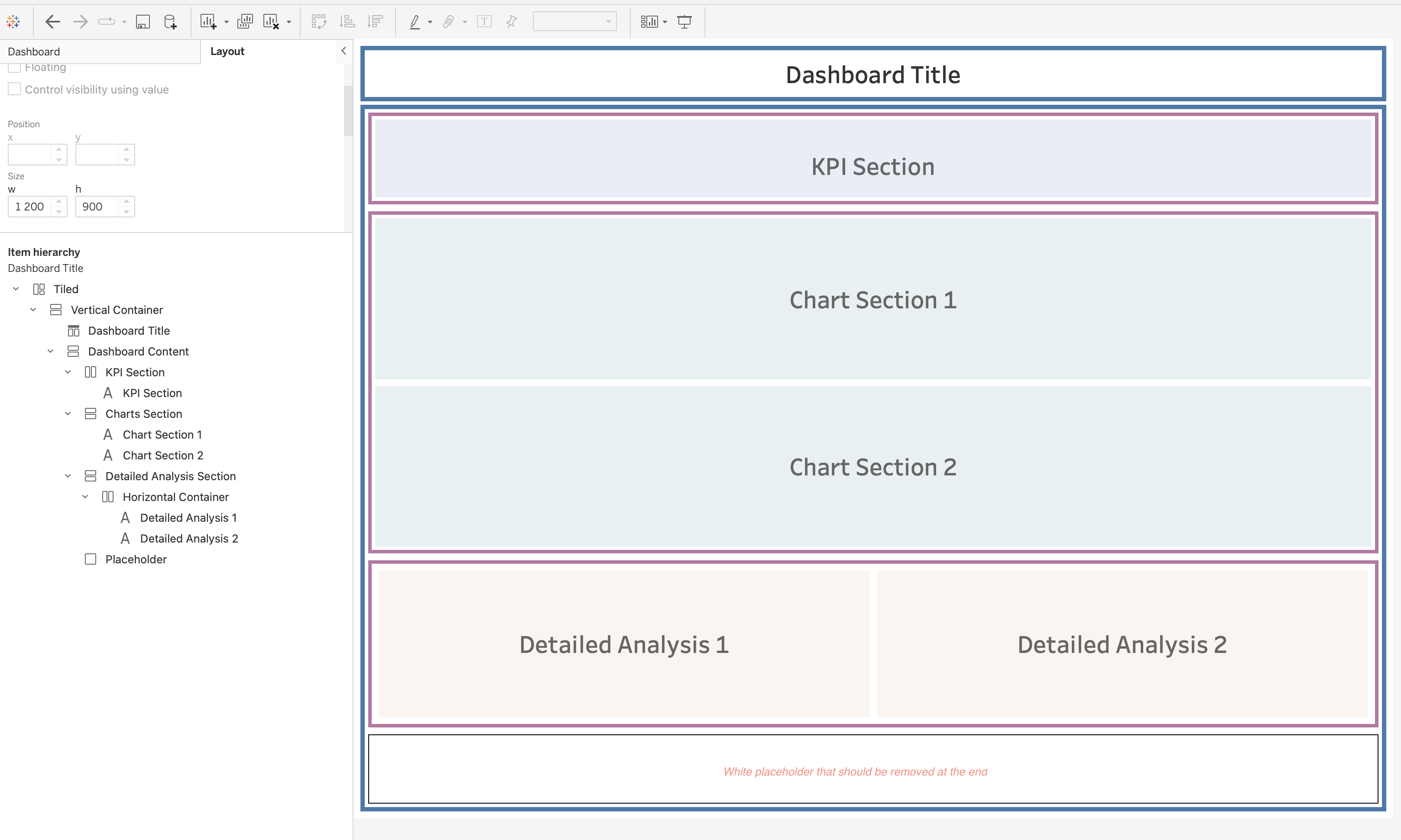
Containers help you organize, align, and control spacing of dashboard elements.
They are the foundation of a clean and scalable dashboard design.
Types:
Horizontal containers – arrange elements side by side (used for columns or comparisons).
Vertical containers – stack elements top to bottom (used for sections or storytelling).
1. Adding a Layout Container
Drag a Vertical or Horizontal Container from the Dashboard pane onto the canvas.
By default, containers are tiled and snap into position.
Hold Shift while dragging to create a floating container.
Apply a temporary background color to visually identify container boundaries during development.
Best practice:
Start with a main vertical container as the base structure of the dashboard.
Build all other elements inside it.
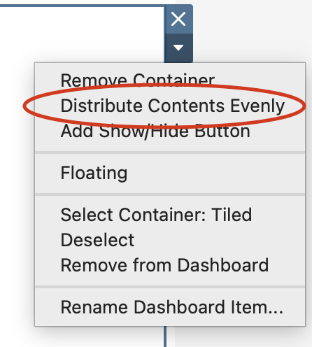
2. Container Structure
Containers define the layout hierarchy of the dashboard.
Single-level containers
Contain multiple elements in one direction
Suitable for simple layouts
Nested containers
Containers placed inside other containers
Enable complex layouts (e.g., sidebar + main content area)
Best practice:
Limit nesting to 2–3 levels maximum to avoid complexity and performance issues.
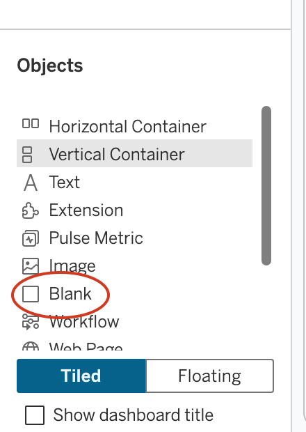
3. Adding Elements
Use Blank objects first to define spacing and layout structure.
Replace blanks with:
Worksheets
Text objects
Images or icons
Adding ellements
Why use blanks:
Helps create consistent spacing
Prevents layout shifts when adding content
Best practice:
Build layout structure first → then populate with visuals.
4. Orientation and Placement Logic
Drop on left/right edge → horizontal alignment
Drop on top/bottom edge → vertical alignment
Drop in the center → stacked inside container
Best practice:
Use blue placement indicators to control layout precisely.
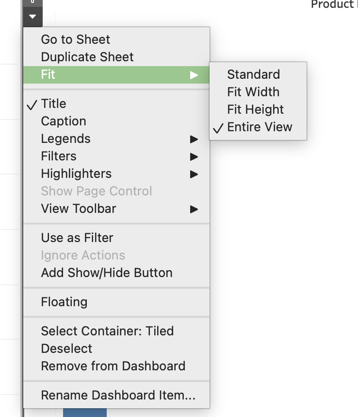
5. Fitting Visualizations
Fit Entire View → responsive charts
Fit Width / Height → controlled resizing
Standard → fixed size
Fit Entire View
Fixed Width/Height
Distribute Content
Additional:
Use Distribute Evenly for equal spacing
Use Fixed size when consistency is required
6. Padding and Spacing
Inner padding → space inside container
Outer padding → space between elements
Best practice:
Keep consistent spacing (4–20 px) across the dashboard.
7. Scaling Options
Fixed → consistent size (best for presentations)
Range → adaptive within limits
Automatic → fills screen (requires testing)
8. Scrollable Dashboards
Set dashboard height smaller than content
Use a vertical container
Tableau adds scroll automatically
Best practice:
Place key KPIs at the top
Avoid multiple scroll areas
9. Tiled vs Floating Layout
Tiled
Structured and responsive
Recommended for main layout
Floating
Free positioning
Used for KPIs, buttons, overlays
Best practice:
Tiled for structure
Floating for enhancements
10. Dashboard Grid Planning
Define structure before building
Choose layout type:
Top → Revenue, Orders, Customers (KPIs)
Middle → Sales trend + Category comparison
Bottom → Detailed table
Dashboard Grid Planning
11. Visual Hierarchy
Visual hierarchy determines how users scan and understand your dashboard.
A well-designed hierarchy ensures that users immediately focus on the most important information.
Principles:
Size indicates importance
Larger elements attract more attention
Use larger containers for KPIs and key charts
Position matters
Top and top-left areas are viewed first
Place critical insights (KPIs, main trends) at the top
Grouping related elements
Place related charts within the same container
Use proximity to indicate logical relationships
Example: KPIs grouped in one row, category charts grouped together
Use of white space
Space between elements improves readability
Prevents visual clutter
Helps separate sections clearly
Visual flow
Design dashboards to follow a natural reading pattern:
Top → summary
Middle → analysis
Bottom → details
Best practice:
Users should understand the dashboard in 3–5 seconds
Avoid competing elements of equal importance
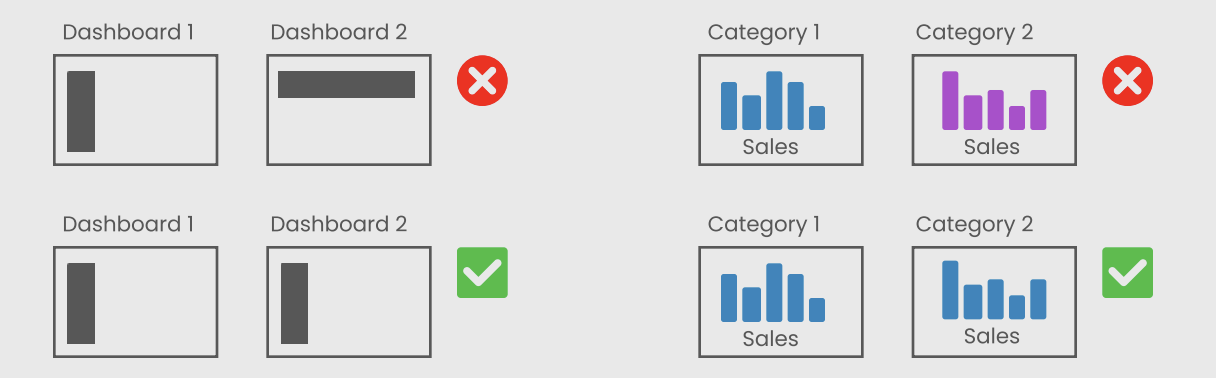
12. Consistency Guidelines
Consistency ensures that dashboards are professional, predictable, and easy to use.
Key areas of consistency:
Alignment
Align all objects to a grid
Avoid uneven edges or misaligned containers
Spacing
Maintain equal spacing between elements
Use consistent padding values across the dashboard
Typography
Use consistent font family
Define hierarchy:
Title (largest)
Section headers
Labels and annotations
Color usage
Use a consistent color palette
Assign meaning to colors (e.g., red = decrease, green = increase)
Avoid unnecessary color variation
Container styling
Keep consistent:
Background colors
Border styles
Corner radius (if using rounded corners)
Best practice:
Create a design standard and reuse it across all dashboards
Consistency reduces cognitive load for users
13. Performance Considerations
Layout and design decisions directly affect dashboard performance.
Key factors:
Nested containers
Deep nesting increases rendering complexity
Makes layout harder to manage
Floating objects
Require additional positioning calculations
Can slow down rendering, especially when overused
Number of visuals
Each worksheet generates a query
More charts = longer load time
High mark count
Charts with many marks take longer to render
Interactive elements
Filters and actions trigger additional queries
Best practices:
Keep layouts simple and structured
Limit dashboard to essential views
Use summary views instead of raw-level data
Optimize heavy charts (aggregation, filtering)
14. Placement of Interactive Elements
Proper placement of interactive components improves usability and user flow.
Guidelines:
Top section (global controls)
Date filters
Global parameters
High-level selectors
Side panels (detailed filters)
Category filters
Segment selectors
Drill-down options
Near related visuals
Action filters
Highlight actions
Context-specific controls
Logical grouping
Group filters together
Avoid scattering controls across the dashboard
Best practices:
Place controls where users expect them
Keep interaction close to the data it affects
Minimize unnecessary user movement across the dashboard
flowchart LR
A[Global Filters] --> B[Main Charts] --> C[Detailed Views]
D[Side Filters] --> B
Use filter actions instead of too many quick filters
Ensure interactive elements are intuitive and clearly labeled
15. Rounded Corners (Tableau 2026.1)
Tableau 2026.1 introduces rounded corners for containers, enabling modern dashboard design.
What It Does
Replaces sharp edges with smooth curved corners
Improves visual aesthetics and readability
How to Apply
Select a container
Open the Layout pane
Adjust corner radius in border/shading settings
Best Practices
Use consistent radius across dashboard
Combine with:
Background color
Inner padding
Recommended values:
5–10 px → subtle
12–20 px → card-style design
Use Cases
KPI cards
Filter panels
Section containers
16. Common Layout Mistakes
Overcrowded dashboards
Misaligned elements
Inconsistent spacing
Too many floating objects
Multiple scroll areas
Best practice:
Focus on clarity and structure
Types of Dashboards
Following Stephen Few, we classify dashboards by function:
Operational
Tactical
Analytical
Strategic
Multifunctional / Self-Service
Each serves a different decision-making level.
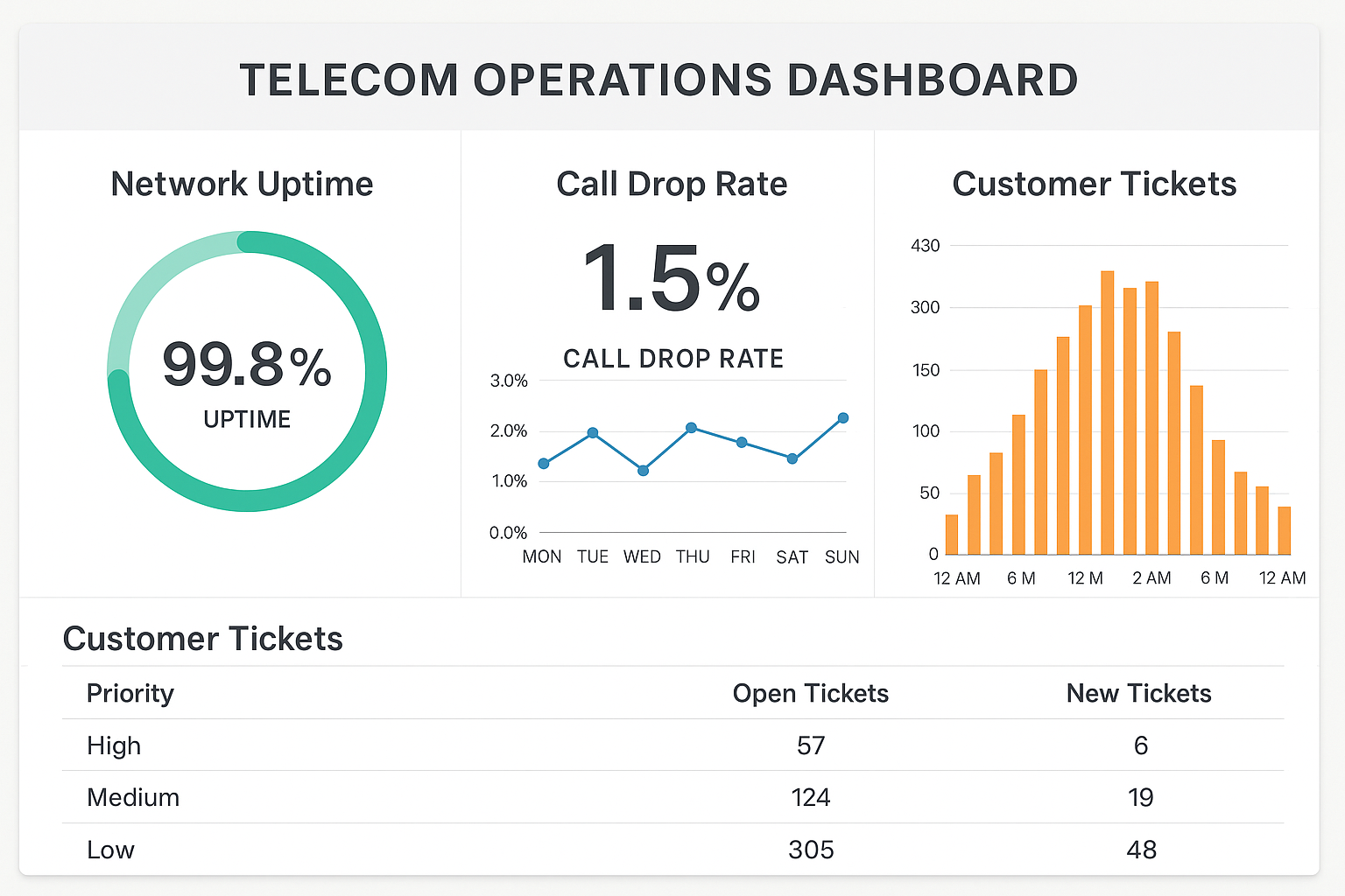
1. Operational Dashboards
Question: “What is happening right now?”
Purpose: Monitor day-to-day operations and detect issues as they occur.
Audience: Frontline staff, operations teams, call center supervisors.
Example: Telecom operations dashboard with uptime, call drop rate, open tickets.
Common visuals:
KPI cards with thresholds
Gauges / bullet charts
Real-time tables and alerts
Operational Dashboard
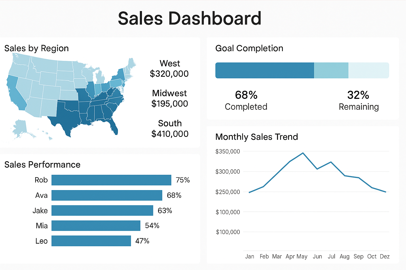
2. Tactical Dashboards
Question: “How are we performing against our goals?”
Purpose: Track short- and mid-term performance vs targets.
Audience: Team leads, department heads, project managers.
Example: Sales dashboard tracking regional results vs monthly targets.
Common visuals:
Variance-to-target bars
Trend lines by month/quarter
Progress bars by region/team
Tactical Dashboard
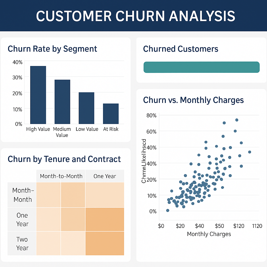
3. Analytical Dashboards
Question: “Why is this happening?”
Purpose: Explore data deeply, detect patterns, and understand root causes.
Audience: Data analysts, BI teams, advanced users.
Example: Churn dashboard showing which segments are at higher risk and why.
Common visuals:
Heatmaps
Scatter plots
Cohort charts
Drillable tables
Analytical Dashboard
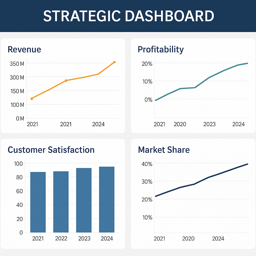
4. Strategic Dashboards
Question: “Where are we heading?”
Purpose: Provide a high-level view of organizational performance and strategy.
Audience: Executives, directors, board members.
Example: Executive dashboard with revenue, profitability, market share, and satisfaction over time.
Common visuals:
KPI scorecards
Trend lines & forecasts
High-level maps and summaries
Strategic Dashboard
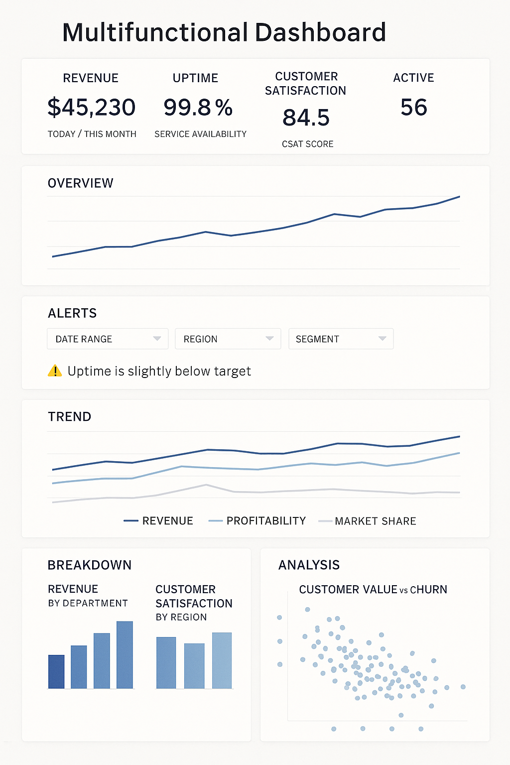
5. Multifunctional Dashboards
Some dashboards combine elements from several types.
Purpose: Allow users to access multiple levels of insight in one place.
Example:
Top section → Overview (strategic KPIs + operational health).
💡 Best practice: design these as scrollable dashboards with clear sections.
Multifunctional Dashboard
Dashboard Type Summary
Type
Question
Audience
Update Frequency
Focus
Example KPI
Operational
What’s happening now?
Frontline teams
Real-time
Efficiency
Average handling time
Tactical
Are we meeting our goals?
Managers
Weekly / Monthly
Performance
Sales vs target
Analytical
Why is this happening?
Analysts
On-demand
Insight & causes
Churn drivers
Strategic
Where are we heading?
Executives
Monthly / Quarterly
Outcomes
Revenue growth
Reflection and Discussion
Which dashboard type do you use most often in your current work or study?
Where do you see chartjunk or poor color use in real dashboards around you?
How could you redesign one of your own dashboards using Tufte’s principles and color harmony?
Take notes or share examples in class.
Performance Optimization in Tableau
Performance optimization ensures that dashboards are fast, responsive, and scalable, especially when working with large datasets or complex calculations.
A well-designed dashboard should load quickly, respond instantly to filters, and provide a smooth user experience.
1. Reduce Extract Size
Large datasets significantly slow down Tableau performance. Reducing extract size improves both load time and query execution speed.
Techniques:
Remove unnecessary columns
Filter data during extract creation (e.g., last 1–2 years only)
Aggregate data to a higher level (e.g., daily → monthly)
Hide unused fields
Best practice:
Keep only the data required for analysis
Use aggregated extracts when detailed granularity is not needed
2. Optimize Calculations
Complex calculations increase processing time, especially when used across multiple worksheets.
Replace complex IF statements with simpler logic when possible
Use Boolean calculations instead of string comparisons
Prefer row-level calculations over complex aggregations when possible
TipLOD Optimization Tip
If the required dimensions are already present in the view,
→ skip using FIXED LOD expressions
Why:
FIXED ignores the view level of detail
Forces additional computation
Can negatively impact performance
Better approach:
Let Tableau aggregate naturally using SUM, AVG, etc.
Use FIXED only when you need to override the view granularity
3. Use Efficient Data Modeling
Data structure impacts performance.
Best practices:
Use star schema instead of highly normalized models
Avoid too many joins in Tableau
Prefer relationships over joins when appropriate
Ensure join keys are indexed in the database
4. Minimize Dashboard Load Time
Dashboard load time depends on the number of elements and their complexity.
Reduce load time by:
Limiting number of worksheets per dashboard
Avoiding too many filters and actions
Reducing use of high-cardinality dimensions (e.g., MSISDN-level views)
Using fewer quick filters (replace with parameters where possible)
Best practice:
Focus on essential visuals only
5. Optimize Filters
Filters can significantly impact performance.
Guidelines:
Use context filters to reduce dataset early
Prefer extract filters over dashboard filters
Avoid cascading filters unless necessary
Limit number of quick filters displayed
Filter Execution Order
Extract filters
Data source filters
Context filters
Dimension filters
Explanation:
Extract filters reduce the dataset before it is loaded
Data source filters limit data at the connection level
Context filters create a subset for further filtering
Dimension filters operate on the filtered dataset
Best practice:
Apply filters as early as possible in the pipeline to improve performance
6. Reduce Number of Marks
Each mark (point, bar, line) requires rendering.
To optimize:
Aggregate data where possible
Avoid displaying millions of marks
Use summaries instead of raw-level data
Best practice:
Keep mark count manageable for better rendering speed
7. Optimize Use of Containers and Layout
Layout also affects performance.
Avoid excessive nested containers
Limit floating objects
Use simple, clean layouts
Best practice:
Simpler dashboards render faster
8. Use Extracts Instead of Live Connections
Extracts
Faster performance
Optimized for Tableau engine
Live connections
Depend on database performance
Slower if queries are complex
Best practice:
Use extracts for dashboards when real-time data is not required
9. Improve Initial Load Experience
Show only key visuals on initial load
Use navigation buttons instead of one large dashboard
Break dashboards into multiple views if necessary
Best practice:
Ensure first screen loads quickly
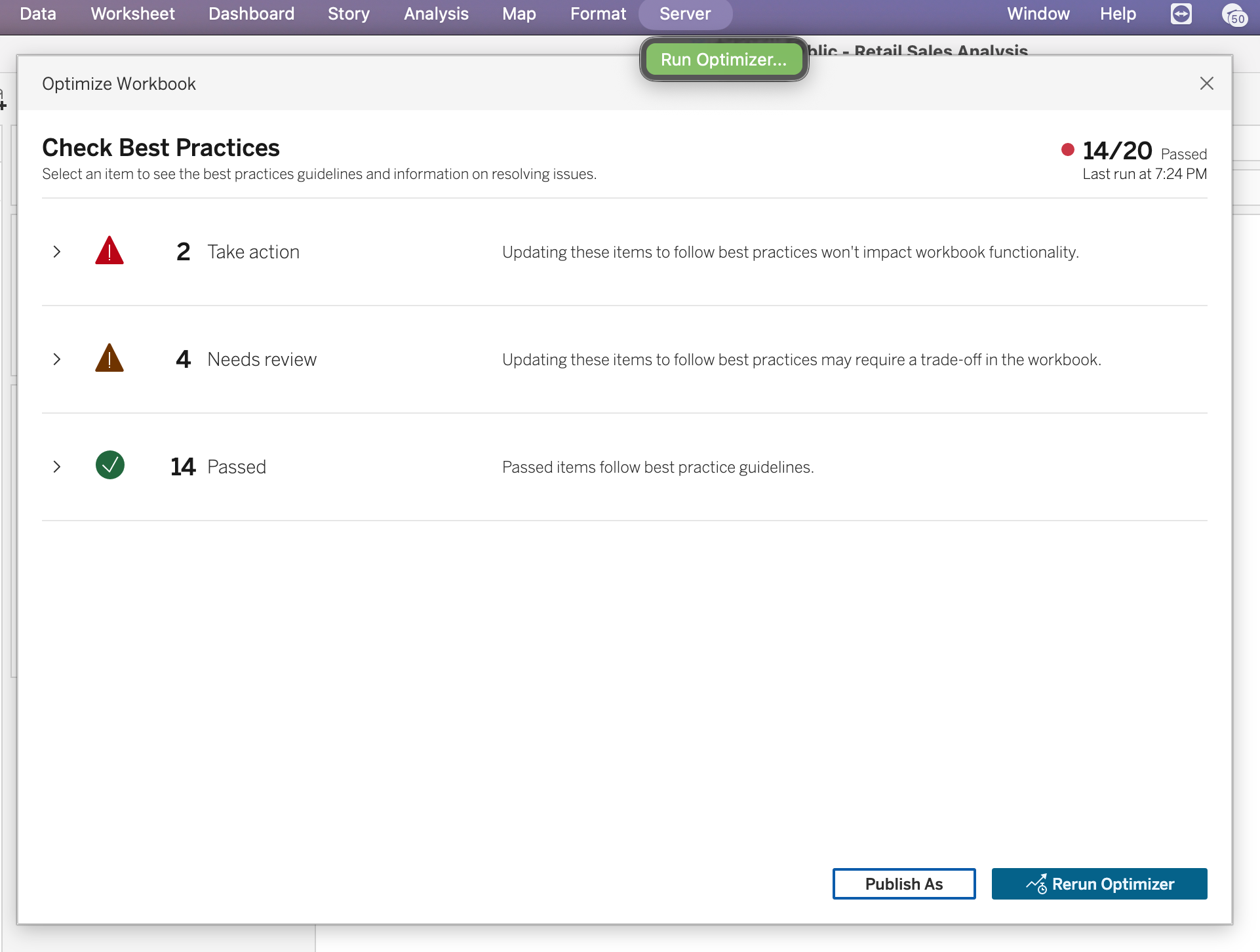
10. Workbook Optimizer
The Workbook Optimizer is a built-in tool that evaluates whether a workbook follows Tableau performance best practices.
Applies to:
Tableau Desktop
Tableau Server
Tableau Cloud
It analyzes workbook metadata using a rules-based engine and provides recommendations.
Not all recommendations apply to every scenario — always evaluate based on your use case.
11. How to Run Workbook Optimizer
In Tableau Desktop
Go to Server → Run Optimizer
The workbook is evaluated automatically
Results are grouped into categories:
Take action
Needs review
Passed
Expand each guideline to see:
Explanation
Suggested improvement
You can:
Apply recommendations
Ignore them
Proceed with publishing
Optimizer
12. Optimizer Categories
Take Action
Low-risk improvements
Minimal impact on functionality
Should generally be implemented
Needs Review
May require redesign (data model, dashboard structure)
Evaluate cost vs benefit
Passed
Already follows best practices
Passed and Ignored
Guidelines intentionally skipped
13. Autofix and Ignore Options
Autofix
Automatically resolves some issues
Example: closing unused data sources
Ignore
Suppresses irrelevant recommendations
Useful for templates or intentional design decisions